WP Central new look (7/25/2014)

Status
Not open for further replies.

Lance_WPCentral

New member
Nov 22, 2013
1,451
0
0
Visit site
WP Central site header & banner has changed today. It has got a new look and feel. The sliding up and down is cool. :smile:

What do you guys think about the new look of the site ?
 
Last edited:

AlastorX50

New member
Apr 23, 2014
124
0
0
Visit site
I really don't like it, WPCentral should go with a Modern UI, Androidcentral with the Material Design *cough* modern ui *cough*, iMore with the new Yosemite UI and Crackberry should stay the same as it.... well looks like the Blackberry OS, no change in design.
 

Laura Knotek

Retired Moderator
Mar 31, 2012
29,423
37
48
Visit site
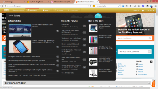
I don't like it. I preferred the old style, since I could easily click on another site and get to the forums easily by selecting "hot in forums" as shown here.
Screenshot (43).png

I have little interest in the blog posts on any of the sites, but I like checking out the forums on all sites. The current setup on AC and WPC requires an extra mouse click to skip the blogs and head to the forums when navigating from one site to another.

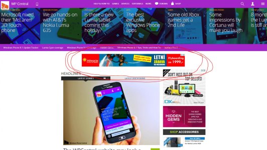
I also hate that big banner at the top of the page, and adblock and ghostery doesn't block it. Neither does Request Policy.
 

afgzee

Member
Nov 1, 2012
617
1
18
Visit site
look cleaner but generally dont like it, preferred the old style, not too happy with the dark purple colouring doesn't suit our site. Possibly an ability to select a colour of our choice like we can do on our windows phones? just a suggestion.


Tummala Rahul

New member
Jun 18, 2014
10
0
0
Visit site
New site is not easy to browse on a mobile. The images are too big for a phone screen. The new logo colours are also not that elegant. Light logo on dark background is the way to go. Is there anyway the whole design could be changed so that it does not resemble android central completely? or is it just too much to ask?
 

fishoa

New member
Jun 8, 2014
5
0
0
Visit site
I put this on comments but I'm going to paste the same here:

Very nice changes, I have some recommendations of some errors, there are very simple:

1. In the bottom you have a white space with 18px of height, actually that white space is for Google iframe, you can set height:0 and if you have troubles perhaps a position:absolute can be help, I try to fix it in developers panel but I cant check because I cant refresh the website without lose the changes.

2. The "#mbnf .mbnf_community" is small, you can set height:35px and fix it.

3. "#mbnf .mbnf_top_back" is small, you have to change the height or you can set to "#mbnf .mbnf_quote, #mbnf .mbnf_quote a" a font-size of 12px and fix it.

Another possible change, thats a recommendation, Facebook Beta has the same but I think is not user-friendly: the header pins to top when you scroll up, I think thats better pin it all the time when you scroll down, not only in the scroll up.

Great work, love WPCentral and sorry for my bad english.
 
Status
Not open for further replies.

Members online

Forum statistics

Threads
326,656
Messages
2,248,714
Members
428,533
Latest member
Eldonmcartney