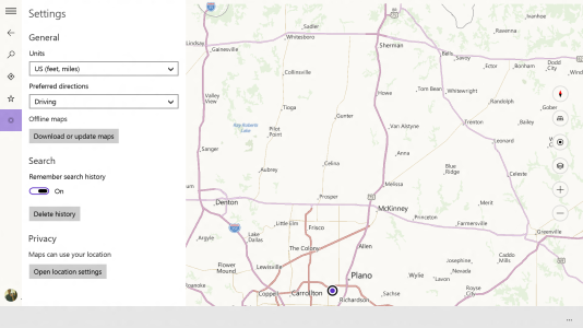
CORRECTION: I just saw a video walkthrough of this build, and realized that the new apps in fact do NOT adjust to the system theme color. They are always blue (which just happened to be the system theme color in the screenshots mentioned below). So this could be interpreted in a few different ways: Either blue is going to be the theme color for most Microsoft apps in the future, or they just used blue in this build because they have yet to decide final individual colors for the apps, or maybe the apps will in fact adjust to the system theme color in the final build. What's interesting to notice is that when you pin one of those new apps to the desktop, the icons don't have a color at all - they are just the white icons on a transparent background. To me that means that individual color themes for preinstalled apps might be going away.
I have not updated the original post below.
I've rewritten this post after I found a huge collection of screenshots of build 9901 (can't post the link, just google "thecollectionbook").
That recently leaked build reveals a huge amount of elaborate UI redesigns, both within a number of existing and new apps, and in the system UI. Seems like "Metro" is going to look truly different than it used to.
Less color
Most of the redesigned apps in this build have lost their individual theme colors. Their app icons (in the Start menu), splash screens, and highlighted UI elements within those apps now match the system theme color. The rest of the app UI uses different shades of grey (mostly dark shades).

This image shows some of the new app icons and splash screens:

New icon design language
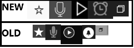
There are many new icon designs in the new system UI and in redesigned apps. Most of those icons follow a new distinctive design language: they are composed of thin monochrome (mostly white, grey or black) lines (and dots) of consistent thickness and of simple geometrical forms (mostly straight and circular lines). That's a huge departure from past "Metro" icon designs, which were basically monochrome pictograms (simplified visual depictions) of any form or shape, designed to be easily recognizable. The new icon design allows for a more distinctive and consistent look, but it has some disadvantages: thin lines are less easily recognizable from greater viewing distances or on low res screens, and the reduction of the icons to simple geometrical forms makes them more abstract and harder to interpret.
Hamburgers everywhere
Some of the redesigned apps now have a hamburger menu that looks and works just like it does on a lot of mobile apps: tapping a hamburger button in the top left corner will open or expand a menu that includes app navigation as well as access to settings. To me this seems like a smart design choice, considering that windowed apps don't allow you to swipe in an app bar or the charms menu. Hamburger menus can replace some of that functionality, and they are easy to find and easy to use for both mouse and touch. Plus, this kind of design allows for consistent app designs across PCs and phones (universal apps).

My predictions
These new designs in build 9901 are not final, and they are not applied to the whole OS and to all apps (yet), but here are my predictions:
- I think preinstalled apps will all use the system theme color. That system theme color will be used in other parts of the OS as well (it's already applied to the new Cortana UI).
- I think "Metro" will be visually much darker and less colorful than it used to be. Combined with the new abstract and delicate looking icons, that will make for a more elegant look compared to the playful look of current "Metro" designs.
- I think hamburger buttons (within the app and in the title bar) will ultimately replace both the app bar and the charms menu.
- I think the phone versions of the preinstalled Windows 10 apps will look very similar, with hamburger buttons potentially replacing the horizontal "panorama" layouts. (By the way, this build has a WP app preinstalled, and the Store app lists WP apps!)
- I think the old desktop UI (taskbar, window title bar, ?), as well as the Start menu, will be redesigned to match the visual design of "new Metro".
I have not updated the original post below.
I've rewritten this post after I found a huge collection of screenshots of build 9901 (can't post the link, just google "thecollectionbook").
That recently leaked build reveals a huge amount of elaborate UI redesigns, both within a number of existing and new apps, and in the system UI. Seems like "Metro" is going to look truly different than it used to.
Less color
Most of the redesigned apps in this build have lost their individual theme colors. Their app icons (in the Start menu), splash screens, and highlighted UI elements within those apps now match the system theme color. The rest of the app UI uses different shades of grey (mostly dark shades).

This image shows some of the new app icons and splash screens:

New icon design language
There are many new icon designs in the new system UI and in redesigned apps. Most of those icons follow a new distinctive design language: they are composed of thin monochrome (mostly white, grey or black) lines (and dots) of consistent thickness and of simple geometrical forms (mostly straight and circular lines). That's a huge departure from past "Metro" icon designs, which were basically monochrome pictograms (simplified visual depictions) of any form or shape, designed to be easily recognizable. The new icon design allows for a more distinctive and consistent look, but it has some disadvantages: thin lines are less easily recognizable from greater viewing distances or on low res screens, and the reduction of the icons to simple geometrical forms makes them more abstract and harder to interpret.

Hamburgers everywhere
Some of the redesigned apps now have a hamburger menu that looks and works just like it does on a lot of mobile apps: tapping a hamburger button in the top left corner will open or expand a menu that includes app navigation as well as access to settings. To me this seems like a smart design choice, considering that windowed apps don't allow you to swipe in an app bar or the charms menu. Hamburger menus can replace some of that functionality, and they are easy to find and easy to use for both mouse and touch. Plus, this kind of design allows for consistent app designs across PCs and phones (universal apps).

My predictions
These new designs in build 9901 are not final, and they are not applied to the whole OS and to all apps (yet), but here are my predictions:
- I think preinstalled apps will all use the system theme color. That system theme color will be used in other parts of the OS as well (it's already applied to the new Cortana UI).
- I think "Metro" will be visually much darker and less colorful than it used to be. Combined with the new abstract and delicate looking icons, that will make for a more elegant look compared to the playful look of current "Metro" designs.
- I think hamburger buttons (within the app and in the title bar) will ultimately replace both the app bar and the charms menu.
- I think the phone versions of the preinstalled Windows 10 apps will look very similar, with hamburger buttons potentially replacing the horizontal "panorama" layouts. (By the way, this build has a WP app preinstalled, and the Store app lists WP apps!)
- I think the old desktop UI (taskbar, window title bar, ?), as well as the Start menu, will be redesigned to match the visual design of "new Metro".
Last edited:


