[Mockup] Windows 10 Project (Please vote on UserVoice!)

metroversal

New member
Feb 20, 2015
24
0
0
Visit site
Since Microsoft is listening to feedbacks I decided to try to contribute with some mockups. I hope that it will come to their attention :smile:

Start Menu & File Explorer (icons, tabs, ribbon)
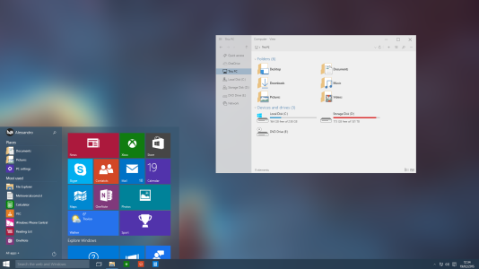
start-menu.png
View attachment 98004
View attachment 98005
What's new:
  • Transparency (with option to customize opacity level)
  • Remove Expand button from the Start Screen (right click > expand, should be enough)
  • Search inside the Start Menu (w/o Cortana overlapping it)
  • Power options at the bottom
  • New icons (Office 2013 Flat Style)
  • File Explorer Overhaul (removed Ribbon, streamlined, modern)
  • File Explorer Tabs support
  • New Ribbon UI

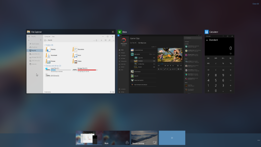
Task View
task-view.png
What's new:
  • Hidden Taskbar and Desktop icons
  • Close All Button (of course if you click it, a confirmation popup will appear)
  • Better use of Accent Color
  • Password protected Desktop support
  • Manage Remote Desktops Directly from the Task View
  • Drag and drop Support
  • Swipe down to close apps

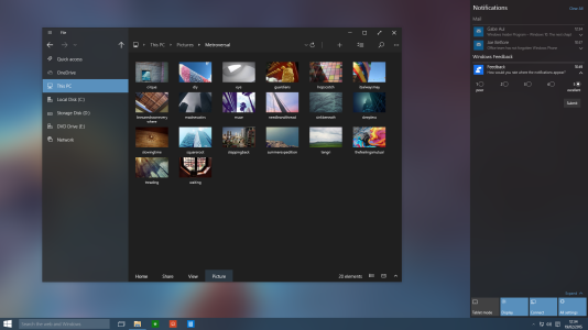
Dark Theme
dark-theme.png
What's new:
  • Available throughout the OS (File Manager, Cortana, Action Center, Settings, Store, etc.)
  • Better use of Accent Color
  • New Ribbon UI

(*) = not available in current mockups

What do you like? What do you don't like? Please comment and if you appreciate the work please vote this on UserVoice

PS: Windows 10 for phones mockups will come soon!
 
Last edited:

metroversal

New member
Feb 20, 2015
24
0
0
Visit site
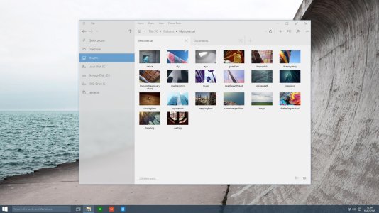
I just added Tabs in the new File Explorer. Check it out!
tabs.jpg

Hope you like it, if you do please vote on UserVoice, let's get this to Microsoft attention! :wink:
 

Wevenhuis

New member
Oct 19, 2011
408
0
0
Visit site
Since Microsoft is listening to feedbacks I decided to try to contribute with some mockups. I hope that it will come to their attention :smile:

Start Menu & File Explorer
View attachment 97733
View attachment 97823
What's new:
  • Transparency (with option to customize opacity level)
  • Remove Expand button from the Start Screen (right click > expand, should be enough)
  • Search inside the Start Menu (w/o Cortana overlapping it)
  • Power options at the bottom
  • New icons (Office 2013 Flat Style)
  • File Explorer Overhaul (removed Ribbon, streamlined, modern)
  • File Explorer Tabs support
  • File Explorer Split View (*)

Task View
View attachment 97734
What's new:
  • Hidden Taskbar and Desktop icons
  • Close All Button (of course if you click it, a confirmation popup will appear)
  • Better use of Accent Color
  • Password protected Desktop support
  • Manage Remote Desktops Directly from the Task View
  • Drag and drop Support
  • Swipe down to close apps

Dark Theme
View attachment 97732
What's new:
  • Available throughout the OS (File Manager, Cortana, Action Center, Settings, Store, etc.)
  • Better use of Accent Color

(*) = not available in current mockups

What do you like? What do you don't like? Please comment and if you appreciate the work please vote this on UserVoice
http ://bit .ly/1AcNT5F
(remove spaces)

PS: Windows 10 for phones mockups will come soon!

From which point of view have you made these mock ups, desktop or tablet?
 

metroversal

New member
Feb 20, 2015
24
0
0
Visit site
From which point of view have you made these mock ups, desktop or tablet?
Mainly for desktop (phone and tablet versions will come later), but some stuff like the new File Explorer could work just fine for a tablet (if you notice, in the "tabs" mockup there's a full screen button). Thoughts?
 

Wevenhuis

New member
Oct 19, 2011
408
0
0
Visit site
In the Insiders preview program I am focussing on mainly the tablet experience. I was intrigued by the clean look and what apprears a design with larger font size and tabs and buttons. I think this is the key to a better touch, thus a better tablet exprience. In general I expreience the desktop environment and the windows and explorer windows as touch unfriendly. The buttons, icons, font sizes and spaces are too narrow and small. It delivers a fidgety touch experience.

I think your mock up shows a better touch design. The only change I can think of here is that the icons at the corners and edges of the winodw could be bigger, that the spacing of folder and drives in the left column could be spaced a little further apart and the fonts be made bigger for a good funtional use in tablet mode. But my first feeling is that the explorer design otherwise seems a better design for touch use. I like that. I think I would like this design in full screen mode.
 

osars ehi

New member
Feb 22, 2013
108
0
0
Visit site
Since Microsoft is listening to feedbacks I decided to try to contribute with some mockups. I hope that it will come to their attention :smile:

Start Menu & File Explorer
View attachment 97733
View attachment 97823
What's new:
  • Transparency (with option to customize opacity level)
  • Remove Expand button from the Start Screen (right click > expand, should be enough)
  • Search inside the Start Menu (w/o Cortana overlapping it)
  • Power options at the bottom
  • New icons (Office 2013 Flat Style)
  • File Explorer Overhaul (removed Ribbon, streamlined, modern)
  • File Explorer Tabs support
  • File Explorer Split View (*)

Task View
View attachment 97734
What's new:
  • Hidden Taskbar and Desktop icons
  • Close All Button (of course if you click it, a confirmation popup will appear)
  • Better use of Accent Color
  • Password protected Desktop support
  • Manage Remote Desktops Directly from the Task View
  • Drag and drop Support
  • Swipe down to close apps

Dark Theme
View attachment 97732
What's new:
  • Available throughout the OS (File Manager, Cortana, Action Center, Settings, Store, etc.)
  • Better use of Accent Color

(*) = not available in current mockups

What do you like? What do you don't like? Please comment and if you appreciate the work please vote this on UserVoice
http ://bit .ly/1AcNT5F
(remove spaces)

PS: Windows 10 for phones mockups will come soon!
It looks nice.... Can't wait to see ur ideas for windows phone
 

Alfa Kapa

New member
Sep 29, 2014
195
0
0
Visit site
I have to admit it, your idea sir is pure gold!
As a W8.1 user on the desktop, I like what I'm seeing more than the W10 technical previews in general and
the settle changes that you made , look miles better than the current looks.
And no! Transparencies doesn't mean automatically that you copy apple ,they are stellar!

I voted on uservoice but you have to spread the world with this concept ,now is the right
time to push this concept as nothing is final and it is more in line with the unification vision of Windows ,
it is by far superior to the current W10TP and in my opinion it seams like the true successor of Windows 8.1 (or W7 for many).

Remember that W10 design is purely the creation of a concept from a person like you ,so
if you press the right buttons we may end up with your vision of windows!
:D
 

Matt Addy

New member
May 29, 2014
125
0
0
Visit site
This concept is pure awesomeness will vote on uservoice when I have the time everyone needs to boost this post to get this out there
 

AngryNil

New member
Mar 3, 2012
1,383
0
0
Visit site
It's always cool to see how little tweaks here and there can add up to something much better. The transparency in particular is very nicely done.
 

KarmaEcrivain94

New member
Feb 1, 2013
374
0
0
Visit site
If you look on uservoice, There are already a few other similar concepts that have tens of thousands of votes.... I hope the UI and icons aren't definitive :/ the problem with the current builds, is that it just doesn't look elegant. It seems that, as Steve Jobs ones said, "Microsoft simply has no taste". On this thing in any case (the zune modern UI was my favorite ui, all platforms included)
 

Members online

Forum statistics

Threads
323,278
Messages
2,243,563
Members
428,055
Latest member
graceevans