[Mockup] Windows 10 Project (Please vote on UserVoice!)

metroversal

New member
Feb 20, 2015
24
0
0
Visit site
Updated Tabs in File Explorer and... new Ribbon UI!

Hey guys thank you so much for the support! You are AWESOME! :excited:

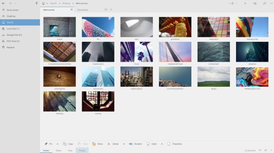
Here's an updated mockup of Tabs in File Explorer, check it out!
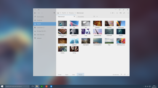
tabs.png

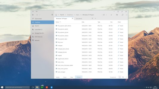
Also, I know that I wrote about removing the Ribbon, but what do you guys think about placing it at the bottom? :D
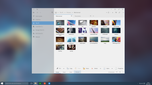
ribbon.png

Please let me know (I do listen!), tomorrow you're going to see full screen view (tablet mode) of File Explorer, and a new Start Screen maybe.

I'm constantly adding new stuff in my public OneDrive folder:
http://1drv.ms/1ApKxek
 

metroversal

New member
Feb 20, 2015
24
0
0
Visit site
why do you have " This Pc " writen on the side and top?????
That's an earlier mockup (I'll update it later), if you notice I changed the text at the top and replaced it with "File".

If the ribbon is an option, it's okay. I would use it on my Surface, but not on my Home PC.
Of course it's an option :wink: it should work like this:
Desktop mode - Ribbon hidden by default
Tablet mode - Ribbon shown by default

The aim is to have a single UI that's easy to use for both scenarios.
 

anon(5445874)

New member
Dec 6, 2012
673
0
0
Visit site
Please stop demanding the Task Bar be removed from the Task View!!!! All the time I go to the Task View to switch to an app only to find out that it's not open anymore. At that point, I just tap the icon on the Task Bar and it launches. Productivity is awesomeness.
 

Italo Souza

New member
Sep 12, 2013
13
0
0
Visit site
I would love if the Windows 10 was like that! About the Light/Dark themes, i think that should be Day/Night and not Light/Dark. The differences is that Day have apps with colours (like iOS apps) and the Night have only black and "50 shades of grey". About the Action center, it's too large! Need to be smaller like Cortana and about Cortana, the background should be the bing image of the day with blur :)
 

osars ehi

New member
Feb 22, 2013
108
0
0
Visit site
Since Microsoft is listening to feedbacks I decided to try to contribute with some mockups. I hope that it will come to their attention :smile:

Start Menu & File Explorer (icons, tabs, ribbon)
View attachment 97733
View attachment 98004
View attachment 98005
What's new:
  • Transparency (with option to customize opacity level)
  • Remove Expand button from the Start Screen (right click > expand, should be enough)
  • Search inside the Start Menu (w/o Cortana overlapping it)
  • Power options at the bottom
  • New icons (Office 2013 Flat Style)
  • File Explorer Overhaul (removed Ribbon, streamlined, modern)
  • File Explorer Tabs support
  • New Ribbon UI

Task View
View attachment 97734
What's new:
  • Hidden Taskbar and Desktop icons
  • Close All Button (of course if you click it, a confirmation popup will appear)
  • Better use of Accent Color
  • Password protected Desktop support
  • Manage Remote Desktops Directly from the Task View
  • Drag and drop Support
  • Swipe down to close apps

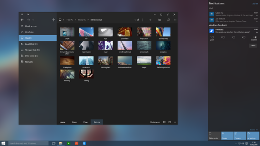
Dark Theme
View attachment 98088
What's new:
  • Available throughout the OS (File Manager, Cortana, Action Center, Settings, Store, etc.)
  • Better use of Accent Color
  • New Ribbon UI

(*) = not available in current mockups

What do you like? What do you don't like? Please comment and if you appreciate the work please vote this on UserVoice

PS: Windows 10 for phones mockups will come soon!

How is your windows 10 for phone concept going.....
 

metroversal

New member
Feb 20, 2015
24
0
0
Visit site
Hey guys sorry if I've been quiet lately, there's so stuff much going on!

I would love if the Windows 10 was like that! About the Light/Dark themes, i think that should be Day/Night and not Light/Dark. The differences is that Day have apps with colours (like iOS apps) and the Night have only black and "50 shades of grey". About the Action center, it's too large! Need to be smaller like Cortana and about Cortana, the background should be the bing image of the day with blur :)
Thanks for your feedback! Not sure about the "Black and Grey" UI, people like customization, however you can still select gray as accent color, if desired.
As for the Action Center, I have not really optimized that much. We'll see!
Noted on Cortana!


How is your windows 10 for phone concept going.....
I can tell you that there's so much stuff going on but things are coming along nicely!
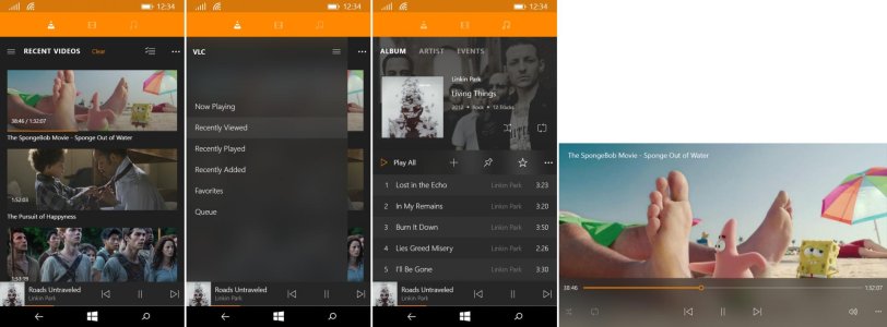
As regards Windows 10 for phones, I'll start adding new bits in the coming weeks.

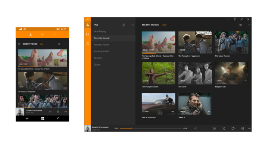
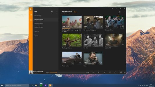
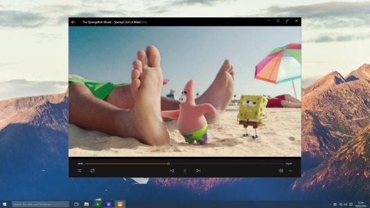
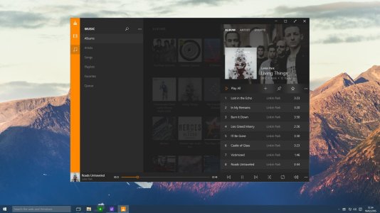
in the meantime you can have an exclusive look of an example of Windows 10 Universal app (still work in progress)!
vlc.png
I know this isn't a Microsoft app but I'm not a huge fan of the design choices of some app developers, so It try to give them a few hints!


Other apps I'm working on:
- Notepad (done - has tabs support and much more)
- Regedit (wip - has a "path bar" for easily copy and paste paths)
- Task Manager (wip)
 
Last edited:

metroversal

New member
Feb 20, 2015
24
0
0
Visit site
Hey, here's finally the new shots I promised!


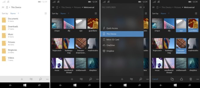
File Explorer:

file_explorer_list_view.jpg
file_explorer_w10phone.jpg
  1. Before some of you start complaining for the "hamburger" button I'd like to tell you that it's not mandatory to use it, the easiest way to access the side menu is to swipe to the right. The hamburger button is a sort of "visual cue" that remarks the presence of a menu on the left.
  2. The menu items are vertically centered for an easier experience for all sized hands.
  3. Supports cloud services besides OneDrive


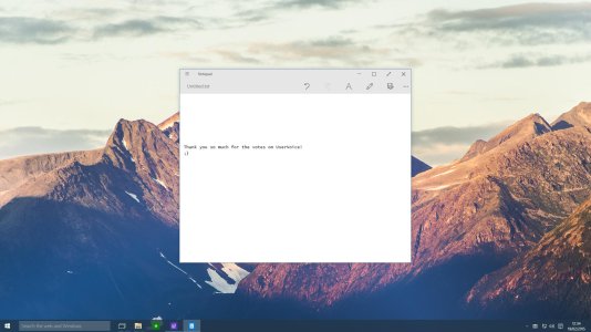
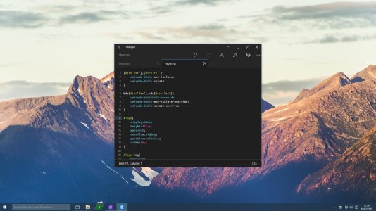
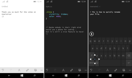
Notepad:
notepad.jpg
notepad_dark.jpg
notepad_w10phone.png
  1. Added tabs support*
  2. Support supports several programming languages
* Phone version doesn't support tabs


VLC:

vlc.jpg
vlc_playing_video.jpg
vlc-album.jpg
vlc_w10phone-5.jpg
An example of Windows 10 universal app featuring "metro 2.0" (Xbox version will come later)


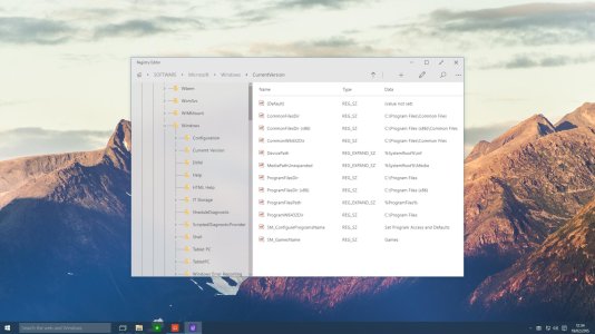
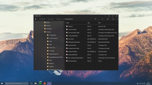
REGISTRY EDITOR:

regedit.jpg
regedit_dark.jpg
  1. New UI. Not a realy priority but it hasn't changed a lot in the last 20 years I think.
  2. Added an address bar (you can copy/paste paths)


If you like the mockups, please consider to support the idea on UserVoice (remeber to add 3 votes), here's the link to vote:
UserVoice

Also, if you leave an constructive feedback that would be much appreciated!
 
Last edited:

Wevenhuis

New member
Oct 19, 2011
408
0
0
Visit site
Looks good for desktop mode, but I'm still convinced that a different UI is necessary for tablet mode. On such smaller devices the icons and font sizes needs to be bigger and the spacings in filelists needs to be larger. Reason for this is that the finger surface area is not comparble to a pixelperfect mouse or stylus pointer. Smaller icons and font sizes, just for the design esthetics will increase mouse over pressing errors by the end user using winodows 10 like this in tablet mode using touch. This is not a good end user experience.
 

metroversal

New member
Feb 20, 2015
24
0
0
Visit site
Looks good for desktop mode, but I'm still convinced that a different UI is necessary for tablet mode. On such smaller devices the icons and font sizes needs to be bigger and the spacings in filelists needs to be larger. Reason for this is that the finger surface area is not comparble to a pixelperfect mouse or stylus pointer. Smaller icons and font sizes, just for the design esthetics will increase mouse over pressing errors by the end user using winodows 10 like this in tablet mode using touch. This is not a good end user experience.

Thanks for pointing that out. What you've said is totally right, it's not easy to have a single UI for different form factors without compromising.

If you look closer at the mockups, you'll see that I have increased the amount of space between elements and I can assure you that it's not hard at all to use this UI using your fingers. I find it much easier than previous versions of Windows.

You can try your self if you have a tablet, just open one of my concepts in full screen and try to see if you can actually use your fingers to interact with the UI elements.

Anyhow, if you still think that the experience is still not optimal, a possible solution may be to enhance the Tablet Mode. Instead of just making maximising all apps it might also increase the spacing between buttons, files, icons, etc. Thoughts?Thanks for pointing that out.
 

Wevenhuis

New member
Oct 19, 2011
408
0
0
Visit site
Thanks for pointing that out. What you've said is totally right, it's not easy to have a single UI for different form factors without compromising.

If you look closer at the mockups, you'll see that I have increased the amount of space between elements and I can assure you that it's not hard at all to use this UI using your fingers. I find it much easier than previous versions of Windows.

You can try your self if you have a tablet, just open one of my concepts in full screen and try to see if you can actually use your fingers to interact with the UI elements.

Anyhow, if you still think that the experience is still not optimal, a possible solution may be to enhance the Tablet Mode. Instead of just making maximising all apps it might also increase the spacing between buttons, files, icons, etc. Thoughts?Thanks for pointing that out.
Thanks.

Tried full screen of your mock ups.
I think for tablet mode a good point of reference would be to orient files and file icons to the sizes of the current live tile dimensions.
As for the font size I would consider font size 12 or higher.

your registry editor looks clean enough.
For the file explorer I would hide more tabs and just make navigation more singular as is current on windows 8. I would hide more subfunctions in the dot dot dot menu and only keep the search and arrows in the title bar.
For more granular functionality perhaps a look of how it is done with the office preview app styling of the titlebar could help. For tablet I would even consider having a look how navigation and funcionality is organised within the onenote app for the modern UI (double menu).
I hope this helps.

With regard to navigation I've been thinking along these lines. I'm not an expert in design, but I'm looking at the functional experience of windows 10. https://onedrive.live.com/redir?res...464&authkey=!ABu5RSgfaINAoSk&ithint=file,pptx

I hope this helps.
 

metroversal

New member
Feb 20, 2015
24
0
0
Visit site
Thanks.

Tried full screen of your mock ups.
I think for tablet mode a good point of reference would be to orient files and file icons to the sizes of the current live tile dimensions.
As for the font size I would consider font size 12 or higher.

your registry editor looks clean enough.
For the file explorer I would hide more tabs and just make navigation more singular as is current on windows 8. I would hide more subfunctions in the dot dot dot menu and only keep the search and arrows in the title bar.
For more granular functionality perhaps a look of how it is done with the office preview app styling of the titlebar could help. For tablet I would even consider having a look how navigation and funcionality is organised within the onenote app for the modern UI (double menu).
I hope this helps.

With regard to navigation I've been thinking along these lines. I'm not an expert in design, but I'm looking at the functional experience of windows 10. https://onedrive.live.com/redir?res...464&authkey=!ABu5RSgfaINAoSk&ithint=file,pptx

I hope this helps.

Thanks for sharing the ppt file, really interesting! A lot of ideas in common.
Also, almost all of your suggestions were spot on.
You definitely helped!
 
Last edited:

Wevenhuis

New member
Oct 19, 2011
408
0
0
Visit site
Thanks for sharing the ppt file, really interesting! A lot of ideas in common.
Also, almost all of your suggestions were spot on.
You definitely helped!

Thanks for sharing your mock ups. I'm curious what microsoft will bring to the table in the coming months. I got a tip from another forum user to share the ppt file with microsoft. Thus shared it on the insiders program and microsoft community. Perhaps it could be worth it if you shared yours as well.
 

metroversal

New member
Feb 20, 2015
24
0
0
Visit site
Any updates? Sorry just wanna see more of this amazing concept
Yes! :)
Here's what's coming in the next update:
- Project Spartan
- Cortana
- Task Manager redesign
- Icon set (folders, files, devices, etc.)
- Universal apps showcase (I'm thiking about Steam but I'm open to suggestions)

What I want to know is how you got the SpongeBob movie ��
Lol, it's just a random picture from internet, I don't have that movie :wink:
 

Members online

No members online now.

Forum statistics

Threads
323,182
Messages
2,243,401
Members
428,035
Latest member
powerupgo