Windows Phone 9 concept - linking1990

linking1990

New member
Jan 20, 2012
156
0
0
Visit site
Dear fellas, respected community of WPCentral,

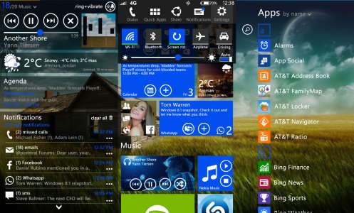
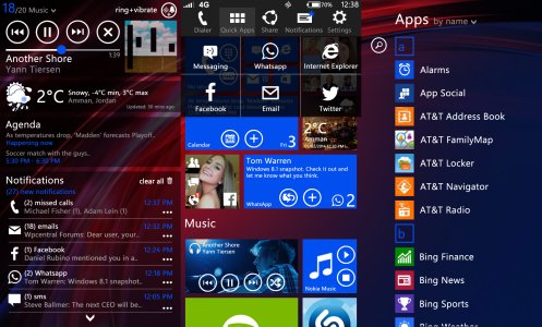
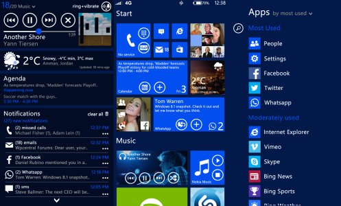
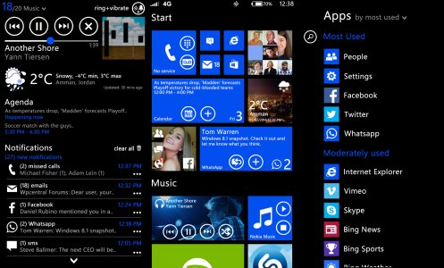
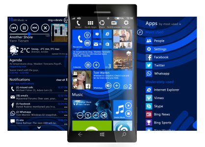
With no further introductions, I am excited to share with you my concept design for how Windows Phone 9 should look like.
(please press on any image to enlarge it)
(please read each new addition and see related screenshots)
( I posted images on two posts as WPCentral doesn't allow the upload of more than 15 images per post)


mine.jpg


Windows Phone 9 UI:


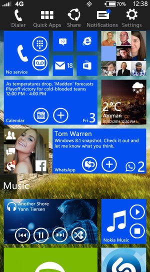
  • New start screen experience, complete with 3 different pages:

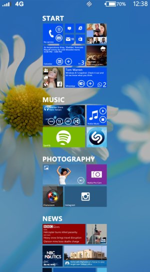
    • New home page, which includes:
      • Background appliance with Parallax effect (both vertical and horizontal).
      • Interactive tiles. (developers have access to a new API where they can add buttons to tiles for quicker access).
      • Grouping of different tiles.
      • SemanticZoom. (pinch-out on the home screen or in apps with this new API for quicker access of scroll-able screens).
      • Double tap on any tile to clear notifications.
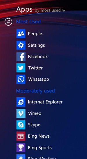
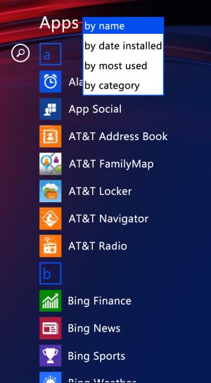
    • App list:
      • Re-arrange your app list with four different ways:
        • By name.
        • By date installed.
        • By most used.
        • By category.
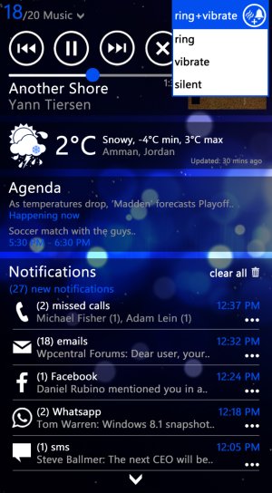
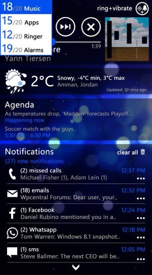
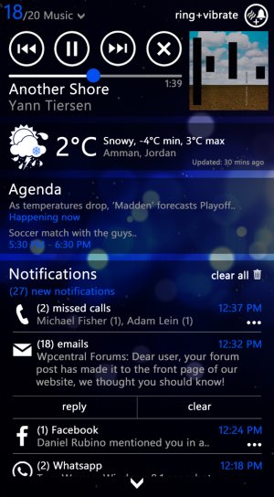
    • Notifications hub, which gathers:
      • Music and volume controls.
        • Control your mobile state, with 4 modes (ring+vibrate, ring, vibrate, silent).
        • Control your volume, with separate controls (master, music, apps, alarms).
      • Weather.
      • Agenda.
      • Dynamic Notifications.
        • Expand notifications.
        • Clear and reply to notifications, with direct links to apps.
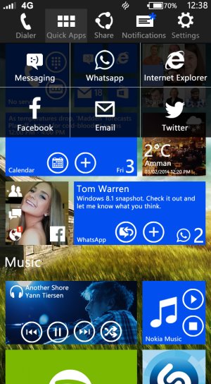
  • Charms bar implementation:

    • Accessible from any place in the system.

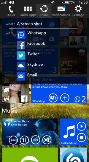
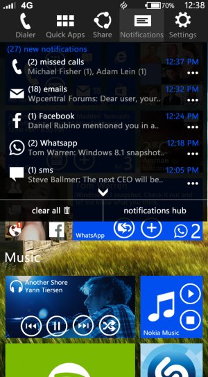
    • Contains different shortcuts, which increases productivity:
      • Dialer shortcut.
      • Quick apps access. (changeable from the phone settings).
      • Universal share button. (quickly share what's on your screen, either a screenshot, a link in IE, a tweet.. depending on the app you are running).
      • Notifications shortcut. (quick access for notifications with shortcuts to the notifications hub).
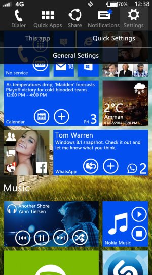
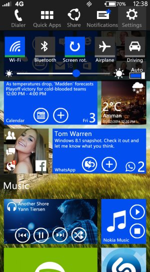
      • Universal settings menu.
        • Quick settings. (toggles)
        • App settings. (a way to organize apps).
        • General settings.
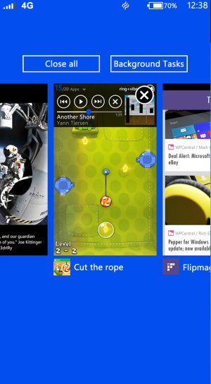
  • Improved multi-tasking menu.

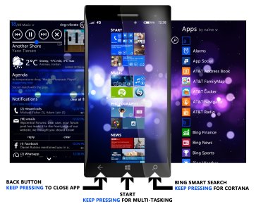
  • Re-assigning of capacitive buttons.

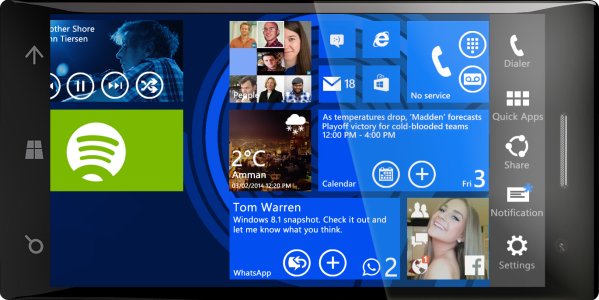
  • Improved rotation experience in the home screen (landscape).

Now with the screenshots:

New home page, which includes:
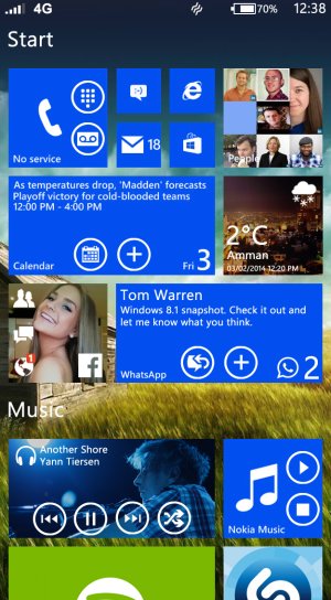
  • Background appliance with Parallax effect (both vertical and horizontal).
  • Interactive tiles. (developers have access to a new API where they can add buttons to tiles for quicker access).
  • Grouping of different tiles.
  • SemanticZoom. (pinch-out on the home screen or in apps with this new API for quicker access of scroll-able screens).
  • Double tap on any tile to clear notifications.
Start.jpg

Semantic Zoom.jpg

App list:

  • Re-arrange your app list with four different ways:
    • By name.
    • By date installed.
    • By most used.
    • By category.

Sorting apps 1.jpg Sorting apps 2.jpg


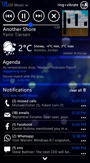
Notifications hub, which gathers:
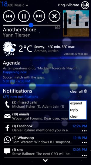
  • Music and volume controls.
    • Control your mobile state, with 4 modes (ring+vibrate, ring, vibrate, silent).
    • Control your volume, with separate controls (master, music, apps, alarms).
  • Weather.
  • Agenda.
  • Dynamic Notifications.
    • Expand notifications.
    • Clear and reply to notifications, with direct links to apps.
not hub 1.jpg

Music controls.jpg volume.jpg

not hub 2.jpg not hub 3.jpg
 

linking1990

New member
Jan 20, 2012
156
0
0
Visit site
  • Charms bar implementation:

    • Accessible from any place in the system.

    • Contains different shortcuts, which increases productivity:
      • Dialer shortcut.
      • Quick apps access. (changeable from the phone settings).
      • Universal share button. (quickly share what's on your screen, either a screenshot, a link in IE, a tweet.. depending on the app you are running).
      • Notifications shortcut. (quick access for notifications with shortcuts to the notifications hub).
      • Universal settings menu.
        • Quick settings. (toggles)
        • App settings. (a way to organize apps).
        • General settings.


Charms bar 1.jpg

Charms bar 2.jpg Charms bar 3.jpg

Charms bar 4.jpg

charms bar 5.jpg charms bar 6.jpg


  • Improved multi-tasking menu.

Multitasking.jpg


  • Re-assigning of capacitive buttons.
Capacitive buttons.jpg


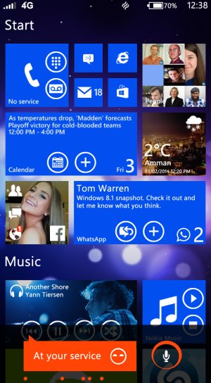
  • Cortana
Cortana.jpg


  • Improved rotation experience in the home screen (landscape).

rotating.jpg

All

all 2.jpg

all.jpg

Concept+solid color.jpg

Concept+black 2.jpg

Update: Solid Color + black were added later.
 
Last edited:

narv

New member
Nov 24, 2012
307
0
0
Visit site
Overall I like it but it seems a bit busy to me. I do like the "gap" you have in the home screen app list where it says "Music" or whatever category you have. And the ability to fast track to a particular category (like you can in win 8 now).

The deep integration of tiles (the ability to add buttons to tiles) seems like a great idea I would just hope that it would have limits so devs don't put a million buttons on their app tiles and make everything cluttered. Though I DO like how on the multi-task screen you can have the deep integration buttons (like go over to the music app, hit next, then scroll back to whatever other app without having to open the app, even though that is something that can be done from vol control.. point remains).
 

wuiyang

New member
Oct 2, 2013
405
0
0
Visit site
everything is ok until the universal share, this will make dev's work and microsoft more complicated and less efficient, i am expecting selectable textblock(the textfield), cortana menu shortcut, charm bar are allowed to hide by slide down or up from the top of the screen, i dont like the background concept, i just want it simple, but it is ok, cause not everyone like simple black or white, also IF ALLOWED TO, the volume control has slide bar beside it
 

linking1990

New member
Jan 20, 2012
156
0
0
Visit site
Overall I like it but it seems a bit busy to me. I do like the "gap" you have in the home screen app list where it says "Music" or whatever category you have. And the ability to fast track to a particular category (like you can in win 8 now).

The deep integration of tiles (the ability to add buttons to tiles) seems like a great idea I would just hope that it would have limits so devs don't put a million buttons on their app tiles and make everything cluttered. Though I DO like how on the multi-task screen you can have the deep integration buttons (like go over to the music app, hit next, then scroll back to whatever other app without having to open the app, even though that is something that can be done from vol control.. point remains).

Thank you sir for your post.

I may agree with on it making everything a little busy, but this would finally come to a decision: simplicity VS functionality, which I think is more to an engineering decision. How much would you sacrifice functionality for the sake of having things more simple? I thought about this a lot, and I came to finally having this. There are lots of things that I cut short in my concept that I thought they might make things a little harder or more busy.

Thanks again for your comment :)
 

linking1990

New member
Jan 20, 2012
156
0
0
Visit site
everything is ok until the universal share, this will make dev's work and microsoft more complicated and less efficient, i am expecting selectable textblock(the textfield), cortana menu shortcut, charm bar are allowed to hide by slide down or up from the top of the screen, i dont like the background concept, i just want it simple, but it is ok, cause not everyone like simple black or white, also IF ALLOWED TO, the volume control has slide bar beside it

Thanks for your post.

I think that Windows Phone concept is about grouping things together in one place, that's why we had the people hub which had everything about your contacts (numbers, facebook, twitter, linkedin), also the pictures hub, music, etc..

When using universal buttons for very common tasks, I think it makes things easier, as you don't have to look for the share button on each different app (some hide them in the 3 dots, others are buttons, others you have to scroll to find them).. I don't know, I've tried this in Windows 8 and liked it very very much.

Thanks again. :)
 

monzki

New member
Dec 7, 2013
94
0
0
Visit site
On second thought the home screen design could overwhelm others. For me I can handle it. I think WP should also offer ability to have some spaces on the start screen without tiles. That would make it more simple and not crowded.
 

Checki

Banned
Apr 17, 2013
200
0
0
Visit site
that looks HORRIBLE !

If i want something like that, i can just buy Android! Nope, MS does it right. We should wait for WP 8.1, it will be great and impressive! I know that :)
 

techiez

Member
Nov 3, 2012
832
0
16
Visit site
that looks HORRIBLE !

If i want something like that, i can just buy Android! Nope, MS does it right. We should wait for WP 8.1, it will be great and impressive! I know that :)

Try to appreciate the hardwork man, I agree much of inspiration is from android but ur words cud hv been better presented, that concept wud hv required a lot of effort n hardwork.
 

Members online

Forum statistics

Threads
323,126
Messages
2,243,304
Members
428,031
Latest member
quicktravo