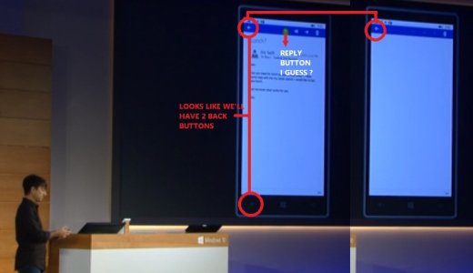
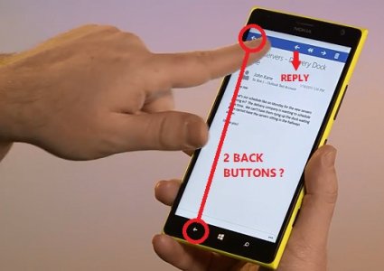
All buttons are going to the top! Horrible

a5cent

New member
Nov 3, 2011
6,622
0
0
Visit site
Look at the phone, I struggle to see any modern UI in the upcoming XBOX universal app. There are a lot of icons that have no obvious visual identity and no label.
Hmm... and what is that arrow at the top left of the xbox app on the phone, right next to the hamburger button? Also a reply button? (sorry tiziano27, couldn't resist)

As for everything else.... man... that hurts my eyes and insults my design sensibilities... The UI is 60% chrome.
 

tiziano27

Banned
Dec 8, 2012
192
0
0
Visit site
Hmm... and what is that arrow at the top left of the xbox app on the phone, right next to the hamburger button? Also a reply button? (sorry tiziano27, couldn't resist)

Well, everything has an explanation. That's just a mock up. It's the layout of an 8-inch tablet in portrait orientation, scaled down to fit in the phone. The XBOX app for phone is not ready.

The 8-inch tablet won't have hard nor soft buttons as the phone does. So, in that context they add the back button as they do in Windows 8.

But that opens other question.. what is more important, perfect consistency or avoid the redundancy of the back button?
 

a5cent

New member
Nov 3, 2011
6,622
0
0
Visit site
what is more important, perfect consistency or avoid the redundancy of the back button?

Why are you framing that as an "either/or" choice? How about both? Like I said, you don't need consistency from 30" displays all the way down to 4.5" smartphones. You do need consistency within a particular category of device. On smartphones with a hardware back button, software back buttons are not acceptable. Period. Secondly, nobody is talking about perfect consistency. There are always exceptions that break the rules. It becomes problematic only when something becomes so inconsistent that you're no longer sure what the rules are. That's where this is headed. And that's what people should be opposed to.
 

jlzimmerman

Member
Jan 3, 2013
815
7
18
Visit site
I agree with what most people are saying here. For those of you who are upset at this change, are you communicating this to Microsoft/Windows Phone in a proper constructive manner, or are you just b**ching about it here where your angst will just go into the toilet and never be read in Redmond? Mmm?
 

SteveNoza

New member
Jul 16, 2014
374
0
0
Visit site
I think the arguments of using the top buttons block your view don't apply as the only time you use them is when you're navigating through your mail (in this case), not when you're typing, typing still works the same. It could even be set up so when the keyboard pops up it would hide the top ribbon.
 

tiziano27

Banned
Dec 8, 2012
192
0
0
Visit site
Why are you framing that as an "either/or" choice? How about both? Like I said, you don't need consistency from 30" displays all the way down to 4.5" smartphones. You do need consistency within a particular category of device. On smartphones with a hardware back button, software back buttons are not acceptable. Period. Secondly, nobody is talking about perfect consistency. There are always exceptions that break the rules. It becomes problematic only when something becomes so inconsistent that you're no longer sure what the rules are. That's where this is headed. And that's what people should be opposed to.

Well, the leading platform, that gets 85% of the love, has both kind of back buttons, and sometimes they do the same, other times not.

But, I agree in this case, I wouldn't add the redundant back button just for consistency, even though It could be confusing to use a 8-inch tablet and a 6-inch phablet with that difference. The concept is easy to grasp, the problem is the muscle memory.
 

jlzimmerman

Member
Jan 3, 2013
815
7
18
Visit site
I think the arguments of using the top buttons block your view don't apply as the only time you use them is when you're navigating through your mail (in this case), not when you're typing, typing still works the same. It could even be set up so when the keyboard pops up it would hide the top ribbon.
Yep. I think it's also important for us to keep in mind is that if this is a universal app. Desktop users don't have a capacity back button and every desktop user is used to having the menu of every application at the top. keeping the code consistent is important, hence the menu at the top. Even at 1:21:55 in the presentation below Joe B said it's the same code.

https://www.youtube.com/watch?v=R8LYzWxpfI8

Yes, it would be nice for MS to give a phone user the option the change the menu to the bottom and maybe that may be the case, if we gather together and suggest it. Maybe it would happen.
 

jjag520

New member
Sep 6, 2013
35
0
0
Visit site
To be fair, when you tap into individual emails on current 8.1 devices, they have a back and forward button despite a capacitive/hardware/on-screen back button.

That's the reply button, not a back button.

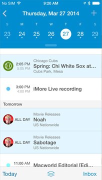
Was referring to these. Joe B. tapped the left arrow on the middle of the ribbon to reply, so betting that's the reply arrow/button. So guessing the arrow on the top left is but a redundant back arrow/button. I don't see why we'd need one for WP since we already have a back capacitive/hardware/on-screen button for that, android does too. iOS really is the only one that needs that dedicated back arrow up there, hence I said the app looks like it was tailored for iOS. The main aesthetic of the app gives off a very iOS7/8 vibe, you know, the whole colored ribbon up top, back arrow on the top left, some more buttons on the other side. Just my opinion though.

Guessing those 4 buttons there are Back, Reply, Reply to all, Forward, & Delete.

Untitled3.jpg
YJUer9B.jpgupto_calendar_iphone_screens_2.jpg
 
Last edited:

mortici

New member
Sep 18, 2013
95
0
0
Visit site
Is there another capture that shows a back arrow?, because I think in the one posted here, that back arrow is the reply command.

Popups should block the underlying UI, or at least block the UI close to the popup. They could also make the volume popup bigger.

When activating a command through touch, you're concentrated targeting the command with the finger, so the effect of the command is out of your visual field. Most of the time the effect of the command is obvious, so there is no need to see the exact change of state. When really want to see the effect give your hand a little angle using your wrist.

The bottom location has problems too, most people don't pay attention to the bottom of the screen. For example, It's a know fact that notification bars at the bottom are never seen. So, there is a little bit of mental overhead to go for the commands at the bottom, specially for new users.

what a5cent mentions is correct and valid. Think of the UI this way: Content & Information at the top half, Navigation & Input at the bottom half. Moving your navigation or input portion to the top half intrudes on the content & information that is being presented, again toast notifications etc block nav. What if you got a toast at the time you wanted to reply or go back, now you went into the toast notifications app, causing frustration...

Its not good design, that's the key thing. It works cross platform but makes for poor UX.

One solution is to have the UX/UI transition to bottom half of the screen when Win10 detects its running on 6" or smaller screen. Think of this way a tablet you will most definitely use two handed, so controls can exist at the top for the most part. Anything smaller like a phone should be operational single handed all the time, no matter what.

Think of a one armed person, on a tablet or pc/laptop whatever they have other modes of input, pen, mouse, touchpad or even touch, etc that can still give you ease of use single handed (those devices are rarely used while walking or doing casual things if anything once you set it to the screen you want say for reading you would pick it up and walk and read and sit down somewhere else or whatever. A phone type device on the other hand should be used single handedly, reading info and writing a note with a pen in the other hand while still navigating the phone, or the one armed person where they walk and need to use the phone without fumbling and possibly dropping a larger device, if your wondering why they would get a large device what if they have poor vision too?

More importantly, they should focus on UX/UI experience across their OWN platform. Provide the services and apps on other platforms with the poor UX/UI, while providing a superior experience on your own platform. Thus giving a reason to switch, "Yes you can have our services on your platform of choice, but if you are on the Windows platform you will have the best experience possible as our UI design keeps the user UX of content over chrome"

MS should set the standard for UX not follow.
 
Last edited:

drankurn

New member
Jun 22, 2011
84
0
0
Visit site
so did someone make a Usevoice Post for this yet?

Discussing it here is fine but it needs to be on the Uservoice for MS/Windows 10 team, before all this changes are finalized.
 

tiziano27

Banned
Dec 8, 2012
192
0
0
Visit site
what a5cent mentions is correct and valid. Think of the UI this way: Content & Information at the top half, Navigation & Input at the bottom half. Moving your navigation or input portion to the top half intrudes on the content & information that is being presented, again toast notifications etc block nav. What if you got a toast at the time you wanted to reply or go back, now you went into the toast notifications app, causing frustration...

What a5cent mentions is valid but not correct. There is no correct UI, many different designs work.

The design you describe was a total failure. I agree with tcp in this. A more compact design where actionable parts of the UI are where makes sense is better. The old, bad and failed metro had too much structure, too much space wasted, too much monochrome, too much dull geometry.

Notifications could be thinner and run through the top border, so they don't cover the commands, or any other solution.

Its not good design, that's the key thing. It works cross platform but makes for poor UX.

One solution is to have the UX/UI transition to bottom half of the screen when Win10 detects its running on 6" or smaller screen. Think of this way a tablet you will most definitely use two handed, so controls can exist at the top for the most part. Anything smaller like a phone should be operational single handed all the time, no matter what.

Think of a one armed person, on a tablet or pc/laptop whatever they have other modes of input, pen, mouse, touchpad or even touch, etc that can still give you ease of use single handed (those devices are rarely used while walking or doing casual things if anything once you set it to the screen you want say for reading you would pick it up and walk and read and sit down somewhere else or whatever. A phone type device on the other hand should be used single handedly, reading info and writing a note with a pen in the other hand while still navigating the phone, or the one armed person where they walk and need to use the phone without fumbling and possibly dropping a larger device, if your wondering why they would get a large device what if they have poor vision too?

WP 8.1 can't be used with one hand, there many elements in the UI that aren't reachable. Android needs a little more use of the other hand. It's not an all or nothing situation.
I don't feel any annoyance using other platforms with the menus at the top.

More importantly, they should focus on UX/UI experience across their OWN platform. Provide the services and apps on other platforms with the poor UX/UI, while providing a superior experience on your own platform. Thus giving a reason to switch, "Yes you can have our services on your platform of choice, but if you are on the Windows platform you will have the best experience possible as our UI design keeps the user UX of content over chrome"

MS should set the standard for UX not follow.

Sure, that's why the improved the UI so much, breaking the shackles of the boring and dull old metro, and making the new design consistent throughout Windows 10.

By the way, the UI guidelines for Metro was completely relaxed with Windows 8.1. I remember Jensen Harris like a bald dictator when he presented Windows 8, saying they you had to respect pixel perfect the sacred proportions of the Modern UI elements, or your app could be rejected. All that was dropped with 8.1, and the do whatever you want guideline was established.
 

cruisezero

New member
Jun 12, 2012
23
0
0
Visit site
You can't try to make a universal app without some compromises. If hamburger button is the compromise then I'll take it. People get too sentimental. If it works and is bringing more apps to the platform because devs have to do less work then I think its a good gain for all of us here.

Edit: spelling
 

naeem151287

New member
Oct 30, 2012
274
0
0
Visit site
I think Microsoft is slowly moving to a User Experience that doesn't need hardware buttons for Back & Search. That is why the UI of Windows 10 is the way it is. It could mean we'll have hardware in the future which won't need anything except a Home button (like the iPhone). Search can be switched on using voice (Hey Cortana) & Back button will be coded in the apps and be part of the UI.

This is just the way I see it. We'll have to wait and see how it pans out in the future.
 

naeem151287

New member
Oct 30, 2012
274
0
0
Visit site
User experience is fickle business. Microsoft must already be thinking 2-3 years down the road while designing the user experience of Windows 10. It's called having a vision. We can't (and shouldn't) comment on it until we have experienced it. So when the Preview is out, take the time out to give honest feedback to Microsoft based on your experience. There is no point raging right now just by looking at a demo and a few mockups.
 

Members online

Forum statistics

Threads
323,235
Messages
2,243,499
Members
428,047
Latest member
rorymi6