Windows 10 UI is still Messy/Inconsistent

spaulagain

New member
Apr 27, 2012
1,356
0
0
Visit site
I was very satisfied with yesterdays Windows 10 announcements. However, one thing I noticed was the UI seemed to be quite unpolished still. And it looked like they were actually using different builds to present different features. So my assumption is the UI is something they are still working on over the next 6 months.

However, there are some things that looked mostly finished but still had some critical design issues IMO. Metro had it's issues, but one thing it was very good at was typography treatment. Especially text alignment. I'm really concerned from what we are seeing so far of Office Touch, Settings, Notifications, etc. that they lost a lot of the design expertise and polish they used to have in WP7 and 8.

Examples...

The text doesn't align on the settings app. And where is the visual hierarchy we are used to? Also, the top UI bars don't have enough breathing room.
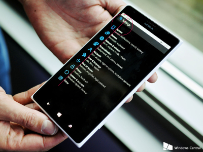
Windows-10-phone-new-Settings_ISSUES.png

Maybe something more like this would be better...
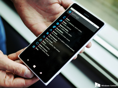
Windows-10-phone-new-Settings_FIX.png

Also, the Cortana UI on the desktop is pretty messy, and why white? And the Task bar Icons?
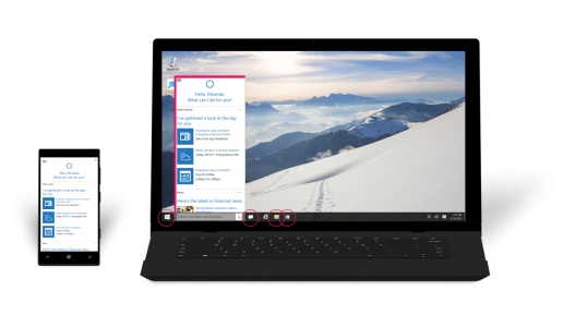
Windows10_Phone_Laptop-3C_ISSUES.png

I'm think it will be better based on this...
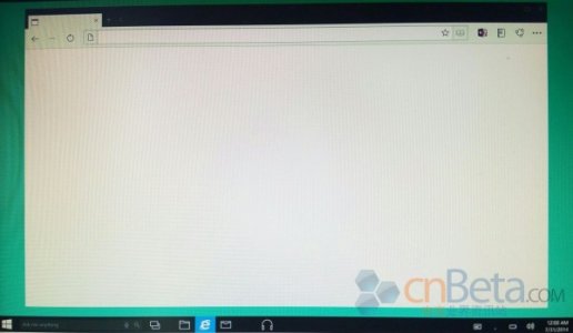
leak.jpg

What do you guys think?

I made this mock-up tonight trying to envision a more polished UI... (matched Cortana to WP version, unified icons in task bar, etc.)
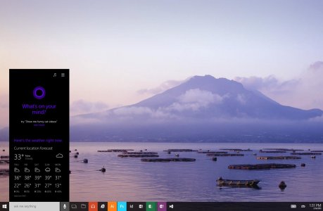
Windows10Concept.jpg
 
Last edited:

alex athanasopoulos

New member
Sep 14, 2013
180
0
0
Visit site
Its an early built so we can ask them to change things to fit better to our needs.
I think that the settings name should be changed as you made it.


But overall i saw that I solved some of our biggest problems. Now we just have to see how the preview will work on our wp.
 

Daniel Olsen

New member
May 3, 2013
117
0
0
Visit site
I'd have to agree, but remember that they are all very early builds. They were just showing us the features and functionality at the core, not the design. I think the UI is going to change a lot as it gets polished out by suggestions from the Insiders. When Joe B lead into the phone portion by saying that they were still pretty rough, he wasn't kidding.
 

spaulagain

New member
Apr 27, 2012
1,356
0
0
Visit site
I'd have to agree, but remember that they are all very early builds. They were just showing us the features and functionality at the core, not the design. I think the UI is going to change a lot as it gets polished out by suggestions from the Insiders. When Joe B lead into the phone portion by saying that they were still pretty rough, he wasn't kidding.

That's what I'm hoping. I guess I thought this announcement would have the more finalized UI already, but we are still 6-9 months away from release. And there will be a preview/feedback program for several months. So plenty of time for them to polish it up.

I'm definitely going to participate in that and actively give feedback. These kind of details drive me nuts if they are off (like literally distract me, lol).
 

TheCudder

New member
Sep 22, 2013
420
0
0
Visit site
Seriously, the "Settings" screen looks perfect as is. It's formatted as an outline. SETTINGS being the header/title and then the list of settings. It works perfectly. The list shouldn't be aligned with the header. And why does the word "Settings" need to be any larger, you already know you're in the settings. The list is what you're focusing on. The Desktop is still not complete, so no reason to even bother commenting on that.
 

Slovenix

New member
Feb 24, 2014
878
0
0
Visit site
I really liked this "polished" and minimalistic thingy when it was presented on our devices (WP, iOS, Kitkat to Lolipop, Windows) in the first place. However now I feel really not impressed anymore with it. So I rather see that Microsoft goes for something in between minimalistic and realistic. I don't think that majority of people really like it to be that way too - minimalistic. Of course no one is to agree with that here, it's Windows Central of course. Try asking people around you and you'll find the answers. I'm more interested in the next era of design, hope it brings up more entertaining look. Anyways don't get me wrong I like the way it is today, but I wouldn't go too far into it and looks like Microsoft's designers agrees with that in W10 for phones. I'm glad we got some color in there. Of course there is room for improvements in both PC (Icons) and phone :).
 

spaulagain

New member
Apr 27, 2012
1,356
0
0
Visit site
Seriously, the "Settings" screen looks perfect as is. It's formatted as an outline. SETTINGS being the header/title and then the list of settings. It works perfectly. The list shouldn't be aligned with the header. And why does the word "Settings" need to be any larger, you already know you're in the settings. The list is what you're focusing on. The Desktop is still not complete, so no reason to even bother commenting on that.

The settings is much better from an organization stand point. The list of items looks fine.

But the text does need to align, especially if they keep the icon in the heading. The outline indentation you speak works if there is a clear enough difference in the indent. In this case, the indentation is close but not, so it looks off. Especially because all the items have a icon to the left.

It doesn't necessarily need to be big, it could be small and caps like it is now on WP. But then the text on the list of items needs to be a little big bigger.

Visual hierarchy and typography really rely on size differentiation and weight. Without it, everything starts to blend with each other and the eye has a harder time deciphering between the two. I'll make another mockup tonight to show the difference.

I know some of this stuff many people just don't see, but to the trained eye they can be quite irritating when done incorrectly.
 

Bas Schwarz

New member
Jul 10, 2014
4
0
0
Visit site
I agree, right now it's really messy.

I just saw some 40 screenshots on Neowin.
And every single screenshot had UI inconsistencies in them.
Badly aligned UI elements. Spacing problems, icon size problems, colour scheme problems, or general inconsistent use of UI language.

Really, these have to be fixed, because right now, it really looks horrible to me.
Hope they fix it, and these are just place holders, to get it shipped.
Overall I'm not impressed.
 

stephen_az

Banned
Aug 2, 2012
1,267
0
0
Visit site
I was very satisfied with yesterdays Windows 10 announcements. However, one thing I noticed was the UI seemed to be quite unpolished still. And it looked like they were actually using different builds to present different features. So my assumption is the UI is something they are still working on over the next 6 months.

However, there are some things that looked mostly finished but still had some critical design issues IMO. Metro had it's issues, but one thing it was very good at was typography treatment. Especially text alignment. I'm really concerned from what we are seeing so far of Office Touch, Settings, Notifications, etc. that they lost a lot of the design expertise and polish they used to have in WP7 and 8.

Examples...

The text doesn't align on the settings app. And where is the visual hierarchy we are used to? Also, the top UI bars don't have enough breathing room.
View attachment 94517

Maybe something more like this would be better...
View attachment 94518

Also, the Cortana UI on the desktop is pretty messy, and why white? And the Task bar Icons?
View attachment 94514

I'm think it will be better based on this...
View attachment 94515

What do you guys think?

I made this mock-up tonight trying to envision a more polished UI... (matched Cortana to WP version, unified icons in task bar, etc.)

View attachment 94520

The level of ego around here at times is astounding. Of course you can design something that is better since you have a vast amount of experience developing UIs for mobile OSs. Don't people have anything better to do with their time? You are looking at an early build - end of story. If you see things that need to be fixed, contact Microsoft's reporting system and I am sure you will get a polite thank you. Of course it will then be filed away with all of the other stuff that assumed UI was finished.

How many times and how many ways do they need to say preview? Maybe it needs to be flashing in neon on every preview and every photo. Perhaps a dancing gif might get attention. BTW, are you aware that the current version of Cortana is also white if you change the scheme from dark to light? Might it not be possible they chose the light background for a presentation since it would be easier to see? Of course, I don't want logic to get in anyone way so everyone please continue with the designs and critiques that will never been of any consequence.

Seriously, what part of Preview is not understood and has no one else seen the equivalent betas from Vista, 7, and 8? For that matter, I would encourage anyone who want to speculate and cutinize at this to take a look at the old betas of Office 2007-2013. They actually used placeholders for some icons and the backstage tab looked different in every build. People might as well be speculating about the color of the boxes for the retail versions of Windows 10 and Office 2016....
 

spaulagain

New member
Apr 27, 2012
1,356
0
0
Visit site
The level of ego around here at times is astounding. Of course you can design something that is better since you have a vast amount of experience developing UIs for mobile OSs. Don't people have anything better to do with their time? You are looking at an early build - end of story.


How many times and how many ways do they need to say preview? Maybe it needs to be flashing in neon on every preview and every photo. Perhaps a dancing gif might get attention. BTW, are you aware that the current version of Cortana is also white if you change the scheme from dark to light? Might it not be possible they chose the light background for a presentation since it would be easier to see? Of course, I don't want logic to get in anyone way so everyone please continue with the designs and critiques that will never been of any consequence.


Seriously, what part of Preview is not understood and has no one else seen the equivalent betas from Vista, 7, and 8? People might as well be speculating about the color of the boxes for the retail versions of Windows 10 and Office 2016....


Speaking of arrogance, maybe you should read my post again. And subsequent posts as well.


I'm well aware this is still a preview and it will have many flaws. My simple point was that I was expecting the UI to be farther a long then this and there are patterns that concern me. Not because they aren't finished, but because they show a pattern of moving away from the design principles WP was built on and I love.


White Cortana is fine with white task bar and theme. But not when the rest is black.


And for your information, I am a UI designer and I have spent countless hours developing interfaces. So yes, I care a lot.


BTW, the effort it took me to make that mock up was less than 2 hours. And I enjoyed doing it. If you have a problem with that, that's your issue.
 

Yazen

Banned
Nov 12, 2012
633
0
0
Visit site
The level of ego around here at times is astounding. Of course you can design something that is better since you have a vast amount of experience developing UIs for mobile OSs. Don't people have anything better to do with their time? You are looking at an early build - end of story. If you see things that need to be fixed, contact Microsoft's reporting system and I am sure you will get a polite thank you. Of course it will then be filed away with all of the other stuff that assumed UI was finished.

How many times and how many ways do they need to say preview? Maybe it needs to be flashing in neon on every preview and every photo. Perhaps a dancing gif might get attention. BTW, are you aware that the current version of Cortana is also white if you change the scheme from dark to light? Might it not be possible they chose the light background for a presentation since it would be easier to see? Of course, I don't want logic to get in anyone way so everyone please continue with the designs and critiques that will never been of any consequence.

Seriously, what part of Preview is not understood and has no one else seen the equivalent betas from Vista, 7, and 8? For that matter, I would encourage anyone who want to speculate and cutinize at this to take a look at the old betas of Office 2007-2013. They actually used placeholders for some icons and the backstage tab looked different in every build. People might as well be speculating about the color of the boxes for the retail versions of Windows 10 and Office 2016....

Why so mad bruh?
Microsoft is releasing this preview so people can take the releases critically. Makes for a better overall product.
 

rockstarzzz

New member
Apr 3, 2012
4,887
1
0
Visit site
Are we complaining that a beta preview that isn't even yet a consumer preview isn't looking nice? It would be fair if we had this sort of errors in design after consumer preview, but with tech preview, really?
 

realwarder

New member
Dec 31, 2012
3,689
0
0
Visit site
Are we complaining that a beta preview that isn't even yet a consumer preview isn't looking nice? It would be fair if we had this sort of errors in design after consumer preview, but with tech preview, really?

The insider track is pretty much Alpha - lots of things are still changing. Beta comes when things solidify. The RC/Preview when Beta is solid.

It is all a mix and I was shocked when I ran up the latest Insider W10 myself (in a VM), but this is real early and definitely Alpha grade. It will quickly get better :)
 

a5cent

New member
Nov 3, 2011
6,622
0
0
Visit site
^ I think we're still going through a bit of a culture shock. None of us are used to getting MS software that is this raw. It takes a while to realize that previous experiences with beta software don't apply here. It's also worrying to see how MS is seemingly nowhere close to having a releasable product, but it's also easy to forget that they literally have thousands of people working on W10 right now.
 

spaulagain

New member
Apr 27, 2012
1,356
0
0
Visit site
Are we complaining that a beta preview that isn't even yet a consumer preview isn't looking nice? It would be fair if we had this sort of errors in design after consumer preview, but with tech preview, really?

Not complaining, just noting issues. After all, that's what they want us to do.
 

Kram Sacul

New member
Mar 4, 2013
750
0
0
Visit site
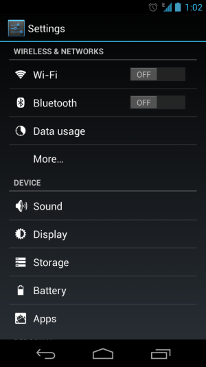
Whenever I see that "new" settings screen I think of this:

Android-Settings-1.png

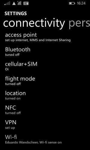
Just a lazy and uninspired design compared to what we have now. The only problem with the current settings screen is instead of properly categorizing things they just added more to the system list. They should've just expanded upon what was already there and given us something along the lines of this:

3.png
 

androidtoWM

New member
Nov 15, 2012
375
0
0
Visit site
as a developer i hate it when my PM tells me that the demo build i made to show a feature has inconsistent UI.

it's a pre-alpha build. give it some time before complaining about something.
 

Asik15

New member
Sep 1, 2013
662
0
0
Visit site
Come on guys stop complaining ... atleast help em by giving a proper feedback !!! No use in complaining or whining !!
 

Members online

Forum statistics

Threads
323,275
Messages
2,243,560
Members
428,053
Latest member
JoshRos