Learning to appreciate Win 10 and Hamburger

zack251

New member
Jan 22, 2013
268
0
0
Visit site
After using Windows 10 Technical Preview for phones, things start to make sense. If previously I spent times to navigate the pivot tabs to go to the screen that I want, with hamburger menu, I can shorten the process i.e. no more I have to go one by one of the screens.

I am still exploring the new design and so far I like it. No more wasted space and cut off words. Just look at the new photo app, very functional, beautiful and fast.

Finally, please read Paul Thurrott's view on this:
https://www.thurrott.com/mobile/windows-phone/1422/yes-still-love-windows-phone
 

anon(5445874)

New member
Dec 6, 2012
673
0
0
Visit site
Yeah, the Hamburger gets a bad name here. But it's used almost everywhere, even Windows Central has a hamburger menu, as do most websites in mobile mode.
 

Kram Sacul

New member
Mar 4, 2013
750
0
0
Visit site
Nope. If I wanted to use a clunky poorly designed OS I would've continued to stick with Android 3 years ago. All this "better get used to this" nonsense is a big FU to many people that were drawn to WP in the first place. The big magazine like headers, the pivots, the layout of apps were all a part of what set WP apart. It's called STYLE. Sadly somewhere along the way MS forgot about this.

The hamburger menu is just a poor man's way of getting to other options. With WP we have ... which is much more elegant, compact, and positioned near your thumb. There is no reason to accept the asinine idea that we suddenly need hamburger buttons. The last time I checked Windows 10 isn't a mobile website.
 

wpn00b

New member
Jan 9, 2013
542
0
0
Visit site
Nope. If I wanted to use a clunky poorly designed OS I would've continued to stick with Android 3 years ago. All this "better get used to this" nonsense is a big FU to many people that were drawn to WP in the first place. The big magazine like headers, the pivots, the layout of apps were all a part of what set WP apart. It's called STYLE. Sadly somewhere along the way MS forgot about this.

The hamburger menu is just a poor man's way of getting to other options. With WP we have ... which is much more elegant, compact, and positioned near your thumb. There is no reason to accept the asinine idea that we suddenly need hamburger buttons. The last time I checked Windows 10 isn't a mobile website.

These are my thoughts exactly. I am getting used to it but I'm seriously considering writing Microsoft about this. It's somewhat upsetting that they seem to be dialing back their unique vision for the sake of... I don't know.
 

Kram Sacul

New member
Mar 4, 2013
750
0
0
Visit site
It doesn't have to be consistently ugly and awkward to use though. It also doesn't mean they have to suddenly abandon and ignore years of their own research on one handed usability and other important design ideas. From some of the apps in W10 you'd think the design team is suffering from amnesia.

Doesn't this mean anything anymore?
IC713299.png

More info here.
 

Alain_A

New member
Dec 2, 2012
988
0
0
Visit site
until someone from MS comes in and chime nobody knows why they are doing what they are doing.. there must some other reason as to why.
I have a BB Z30 and it is the same with the swiping sideway to work the phone. to often when I am in any apps in the phone and type something, if it is not bang on, the window wants to slide which I don't like. Now the new way will prevent that..
 

Praxius

New member
Jun 23, 2014
229
0
0
Visit site
The pivots were nice and unique but they weren't perfect and had their flaws, such as having to slide and slide and slide to what I wanted.

If they go completely, I can't honestly say I'd miss them.
 

white_Shadoww

New member
Jan 11, 2015
374
0
0
Visit site
Nope. If I wanted to use a clunky poorly designed OS I would've continued to stick with Android 3 years ago. All this "better get used to this" nonsense is a big FU to many people that were drawn to WP in the first place. The big magazine like headers, the pivots, the layout of apps were all a part of what set WP apart. It's called STYLE. Sadly somewhere along the way MS forgot about this.


The hamburger menu is just a poor man's way of getting to other options. With WP we have ... which is much more elegant, compact, and positioned near your thumb. There is no reason to accept the asinine idea that we suddenly need hamburger buttons. The last time I checked Windows 10 isn't a mobile website.


Yes, using Windows Phone was just like reading a beautiful book. Those large headers, pivots and page turning animations.
 

anon(5325154)

New member
Feb 18, 2011
230
0
0
Visit site
No solution is perfect, the hamburger solves the direct access issue but brings many other flaws of its own, I wouldn't call it an improvement over pivots, all things considered.

Honestly, just how time consuming is flicking through the pivots with your thumb? Versus say, adjusting your grip, or stretching your thumb, or bringing your other hand to open the hamburger menu, select an item, and wait through the menu's closing animation? People have been using the slide gesture to switch between pages for ages, since you know, that's how you flick through the homescreens on iOS and Android. I certainly don't see iOS and Android users wishing to replace their multiple homescreens with a hamburger menu (even they know better than that right?)
 

Ma Rio

New member
Sep 28, 2013
1,291
0
0
Visit site
I'm amazed by how well Kram Sacul put it. If they force us to use it, I'll probably get used to it, but that doesn't mean I'll like it.

Look at the old version of Alarms, and look at the new version of Alarms (in W10), and tell me which one looks better.
WSA_Design_L2_1_UniquelyWindows_ModernDesign_702x394px_InvariantCulture_Default.jpg


I know it ain't a final product, but still, keep design in mind please.
 

a5cent

New member
Nov 3, 2011
6,622
0
0
Visit site
Yeah, the Hamburger gets a bad name here. But it's used almost everywhere, even Windows Central has a hamburger menu, as do most websites in mobile mode.

It's not just here. Look at the comments on nearly any blog post discussing W10M on any site. It's everywhere.

In fact, it's not even just WP fans, but pretty much the entire UI design community that have come out against this mode of navigation and button placement at the top left, particularly during 2014. It's at least a bit ironic that MS' future standard is what most others are trying to move away from.

I have no opinion on whether this will negatively affect WP market share. Maybe. Maybe not.

Either way, I don't think there is a legitimate debate to be had over whether this is better or worse. I'm sure MS is fully aware of the sacrifices they are making, both in terms of consistency and UI/UX. The bigger question is whether whatever else it is they have up their sleeves is worth that sacrifice. I hope it is. If it is, we'll learn to appreciate the net benefit.
 

tiziano27

Banned
Dec 8, 2012
192
0
0
Visit site
Pivots have many problems:
As OP said, they force the user to navigate through unrelated pages to get to the desired content. In low-end phones It's slow.
Pivots shows only two or three page titles at the top, all the other pages are effectively hidden from the user.
Pivots make impossible to see a high level view of the app structure.
Pivots cycle from the last page to the first page, confusing the average user.

Microsoft is finally fixing the huge usability problems of WP.
 
Last edited:

a5cent

New member
Nov 3, 2011
6,622
0
0
Visit site
The pivots were nice and unique but they weren't perfect and had their flaws, such as having to slide and slide and slide to what I wanted.

If they go completely, I can't honestly say I'd miss them.

Pivots were never intended to have more than four parts. Recommended is three. I don't think I have a single app installed where I can't reach the intended section with but a single swipe.

What you (and tiziano) are describing is just another developer screw up. Most developers are terrible UI designers. Fact of life unfortunately. Developers can screw up any other UI paradigm just as easily. Whether it's a pivot or not.

In fact, as evidenced by the developer guidelines, the pivot is not even intended to be used as a navigational control the way a side panel is. In some cases it was just misused as such, probably because MS does not provide developers with any standard approach to navigation at all (except the hub, which is appropriate only for media intensive apps).

Where I agree with you is that Metro was far from perfect and had a lot of potential for improvement. My question is why not evolve and improve Metro into the best it could have been, rather than throw everything out and start anew?

MS has been doing this for years... start something, stop half way, and then start over.

Doing so with their development technologies, after alternatives appeared, is how they lost the support of many developers.
 
Last edited:

Oliverspin

New member
Mar 27, 2014
263
0
0
Visit site
Nope. If I wanted to use a clunky poorly designed OS I would've continued to stick with Android 3 years ago. All this "better get used to this" nonsense is a big FU to many people that were drawn to WP in the first place. The big magazine like headers, the pivots, the layout of apps were all a part of what set WP apart. It's called STYLE. Sadly somewhere along the way MS forgot about this.

The hamburger menu is just a poor man's way of getting to other options. With WP we have ... which is much more elegant, compact, and positioned near your thumb. There is no reason to accept the asinine idea that we suddenly need hamburger buttons. The last time I checked Windows 10 isn't a mobile website.


No one said "better get used to it," they said they ARE getting used to it. They're saying that after trying it they realize it's better than expected.
"Magazine like headers" I don't know what to say....maybe the title of the magazine is that big, but the actual headers for articles(the useful parts) are much smaller and use space much more efficiently.

Like many other people, you're just SAYING stuff. You're just spurting opinion. On top of that, you don't even give logical reasons. Why do we need the menu right by our thumb? Think about it, you're going to be interacting with the page content MUCH more than the settings, so why do the settings need to be right there. It seems to me that they are out of the way the new way.

"The last time I checked Windows 10 isn't a mobile website." It doesn't matter, those websites are made to be easy, simple, and usable. It doesn't have to be a phone OS to contribute to a point.
 

white_Shadoww

New member
Jan 11, 2015
374
0
0
Visit site
No one said "better get used to it," they said they ARE getting used to it. They're saying that after trying it they realize it's better than expected.

"Magazine like headers" I don't know what to say....maybe the title of the magazine is that big, but the actual headers for articles(the useful parts) are much smaller and use space much more efficiently.

Like many other people, you're just SAYING stuff. You're just spurting opinion. On top of that, you don't even give logical reasons. Why do we need the menu right by our thumb? Think about it, you're going to be interacting with the page content MUCH more than the settings, so why do the settings need to be right there. It seems to me that they are out of the way the new way.

"The last time I checked Windows 10 isn't a mobile website." It doesn't matter, those websites are made to be easy, simple, and usable. It doesn't have to be a phone OS to contribute to a point.

Except what is put under the hamburger is not only settings but categories, ex. in Photos app, Albums and Folders are put there, which we need to use more often.
 

theefman

Active member
Nov 14, 2008
3,979
5
38
Visit site
for the sake of consistency across devices.


But doing it without taking into account the different form factors the controls will be used on is poor design. What works on a PC wont necessarily work on a phone.


People don't expect to use a PC or tablet one handed so navigation menus in the top corner of the screen don't matter as much as on a phone where one handed uses is much more natural. Sticking menus at the top of the screen as opposed to near your thumb is poor design, consistency across devices is no excuse.
 

manicottiK

New member
Nov 24, 2011
660
0
0
Visit site
In fact, as evidenced by the developer guidelines, the pivot is not even intended to be used as a navigational control the way a side panel is. In some cases it was just misused as such, probably because MS does not provide developers with any standard approach to navigation at all (except the hub, which is appropriate only for media intensive apps).
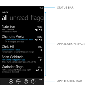
This is so spot on. There is no traditional "tab control" in WP. The Pivot, which looks an awful lot like a tab control, was specifically NOT supposed to be used in that way. In the way that Microsoft envisioned and documented it, each panel on a pivot was to show the same data types and formats, but with different filters applied to each. The Email app is a follower of that model: each panel is a list of mail with a filter applied (none, unread, flagged, or urgent).

As a5cent said, lacking anything else, developers "misused" (well, I prefer "extended") the Pivot control to create tabs. I do it in my own apps because there is no provided and instantly recognizable alternative.

I just took a quick look for pivots in my biggest app. The first three links from the initial pano page go to three Pivot pages, each using a different "tab model". The All Courses pivot had panels for this semester and next, so it follows the MS-preferred pivot usage of each panel being a filter (i.e., different semester filters of the full course list). The Schedule pivot has panels for Daily View, Weekly View, and Finals View -- this isn't quite what MS had in mind, particularly because the latter two are grids while the first one is a list. The Info page totally ignored MS with "tabs" for Release Notes, Tips, an Feedback.

I won't even make an argument that I followed the guidelines for pivots. I also won't apologize for it because 1) the "rule" is too subtle, 2) users aren't even aware of the rule and actually do think that pivots are "Metro tabs", and 3) there's no alternative offered. In my view, as long as the panel appear related to their parent page, anything is OK. So, if I'm on a page titled "All Courses," I should not see tabs for Spring Semester, Sports Scores, and Settings. (One could argue that those would be a fine set of tabs for a page called "Things that Begin with S," but this isn't a Jeopardy category. :wink:
 

Members online

No members online now.

Forum statistics

Threads
323,183
Messages
2,243,404
Members
428,036
Latest member
Tallgeeselll05