[Concept] My Windows 10

Maonsie

New member
Mar 12, 2014
47
0
0
Visit site
Firstly, I'll say that I'm not sure if this is where this goes, but . . . yolo.

So there's this nifty little Office program called Sway (which looks gorgeous in motion), and I was feeling a bit inspired so I put together the start of a few things I want from Windows 10 (and the future of Windows in general). There's not too much there right now other than a little concept I'm calling Quick Access Functions in the Action Centre, and it is extremely WIP.
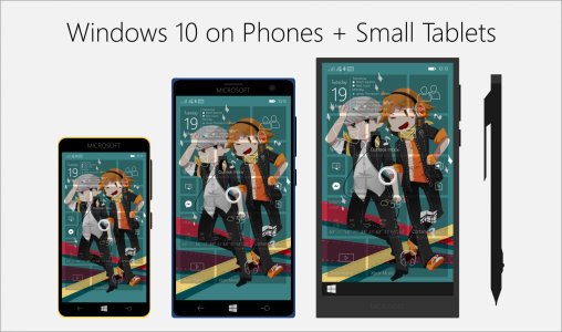
Promo4.jpg

Here's a link to it: https://sway.com/HbP2hFNHt3lzTFu-

As tiring as it is to see concepts all the time - I hope someone enjoys this, and all comments are greatly appreciated. :)
 
Last edited:

teckris

New member
Aug 7, 2013
819
0
0
Visit site
Firstly, I'll say that I'm not sure if this is where this goes, but . . . yolo. So there's this nifty little Office program called Sway (which looks gorgeous in motion), and I was feeling a bit inspired so I put together the start of a few things I want from Windows 10 (and the future of Windows in general). There's not too much there right now other than a little concept I'm calling Actionable Quick Panels.

Here's a link to it: https://sway.com/HbP2hFNHt3lzTFu-

As tiring as it is to see concepts all the time - I hope someone enjoys this, and all comments are greatly appreciated. :)

Toooo much details into action center.. Didnt like it. Would prefer simplified options...
 

m3tv

New member
Nov 19, 2013
111
0
0
Visit site
Amazing Concept! Loved it, a little too much in the action center though. Remove some stuff, make it a bit more simplified and it's perfect. REALLY loed the Media and Cortana integration
 

Maonsie

New member
Mar 12, 2014
47
0
0
Visit site
Toooo much details into action center.. Didnt like it. Would prefer simplified options...

Amazing Concept! Loved it, a little too much in the action center though. Remove some stuff, make it a bit more simplified and it's perfect. REALLY loed the Media and Cortana integration

Thanks to both of you for taking a look! I agree that I was a bit heavy in too much stuff that all clashed with each other, and I've made some significant changes to how it both looks and functions. Still working on the Xbox redesign, but are Cortana and the Media Playback options any better?

Thanks again. :)
 

teckris

New member
Aug 7, 2013
819
0
0
Visit site
Thanks to both of you for taking a look! I agree that I was a bit heavy in too much stuff that all clashed with each other, and I've made some significant changes to how it both looks and functions. Still working on the Xbox redesign, but are Cortana and the Media Playback options any better?

Thanks again. :)

i would like to see media info rather than volume control.
why need cortana? it has a dedicated button...
 

m3tv

New member
Nov 19, 2013
111
0
0
Visit site
Thanks to both of you for taking a look! I agree that I was a bit heavy in too much stuff that all clashed with each other, and I've made some significant changes to how it both looks and functions. Still working on the Xbox redesign, but are Cortana and the Media Playback options any better?
Thanks again. :)

Absolutely love the re-design. Do you mind checking out my concept? Thanks
 
Last edited:

thephiri2point1

New member
Apr 14, 2014
119
0
0
Visit site
Love the concept. Few comments. Cortana doesn't belong in the action center. For one the search button would work better and if you had Cortana in the action center what happens to all the other info that is already there? Will it just not show them or do they go below all of Cortana's info? Last comment is about video in the action center. Would the idea be to let it play in the action center. If so it would be too small and even if you thinking of playing it while doing something else then that wouldn't work because you better off having it in a small window. If its just there to show there is/was a video playing I think it would take too much space and be too cluttered with other info. Once again nice concept. Would like to see more
 

TechFreak1

Moderator
May 15, 2013
4,611
5
38
Visit site
Some good ideas there.

Feedback:

Media

1) Long pressing the pause button, stops the music (it drives me potty that I have to use a separate app to stop music & clear the now playing bar) and clears the now playing bar + persistent controls.

2) Tapping the Media toggle launches the tray at bottom of the screen, to make it easier to use with one hand

Cortana:

1) The shortcut in the action centre is redundant as she as a dedicated search button, so by removing this you simplify the look and reduce the clutter as you just would have the Media & Xbox toggles.

2) Instead of the pull down menu, move this to the bottom so when a user taps the search key Cortana launches in the same sized window but at the bottom (which can be expanded to full screen with a swipe up from drawer handle). Similarly long pressing the search launches the same window but with Cortana in listening mode, the same would apply if the user invokes "Hey Cortana".

Xbox:
What I would like to see similar drawer design to the above loading up from the bottom with pivots
1) For quick access to Messages with the ability to tap to read, reply/send message (would expand the tray upwards to enable space for the keyboard and to read the message) & delete

2) For quick access to the Friends with the ability to see who is online, send message button, whilst displaying the gamertag who the message is being sent above the microphone so the user can see who the message is being sent to.

3) For quick access to smartglass remote which would launch within the tray and so swiping up would expand the tray upwards to expand the remote. Closing it would close the remote (options in the app's settings would enable the user to customize whether it minimizes to the tray or closes it completely so when the user presses the xbox toggle in the action centre it launches the tray with the remote - basically last used view)

4) Swiping over to or tapping "launch smartglass / xbox app" would launch the app
 

bo_woods

New member
Aug 14, 2014
1,449
0
0
Visit site
And does anybody else agree the windows search button on Lumina should point straight to the right like in this concept instead of being tiltedlike right now, I think the it looks better when its straight
 

thephiri2point1

New member
Apr 14, 2014
119
0
0
Visit site
And does anybody else agree the windows search button on Lumina should point straight to the right like in this concept instead of being tiltedlike right now, I think the it looks better when its straight
I like the current one. looks more like a search tool than if it was straight like the concept
 

Members online

Forum statistics

Threads
323,300
Messages
2,243,596
Members
428,055
Latest member
DrPendragon