Thread for UI mock-ups
- Thread starter joseph3423
- Start date
You are using an out of date browser. It may not display this or other websites correctly.
You should upgrade or use an alternative browser.
You should upgrade or use an alternative browser.
manicottiK
New member
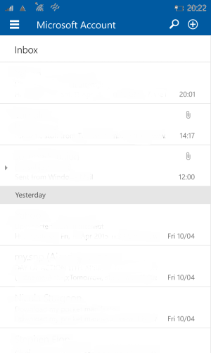
You probably won't like this, but I'd app an app bar at the bottom. If would contain a hamburger menu at the left to navigate mailboxes, buttons for Search, Refresh, and New Message, and an ellipsis at the right to bring up a menu showing the Settings page. I'd move the folder name from its current position in between the hamburger and the action buttons to an overlay of the status bar (like the MSN News app does) since I don't (or at least shouldn't) have to worry about those icons most of the time.
In other words, I'd accept the hamburger as a navigational control, but I'd do it in a way consistent with the usability advances that Microsoft designed back in 2010: putting controls where users can reach them and hiding information that isn't necessary all of the time. As a user, I don't think that I'd be confused that the hamburger and buttons moved around from device to device. The key to an adaptive design is to design for the DEVICE rather than the WIDTH of the device. Putting controls at the bottom of a phone makes sense because of how we hold the device -- that doesn't make special sense for a narrow window on a laptop or tablet screen.
I'd also move the Action Center notification indicator rightward until its just left of the battery. And I'd make it work like the battery icon does when there's text in the status bar. If there are no notifications, it would be hidden; when there are notifications, it would show, just as a low battery icon does.
Similar threads
- Replies
- 6
- Views
- 1K
- Replies
- 0
- Views
- 1K
- Replies
- 0
- Views
- 2K
- Replies
- 7
- Views
- 859
Latest posts
-
-
Manor Lords: How to get Firewood
- Latest: Windows Central
-
Manor Lords: How to fix Homelessness
- Latest: Windows Central
Trending Posts
-
These Manor Lords upgrades are so overpowered you'd be crazy not to use them
- Started by Windows Central
- Replies: 0
-
Manor Lords: How to fix Homelessness
- Started by Windows Central
- Replies: 0
Forum statistics

Windows Central is part of Future plc, an international media group and leading digital publisher. Visit our corporate site.
© Future Publishing Limited Quay House, The Ambury, Bath BA1 1UA. All rights reserved. England and Wales company registration number 2008885.


