The UI problem with Windows 10 for Phones

Slovenix

New member
Feb 24, 2014
878
0
0
Visit site
I can see why some people might like a landscape start screen, but I reckon it'd be a particularly hard design task. For such a small screen, the transitioning between one and the other could be troublesome. And everyone will want it to be done in a smooth way. But "prioritising" which Tiles fit where when rotating between the two sounds like a challenge.
That said, I've not seen how they do it on desktops (I lock my tablets to landscape). Might give it a whirl now and see what the process appears to be.

Try screenshots on the phone. Always looks nice to me.
 

Slovenix

New member
Feb 24, 2014
878
0
0
Visit site
Another dream is that we could use wallpaper and livetile background at the same time. I can already see the creativity.

This wins me.
 

Protocol Rahul

New member
Aug 17, 2013
191
0
0
Visit site
Here's a thought for people who say swiping is not convenient or having a hamburger menu system is better then swiping:
Why not, replace the whole swiping on the start screen ie, swiping from the right to open app view, by adding the hamburger to open the app view(have it placed any where you want).
 

loribinca

New member
Mar 7, 2012
336
0
0
Visit site
I've seen enough of where windows is heading to know that I am going to be staying on 8.1 on all my devices. They're changing the design ethos too much.
 

Kram Sacul

New member
Mar 4, 2013
750
0
0
Visit site
Here's a thought for people who say swiping is not convenient or having a hamburger menu system is better then swiping:
Why not, replace the whole swiping on the start screen ie, swiping from the right to open app view, by adding the hamburger to open the app view(have it placed any where you want).

Don't give MS ideas.
 

Pierre Blackwell

New member
Nov 26, 2012
313
0
0
Visit site
A lot of people make very good points. The whole purpose of these forums is to provide objectivity in a constructive, and cerebral manner, or at least try to. At the end a lot is predicated on a persons own view points, so with that I'll provide mine. MSFT is a business. We can all agree with that. They are still the leading software company, and one of the leading computer technological companies. This isn't something that has happened by mere happenstance. Calculated, metric and monetary decisions have been made to maintain that foothold. With that being said, while the market share statistics are encouraging in Europe, and some growing markets, they're not oblivious to the 3% market share value in the country that the hub of the business resides in. MSFT is knows that it's incumbent to get developers onboard with supporting their brand, but it's the brand of Windows, because they've shuddered at the mention of Windows phone. Developers are going to gravitate to where the masses congregate because that usually results in more revenue. So with that being said, it would only make sense to adopt more of a PC/laptop/tablet UI interface since those are the areas where MSFT still dominate, or are increasing in popularity across the board. While I agree with many of you about the UI changes, many of us are using the same UI outline on a PC or laptop and aren't complaining about that. I would like to see MSFT create an option for the mobile iteration of Windows 10 that allows you to slide the task bar so it doesn't have to stay at the top of the screen. I don't mind the lack of panoramic or pivot capability, because it's a matter of what you're used to. Again, we're familiar with the functionality of the applications, just not from a mobile device. Through repetition, like anything else we will become familiar. I think MSFT is doing the right thing from a business perspective, while not completely compromising what we have grown to love about what the UI interface provides. I love the outlook and calendar conversion. I can get past the circles. I love the Skype integration with the messaging app, and the people hub/contacts will only get better.

In retrospect, we also have to remember that this is by no means the final build and many of these applications in their current state are going to have many changes. I think when everything is said and done the majority of us will be satisfied with the majority of the finished product.
 

Jazmac

New member
Jun 20, 2011
4,995
4
0
Visit site
I've seen enough of where windows is heading to know that I am going to be staying on 8.1 on all my devices. They're changing the design ethos too much.
Change is difficult for a lot of people in the computer game. Don't jump until you're prepared to advance to the next level.
 

loribinca

New member
Mar 7, 2012
336
0
0
Visit site
Change is difficult for a lot of people in the computer game. Don't jump until you're prepared to advance to the next level.

I don't understand your comment. I feel that MS are slowly changing everything that was unique and differentiating to owning a windows phone. its slowly becoming a 'me too' device - to me it's losing it's character and charm .. to me, it's like an indie band you like 'selling out' ..

This is my personal opinion, but from what I've been reading in several places, its an opinion shared by many.
 

Jonnie LasVegas

New member
May 15, 2014
372
0
0
Visit site
I've been one of the biggest detractors of WP10 (I call it that for simplicity and my sanity. What is with the awful naming popping back up at Microsoft, lol). But after accidentally installing it, yes accidentally long story, I love it! Even the design elements changing haven't ruined it for me. Yes much of it is still raw and needs refinement, but it's also refreshing. The new functionalities it brings make it fun and new again. And the transitions from metro to the new design aren't as jarring as expected. With exception to the people hub, which is a mess. I feel Microsoft might finally have a winner with this OS.
I also found I love providing feedback, feels good to help shape things and to let them know what they've got right as much as wrong.
 

tk-093

New member
Aug 30, 2010
1,465
1
0
Visit site
To me, the iOS is a grid of icons. Android is a grid of icons with widgets. Windows Phone is a grid of icons and widgets getting it on and making awesome babies.

The pivots and stuff once you get past the home screen doesn't really matter... and really App parity is the #1 thing that matters and here's hoping with W10 we get more apps or I'm going to be stuck using this stupid iPhone forever. God I hate iOS.
 

Protocol Rahul

New member
Aug 17, 2013
191
0
0
Visit site
For me at this stage, something is missing, every time I open setting from my start screen, something feels different, it is no longer that feeling of wow when I first used windows phone, I don't really know. Let's see what new builds offer and what full OS would look like. Long road ahead.
 

chalx

New member
Jul 13, 2014
23
0
0
Visit site
IDK but I always had a feeling that MS and 3. Party devs didnt know what to do with classic Metro UX. Yeah, I understand flat design, but WP7, 8 and 8.1 are looking not only flat, but also shallow, and weightless. When you pass a start screen tiles and jump into the menu everything looks like eink. IDK, people doesn't want to have hi specs phones with bunch of empty space and some text on their screens. Accents are dull and ugly, choice of black and white background is also dull, endless scrolling is dull, horizontal swiping without knowing what screen comes next is dull so I think MS should to do something with UX eventually.
 

manicottiK

New member
Nov 24, 2011
660
0
0
Visit site
...every time I open setting from my start screen, something feels different, it is no longer that feeling of wow...
One of the reasons may be that the WP10 Settings page doesn't give you any information about current settings, just a list of things that can be adjusted. It is as if the designers of the new Settings app ignored the idea of live tiles (i.e., surfacing content to users instead of making them go to it). Instead, I must tap each group, then tap an individual setting to see how things are configured. There's still time to fix this. I wasn't at all worried when I saw this in the first tech preview, but I am a bit dispirited that it's just as bad in the second preview. Fingers crossed...
 

jlzimmerman

Member
Jan 3, 2013
815
7
18
Visit site
Well *sigh* as much as I would kick and scream if the UI did go more Android, or even looked just like it, I would still stick with WP. Why? Because it isn't from Google or Apple.
 

DCTF

New member
May 16, 2013
229
0
0
Visit site
One of the reasons may be that the WP10 Settings page doesn't give you any information about current settings, just a list of things that can be adjusted. It is as if the designers of the new Settings app ignored the idea of live tiles (i.e., surfacing content to users instead of making them go to it). Instead, I must tap each group, then tap an individual setting to see how things are configured. There's still time to fix this. I wasn't at all worried when I saw this in the first tech preview, but I am a bit dispirited that it's just as bad in the second preview. Fingers crossed...

Settings was always the worst part of WP8, though. It's the best argument in the entire operating system for going for a smaller text size, just to cut the length of the settings list. It was ridiculous; I would forget what I'd scrolled past by the time I got to the bottom, then carefully scrolling back up thinking, "Alright, is there any chance the setting I'm looking for might be in HERE?". It's still got some problems on that score, but at least I can cast my eyes over that menu in one go.

Live tiles were a decent enough idea, but when you got enough of them flipping over continually (and three was uncomfortable, four was horrendous) then it became the opposite of what it was intended to be: a fresh-feeling antidote to the overdressed looks of old iOS and Android setups. The new WP10 is going into dangerous territory again, because the Start page design parameters lend themselves more easily to ugliness than to beauty.
 

Ma Rio

New member
Sep 28, 2013
1,291
0
0
Visit site
I'm too late to the party. Can't catch up with everything that's going on here. But I also am disapointed in the way the UX is going.

Most of you have been mostly talkin' about usability. That has suffered, and it's really sad to see things going that way, but let's not forget the other part.

The other part is the design - how everything looks, beauty-wise.

Instead of going to something new and cool, things seem like they're going backwards (as someone said, back to Android from 2011). How do you mess things up that bad, and not ask yourself 'Where are we going with this'? I'll post a few pictures comparing what W10 is, and what it could have been, and even what is was and isn't going to be anymore.

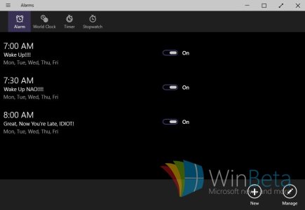
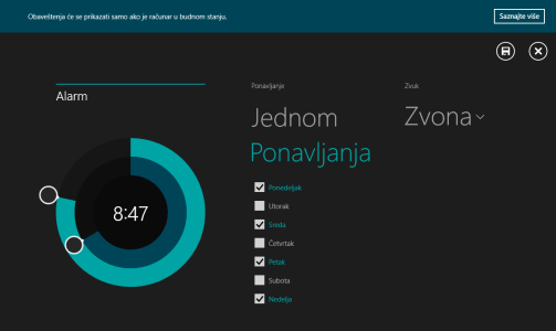
The Clock app:

How it is going to be and how it was
Clock.jpgScreenshot (8).png

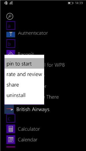
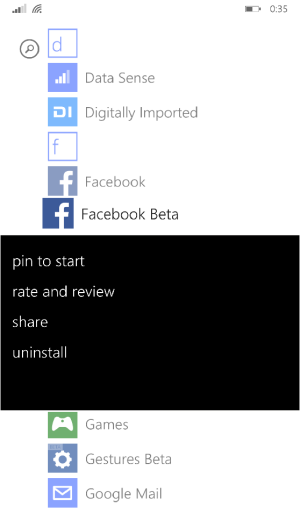
Windows Phone options menu:

How it's going to be and how it was
wp_ss_20150212_0025.pngwp_ss_20150416_0001.png

The Minimise/Maximise/Close buttons:

How it's going to be and how it was
buttons2.pngCapture.PNG

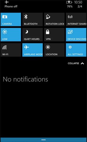
And let's not forget the Action Center. I hoped it was only temporary when they introduced it in 8.1, that it still wasn't finished, that they'll work on it.
Back then the toggles weren't so bad because there was only one row. But now, it looks REALLY bad. I mean, just look at that mess.
Windows-10-phone-Action-Center.jpg

They're going the wrong way, IMO, and I don't think they're looking back.
 

manicottiK

New member
Nov 24, 2011
660
0
0
Visit site
Settings was always the worst part of WP8, though. It's the best argument in the entire operating system for going for a smaller text size...
Settings was bad because it was long and unorganized, but not because of how each item appeared. In WP8 GDR2, Microsoft introduced settings sections (like the main items that we see in W10), but the individual items are listed right there on the page along under the section headings and with their current settings. W10, as it is now, requires going in and out of lots of pages to find something (i.e., users have to go looking for the data) while WP8 GDR2 surfaces the settings and makes it easy to navigate with a quick scroll or a tap on a heading to get to the jump list.

Live tiles were a decent enough idea, but when you got enough of them flipping over continually (and three was uncomfortable, four was horrendous) then it became the opposite of what it was intended to be
I agree that flipping can be annoying and it's overused. Microsoft should offer a way to disable it. Until then, however, developers could show more restraint. We did for our big app.

To avoid annoying myself and our users, our app avoids flipping tiles for the most part. The app has 36 standard items that can be pinned as secondary tiles (things like announcements, grades, campus bus schedules, etc.). In addition, each students has 5-10 courses per semester -- each one of them can be pinned. The Maps+More section of the app provides information on 200-300 campus places, all of which can be pinned. Only one standard item flips (it's our "photo of the day," which flips to show the caption and photographer name). The 120+ merchants also flips, but only on occasion to let you know that a merchant will open or close in the next hour.
 

Kram Sacul

New member
Mar 4, 2013
750
0
0
Visit site
I actually don't mind the expanded action center. Cluttered, yes, but it could be far worse (hamburger buttons). Losing the permanent all settings is stupid though like losing the silence all button in the volume controls in 8.1.

The rest is garbage. Toggles need to die.
 

Jazmac

New member
Jun 20, 2011
4,995
4
0
Visit site
I'm too late to the party. Can't catch up with everything that's going on here. But I also am disapointed in the way the UX is going.

Most of you have been mostly talkin' about usability. That has suffered, and it's really sad to see things going that way, but let's not forget the other part.

The other part is the design - how everything looks, beauty-wise.

Instead of going to something new and cool, things seem like they're going backwards (as someone said, back to Android from 2011). How do you mess things up that bad, and not ask yourself 'Where are we going with this'? I'll post a few pictures comparing what W10 is, and what it could have been, and even what is was and isn't going to be anymore.

The Clock app:

How it is going to be and how it was


Windows Phone options menu:

How it's going to be and how it was


The Minimise/Maximise/Close buttons:

How it's going to be and how it was
View attachment 102353View attachment 102354

And let's not forget the Action Center. I hoped it was only temporary when they introduced it in 8.1, that it still wasn't finished, that they'll work on it.
Back then the toggles weren't so bad because there was only one row. But now, it looks REALLY bad. I mean, just look at that mess.


They're going the wrong way, IMO, and I don't think they're looking back.

"beauty-wise"
Beauty-wise? Never heard that one before. Must be a slang term.like the word, conversate, re-DONK-ulous and tooken. lol. But seriously, it might be one of those things you'll not take to right away. Especially when you don't even know what the final look will be. I mean, how many concept posts does this board have on it? These may only be concepts of what will be in the final product. Personally, I dig the heck out of the direction. but then, my interest in any and all of these electronics is what they add to what I do. I have never had to depend on the interface on my phone to hook up with a woman. I mean seriously, who does that? If my smart phone can enhance my commute time to and from places, get me to a good restaurant, let me know what my investments look like, its going in the right direction. aka Cortana. I could care less trying to impress some dude with my phones interface, beauty-wise or otherwise. That is simply, ahh, re-DONK-ulous.
 

Members online

Forum statistics

Threads
323,252
Messages
2,243,523
Members
428,049
Latest member
velocityxs