Windows 10 mobile - the ugliest future...

Status
Not open for further replies.

Kevin Rush

New member
Aug 11, 2010
1,039
0
0
Visit site
I've been using Windows Phone since windows phone 7. Windows Phone __ is the only smartphone OS I have ever used.
... And I have never once used the Me Tile. Best feature? Hardly. Not even a noteworthy one.

So your admitted lack of use of a feature, for whatever reason, makes you an expert on it? So you chime in to contribute in what way?
 

Jazmac

New member
Jun 20, 2011
4,995
4
0
Visit site
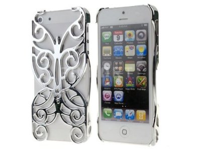
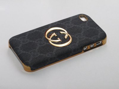
That's it. I quit. I'm hanging up my 1520 and I'm headed to a PrettyPhone.com like the OP and gittin' me a real pretty phone. Because everybody knows a pretty phone just works better. Here it is some PRETTY!

BALLIN'
51yVVIjkExL.jpg
GC-CLASSIC-LEATHER-BLACK1-1.jpg

Bahhahahahahaha
 

Tsang Fai

New member
Aug 11, 2014
301
0
0
Visit site
It is unfair to say Windows 10 is ugly. If you ask 10 people, 8 people would think Windows 10 is prettier than WP 8.1.

The big change in UI elements does not imply it is ugly. Perhaps it is just the feeling of those existing WP 8.1 users.

The emphasis of W10 mobile is intuitive UI. Some may think the new UIs are not efficient enough. But that's not the main concern of Microsoft. Being intuitive is very important for the average users. After all, it is important to let users feel natural for using a smartphone. If Windows 10 is too different from iOS/Android, how would users consider switching to Windows Phone?

I have no problems on using hamburgers menu at all. Just stretch my thumb a little bit further. Everyone can do this right? And what is the point of insisting to use the smartphone with one hand? I can hardly find any time that my left hand is so busy that I can only use my right hand.... :p

If the UI differentiates too much from the mainstream design, most people would not appreciate.

For me, I am willing to sacrifice a little bit efficiency in return of a more natural, more intuitive, and more standard way of working with UI. There should be compromises here.

If we look at Win 10 Mobile from the point of view of advanced users, we can never appreciate the changes made. After all, most users are just general users. They are not going to spend time on discovering useful features. Being intuitive is their primary concern.
 

Akssingh

New member
May 13, 2014
356
0
0
Visit site
Then it's simple, that uservoice was against the company's strategy,
Or do you think if someone started a uservoice with the request to give up the sandboxing and got 1000.000+ votes Microsoft would do it?

If this request gets 1000,000+ votes and still doesn't gets fulfilled by microsoft then they surely need to check what they really want to earn? Customers or audience?
 

Jazmac

New member
Jun 20, 2011
4,995
4
0
Visit site
Re: The ugliest future....

Based on what I see right now, it seems to me that a consistent UI is too much to hope for. It's not just about font sizes, nor is it just about the OS itself.
Consistency involves the entire app ecosystem...
Is navigation handled in the same way for all apps, or do some use the hamburger, while some use hubs or misuse pivots, while yet others use the entries in the bottom app bar?
Will ported android apps look and feel like android apps, while ported iOS apps will look and feel like iOS apps?
How many years will it take for the majority of existing WP apps to be updated to the rather different W10 UI design guidelines? Will it even matter, considering all the other inconsistencies?
Consistency seems to be what WP can no longer afford to maintain...

Well said. I see WP evolving. What I suspect Microsoft is waking up to is in order to expand the user base, they have to make sacrifices and minor adjustments to better assist those unfamiliar with WP and or its ecosystem. That is to have some behaviors like what those whose first exposure is android and IOS and maintain its identity at the same time. Personally, I could work with these changes. It looks pretty dang fantastic to me so far.
 

Kram Sacul

New member
Mar 4, 2013
750
0
0
Visit site
The emphasis of W10 mobile is intuitive UI. Some may think the new UIs are not efficient enough. But that's not the main concern of Microsoft. Being intuitive is very important for the average users. After all, it is important to let users feel natural for using a smartphone. If Windows 10 is too different from iOS/Android, how would users consider switching to Windows Phone?

If Windows Phone/Mobile is just going to be another wannabe iOS/Android why would anyone switch? It sure isn't apps. I switched from Android/Google to Windows Phone/MS because of the unique, stylish and well thought out interface: start screen, hubs, pivots, all of it. If WP had none of that and just had a lazy and dumbed down UI (hamburger menus) I would've never gave it another look.
 

Akssingh

New member
May 13, 2014
356
0
0
Visit site
If Windows Phone/Mobile is just going to be another wannabe iOS/Android why would anyone switch? It sure isn't apps. I switched from Android/Google to Windows Phone/MS because of the unique, stylish and well thought out interface: start screen, hubs, pivots, all of it. If WP had none of that and just had a lazy and dumbed down UI (hamburger menus) I would've never gave it another look.
EXACTLY! we want a better windows phone not a morphed andriod under windows brand.
 

Tsang Fai

New member
Aug 11, 2014
301
0
0
Visit site
If Windows Phone/Mobile is just going to be another wannabe iOS/Android why would anyone switch? It sure isn't apps. I switched from Android/Google to Windows Phone/MS because of the unique, stylish and well thought out interface: start screen, hubs, pivots, all of it. If WP had none of that and just had a lazy and dumbed down UI (hamburger menus) I would've never gave it another look.

Windows 10 is not an exact clone of iOS/Android. Windows 10 is not going to the extreme of copying everything from iOS/Android.

To choose between uniqueness and user-friendliness, I would choose the later.

I do not think that those unique elements (e.g. pivots) are the only possible good UI designs.

Microsoft is striking a balance between uniqueness and higher acceptance of UI design.

It would be sad if something "great" is not commonly accepted by the general users.

Would appreciate if you can point out exactly what exactly the problem of hamburger menu is? Once you get used to it, you have the same efficiency right?

Microsoft is adopting some design features that are proved to be working. It is not blindly copying all the things from its competitors. I would be unhappy too if they are copying the bad things from iOS/Android.
 

Kram Sacul

New member
Mar 4, 2013
750
0
0
Visit site
Windows 10 is not an exact clone of iOS/Android. Windows 10 is not going to the extreme of copying everything from iOS/Android.

To choose between uniqueness and user-friendliness, I would choose the later.

Doesn't WP already have that? Unique style (icons, typography) and user-friendliness (tiles, ellipsis, pivots).

I do not think that those unique elements (e.g. pivots) are the only possible good UI designs.

Microsoft is striking a balance between uniqueness and higher acceptance of UI design.

So basically it's a compromise OS. Trying to make everyone happy by doing everything at once. No standards, no consistency. No one is happy.

Would appreciate if you can point out exactly what exactly the problem of hamburger menu is? Once you get used to it, you have the same efficiency right?

No. It's in the upper left hand corner of the screen which is hard to impossible to touch one handed. So already it's user unfriendly because you have to use two hands to do something that took one before. On top of that it also looks cheap and out of place. A OS isn't supposed to look like a mobile website, right?

The funny part is that WP already has it's own superior version of the hamburger menu: the ellipsis. Takes up much less space, bottom right corner and is easily accessed with a tap or a swipe up. The current implantation of the hamburger menu in W10 doesn't even have that. It's a total design fail.

Microsoft is adopting some design features that are proved to be working. It is not blindly copying all the things from its competitors. I would be unhappy too if they are copying the bad things from iOS/Android.

The problem is that I don't see MS adopting good design features for W10. If anything it's the opposite and Android and iOS are adopting MS' designs while MS is adopting the worst and most annoying things from them. The kind of things that drove me away from Android and iOS in the first place. Hamburger menus, circle profile pictures, wireframe icons, rounded iOS toggles, etc. These aren't the things that WP needs to succeed. These are the rejects of user design.
 

xekrax

New member
Jun 3, 2012
2
0
0
Visit site
Then I have updated my other phone Lumia 625 I thought that the news Windows 10 should have circles not the squares :D The whole menus and and buttons looks like other operating systems...I much more prefer old buttons like switch on wifi or other settings.
 

Jibily

New member
Oct 29, 2012
7
0
0
Visit site
So your admitted lack of use of a feature, for whatever reason, makes you an expert on it? So you chime in to contribute in what way?

The best features would be ones that everyone wants to use. Something that people immediately think about when they talk about the OS. I almost never even remember the Me Tile exists. Most people I know don't know or care about it. It's not important in the grand scheme of things.
 

Tsang Fai

New member
Aug 11, 2014
301
0
0
Visit site
No. It's in the upper left hand corner of the screen which is hard to impossible to touch one handed.

My hand is small and I can reach the hamburger menu. In what situation do you think you cannot reach it with one hand? You should observe those iOS/Android users how they reach, quickly and comfortably every corner of the screen with just one hand.

I don't think your thumb can only reach the lower part of the phone, unless you just do not want to move your fingers.

Again, it has proved to be working in iOS/Android. So there is no room for debate here.


The current implantation of the hamburger menu in W10 doesn't even have that. It's a total design fail.

So you mean iOS/Android is a total design fail? Yet many people are using iOS/Android. Why? Just for the apps? So all people are sacrificing good UI for rich of apps?

Hamburger menus, circle profile pictures, wireframe icons, rounded iOS toggles, etc. These aren't the things that WP needs to succeed. These are the rejects of user design.

These are kind of personal tastes. For me, using squares/rectangles in all user interface is very odd. I think rounded toggles look nice. Why aren't iOS users complaining rounded toggles??? I don't agree Apple users have bad taste.

Live tiles being squares do not mean that such design apply well in every situation. Is there any design theory stating that squares and circles cannot exist together? I think Microsoft has made a wise and flexible decision here.

You should better ask some non-WP users whether they like the look & feel of Win10 or Win8.1. Most will say Win10 :)
 

secher

New member
Jul 26, 2013
69
0
0
Visit site
Yes it is ugly now, because it is very inconsistant... But then again, they are not focusing on polishing the UI yet. Right now they are clearly testing features, but still new bits of the UI/UX shines through, and some of the parts look great. I think when it gets consistant across the whole OS, it will be very pretty.

But you can't tell from the state of things in Preview...
Saying it will be ugly from the state of things now, is like saying the W10P will be really unstable and buggy because that's what the Preview is like now...
 

nohra

New member
Jun 10, 2013
246
0
0
Visit site
One thing that all my freinds ( all of us are windows enthusiast) have agreed to, that except start screen , every single thing related to win 10 is ugly.. And we all are heading to an ugly future... And killing the me tile completely, was probably most rude thing done to the OS... Hope you agree with me and buddies..

I agree with you on the ugly factor of W10m. Can't say on the Me tile since I have never seen a use for it. I know what I look like, so I don't really need a picture of me on my Start screen.

Maybe the ugliness will be fixed in 10.1 LOL! As we all know, the techworld slogan is "Wait for the Next Version"
 

Raj Poladia

New member
Jun 26, 2014
66
0
0
Visit site
My hand is small and I can reach the hamburger menu. In what situation do you think you cannot reach it with one hand? You should observe those iOS/Android users how they reach, quickly and comfortably every corner of the screen with just one hand.

I don't think your thumb can only reach the lower part of the phone, unless you just do not want to move your fingers.

Again, it has proved to be working in iOS/Android. So there is no room for debate here.


So you mean iOS/Android is a total design fail? Yet many people are using iOS/Android. Why? Just for the apps? So all people are sacrificing good UI for rich of apps?


These are kind of personal tastes. For me, using squares/rectangles in all user interface is very odd. I think rounded toggles look nice. Why aren't iOS users complaining rounded toggles??? I don't agree Apple users have bad taste.

Live tiles being squares do not mean that such design apply well in every situation. Is there any design theory stating that squares and circles cannot exist together? I think Microsoft has made a wise and flexible decision here.

You should better ask some non-WP users whether they like the look & feel of Win10 or Win8.1. Most will say Win10 :)

I agree with you most of my friend use iOS and android..... And they said they liked w10 and even they are hoping developers will make apps for w10 when there would be enough apps then they would like to w10 atleast those who use android will switch I guess
 

Akssingh

New member
May 13, 2014
356
0
0
Visit site
I agree with you on the ugly factor of W10m. Can't say on the Me tile since I have never seen a use for it. I know what I look like, so I don't really need a picture of me on my Start screen.

Maybe the ugliness will be fixed in 10.1 LOL! As we all know, the techworld slogan is "Wait for the Next Version"
LOL....good one....
 

syspry

New member
May 5, 2015
54
0
0
Visit site
Then it's simple, that uservoice was against the company's strategy,
Or do you think if someone started a uservoice with the request to give up the sandboxing and got 1000.000+ votes Microsoft would do it?
Bad analogy, you're comparing two vastly different functions
 

Harrie-S

Retired Ambassador
Sep 26, 2014
5,378
0
0
Visit site
Bad analogy, you're comparing two vastly different functions

Why? They are different functions but they are part of one strategy.

And what if I changed the "giving up the sand boxing" in getting an app locker app (which is basically the same)
 
Status
Not open for further replies.

Members online

Forum statistics

Threads
323,274
Messages
2,243,558
Members
428,053
Latest member
JoshRos