Windows 10 mobile - the ugliest future...

Status
Not open for further replies.

michail71

New member
Nov 29, 2012
1,822
0
0
Visit site
The creative individuals in these big companies do care as it's their career and passion that come first. But accountants and lawyers can sometimes get involved to crush their hopes and dreams.
 
Sep 8, 2013
29
0
0
Visit site
I do feel like Windows 10 on mobile devices is in danger of becoming a me too operating system which would be a real shame, Microsoft seem the think the answer is to boost the size of the app store by bringing in more developers. Why? Because faux tech gadget mag's tell consumers that what they want is a huge app store. No. Consumer want a few very good apps they will use all the time not 10,000 family guy sound apps. I've been using Windows Phone 10 for a while now and I am disappointed by some of the changes, I came back to a Lumia 930 from an iPhone 6 and running Windows Phone 8.1 I love it, however seeing the outlook and people apps on Win10 I am worried that I will fall out of love with my fav phone OS.

As has been said before user education is key...but how do you get that out there when you have an ios/osx centric gadget media who can't see beyond the end of their own noses? Once again the "New" MacBook gets rave reviews...its the same as the last one, and as several companies were quick to point out not as good as some Windows Machines out there for less cost (Lenovo). But it's not about the tech for these reporters Gadget's are a lifestyle product not technology and Apple have shown time and again they sell an experience not cutting edge exciting technology
 

xkinn

New member
Oct 26, 2013
20
0
0
Visit site
One thing that all my freinds ( all of us are windows enthusiast) have agreed to, that except start screen , every single thing related to win 10 is ugly.. And we all are heading to an ugly future... And killing the me tile completely, was probably most rude thing done to the OS... Hope you agree with me and buddies..
Then complain it to the Insider Hub.
 

Pavstar619

New member
May 4, 2015
88
0
0
Visit site
EXACTLY! we want a better windows phone not a morphed andriod under windows brand.

If Windows Phone/Mobile is just going to be another wannabe iOS/Android why would anyone switch? It sure isn't apps. I switched from Android/Google to Windows Phone/MS because of the unique, stylish and well thought out interface: start screen, hubs, pivots, all of it. If WP had none of that and just had a lazy and dumbed down UI (hamburger menus) I would've never gave it another look.

Maybe we'll get a Vampire / Werewolf Hybrid Phone (iPhone+Android) = the next big idea!! lol
 

Jazmac

New member
Jun 20, 2011
4,995
4
0
Visit site
IOS and Android users are not complaining cuz that's what they are used to. Google and Apple don't get up one day and make a complete overhaul of the UI. They gradually improved on the UI and made it better. It looks like MS has a disease of making one thing better and messing up the other. They exhibited symptoms with Windows 8 and Windows phone 8. Native Windows phone apps look like they were "borrowed from the other guys".

Posted via the Windows Phone Central App for Android

A disease? ROTFL. Personify much?. lol. Fact is, android "borrowed" heavily from IOS and continues to do so.
 

LTTG

New member
Dec 17, 2013
661
0
0
Visit site
I remember when Windows Phone was supposed to be about "ME" not other people coming from other platforms or people who didn't care to buy a Windows Phone in the first place.
 

sweatshopking

New member
Aug 16, 2011
112
0
0
Visit site
apps aren't improving. the new porting isn't going to change that, as every organization repeatedly says "it's not building the app, it's supporting it" and this won't solve that problem. Microsoft has already acknowledged that their app store is useless and EVEN PEOPLE WITH DEVICES AREN'T BUYING FROM IT, so who cares if they have 1 billion users that aren't using the app store?! NOBODY DOES. The fact that x86 is going hard, and RT is dead means people will stick with win32 even more.

start looking at android and finding a rom you like. windows is done.
 

mariusmuntean

Banned
Mar 12, 2013
789
0
0
Visit site
The fact that Microsoft is still using the same horrible, ugly, kindergarden style icons after so many TP builds is not acceptable and points more that those icons will remain in the RTM also. I simply cannot understand where are the top designers from MS?? What kind of bad joke are these icons?? What moron made them? The rest of the OS UI looks better with every build, but the icons....I've never seen something more hideous! ever!
 

mariusmuntean

Banned
Mar 12, 2013
789
0
0
Visit site
one of the big problems with public windows betas is just what you see here - ITS A BETA PEOPLE get over it unless your really not a windows supporter!

Many are windows supporters, and as well known the problem with the ugly parts, more to the point: explorer icons has been posted and over reposted in the Feedback app. 'Till now there was no positive change! Oh, the recycle bin got a minor tweak but it's the same bull****. I do not think that a designer from MS with his experience needs lot of time to redesign the icons, especially after this trash he created.
 

Sarveshwar

New member
Mar 19, 2015
83
0
0
Visit site
One thing that all my freinds ( all of us are windows enthusiast) have agreed to, that except start screen , every single thing related to win 10 is ugly.. And we all are heading to an ugly future... And killing the me tile completely, was probably most rude thing done to the OS... Hope you agree with me and buddies..

It seems the leadership is not able enough. I think Steven Sinofsky might have done better.
 

alex athanasopoulos

New member
Sep 14, 2013
180
0
0
Visit site
Personally i love the changes. It's refreshing to see new things and this simpler more minimal UI is great. Stop ******** all the time and wait to see the finali product. This a preview!!!!!


Btw check out that uservoice is working. They changes the buttons from top to bottom.
 

Lewk86

New member
Feb 2, 2013
16
0
0
Visit site
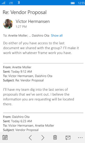
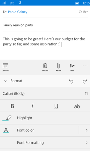
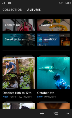
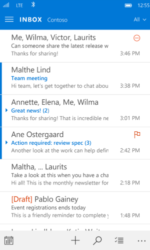
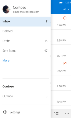
What is exactly ugly?
AppOutlookInbox01.png
AppOutlookInbox02.png
AppOutlookEmail.png
AppOutlookEmailFormat.png
AppPhotos.png
It all looks rather modern and slick to me. I've used WP since it debuted in 2010 and I couldn't care less if they hide functions I rarely use in Hamburger Menu's. I used the me tile for about 10 minutes when I first got my htc Mozart back in the day. Never really cared for it to be honest and having the ability to compose proper emails while on the go and using first rate apps ported from iOS like facebook trumps any medicore feature that integrates social media from other services in a poor way. Besides they're still keeping the 'What's New' Feature in the people hub, so... Also, what does removing the 'Me' tile have to do with how an OS looks??
 

Zeem Frostmaw

New member
Dec 6, 2013
382
0
0
Visit site
Even in those above screenshots you see the email app is white while the photos app is black... the inconsistency is, at least for me, the ugliest thing about the preview.
 

anon(5789608)

New member
Apr 10, 2013
136
0
0
Visit site
What is exactly ugly?
View attachment 105069
View attachment 105070
View attachment 105071
View attachment 105072
View attachment 105073
It all looks rather modern and slick to me. I've used WP since it debuted in 2010 and I couldn't care less if they hide functions I rarely use in Hamburger Menu's. I used the me tile for about 10 minutes when I first got my htc Mozart back in the day. Never really cared for it to be honest and having the ability to compose proper emails while on the go and using first rate apps ported from iOS like facebook trumps any medicore feature that integrates social media from other services in a poor way. Besides they're still keeping the 'What's New' Feature in the people hub, so... Also, what does removing the 'Me' tile have to do with how an OS looks??

Please, post outlook app with the dark theme now
 

Mike Waechter

New member
Mar 17, 2013
85
0
0
Visit site
The reason people don't use or remember the ME tile now is because MS stripped the value out of it in WP 8.1 when the eliminated FB/Twitter integration from the OS. It used to be a universal place to read and post to FB and twitter as well as many other things. Now its useless.

The reasons to use a WP have been slowly stripped away since the switch to WP8. What once was an all-in-one integrated approach to using a smartphone is now the same as ios and Android simply with a different veneer.

Too bad..
Weird... I use the people tile and have my apps connected. Is this not what the me tile was meant for?
 

cricca

New member
Feb 10, 2014
1
0
0
Visit site
As a former iPhone user I remember very well how the design changes went through:
iOS 7 was introduced and everybody said, that it looks crap, the design is bad etc. and everybody wanted iOS 6 back
iOS 8 was introduced and everybody said, that it looks crap, the design is bad etc. and everybody wanted iOS 7 back

The thing is that people will get used to Windows Mobile 10 and that's it...
 

michail71

New member
Nov 29, 2012
1,822
0
0
Visit site
Even in those above screenshots you see the email app is white while the photos app is black... the inconsistency is, at least for me, the ugliest thing about the preview.

People liked the dark theme. At least people that understood it reduces eye strain, brings out colors better and uses less power for AMOLED. So going from recent history that means they'll abandon it.

It's lazy design work as you can start off with the system colors in development and go from there.
 
Status
Not open for further replies.

Members online

Forum statistics

Threads
323,249
Messages
2,243,517
Members
428,049
Latest member
velocityxs