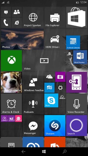
Does anyone else think that it's looking Awful?

Joshwin

New member
Jan 31, 2015
290
0
0
Visit site
You have the recently installed apps on top as it is now untill you dismiss them

Ya thats there. But what i suggested is recently opened files(videos,songs,pdf etc). Many times I wished to have a recently opened file list, sort of jump list we have on PC. so that we don't have to go all the way deep inside the folders to check the file we just opened. of course we can keep frequently used apps on the start screen but not files(except word).
 

Paolo Ferrazza

New member
Dec 7, 2014
441
0
0
Visit site
Ya thats there. But what i suggested is recently opened files(videos,songs,pdf etc). Many times I wished to have a recently opened file list, sort of jump list we have on PC. so that we don't have to go all the way deep inside the folders to check the file we just opened. of course we can keep frequently used apps on the start screen but not files(except word).

Then I thinkl a pin folder to start from inside the file manager app would be much better, like on desktop!
 

Joshwin

New member
Jan 31, 2015
290
0
0
Visit site
pin folder to start from inside the file manager app

I think on w10m file explorer we can see the recently opened files.problem solved. I use wp8.1 now. so i am not aware of that. also pining folders from file explorer is not possible with wp8.1.
 
Last edited:

ArtificiallyYours

New member
Jul 12, 2015
202
0
0
Visit site
I prefer less on the screen because I happen to like the alphabetized drawer to the right and only keep my most frequented apps and the Cortana tile on the front. I also like the High Contrast look because it gives it a sense of stealth and unrivaled simplicity. Something a lot of smartphone interfaces lack.
 

rayf888

New member
Jan 23, 2013
146
0
0
Visit site
I agree with you. But if you see the App list in WP7/8.1 and WM10, you will find the difference in how it looks and feels. While the font in Windows Phone 7/8.1 was too big to fit the screen, in WinM10, it's too small to be quite visible and thus living a large void space. Atleast they should leave a little margin on the left.

Because the font size has decreased a lot now leaving more blank space. PLUS more options is always a good step.

I think you nailed the exact problem here... The fonts are too small... I reckon they look alright on WP7/8... One can easily tell the different elements on the screen from the different size of the fonts, this won't happen on W10M.... Everything look like an "desktop" app....

If the reason they are adopting the hamburger menu is to make it easier to "steal" the iOS/Android apps, that's gonna be one big failure in terms of a design language...
 

floppyedonkey

New member
Dec 22, 2014
101
0
0
Visit site
Additional information would be nice, like details view on your desktop, size of app, date last used, update waiting, installed on phone or sd (use phone or sd icon), data consumption.
 

Members online

Forum statistics

Threads
323,292
Messages
2,243,581
Members
428,054
Latest member
moocher720