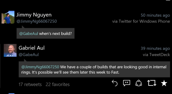
Who thinks we'll get a new build this week? What do you want to see?

msirapian

New member
Jan 26, 2014
777
0
0
Visit site
A basic feature : that SMS history works again. It has stopped being able to restore SMS from build 10572. Currently, my daily driver 640 is on 10549 and I won't upgrade it until I'm sure motion data and SMS work again correctly. My 535 runs 10581 and in spite of updates for the messaging apps, the sms history is stuck at june 2014. Even after a hard reset. MS say they're investigating, but it could be partly server related, partly build. The 640 syncs perfectly with my 1020 (8.1), for instance, all being on the same account.

So a new build fixing that SMS bug is needed, specially if we're about to hit RC/RTM, and that's such a basic feature as messaging is broken.
 

tut1234

New member
Apr 4, 2014
135
0
0
Visit site
Getting SMS back would be good.
It would be nice to see a build that is a step forward for all devices.
My L520 is much better, build before I had to reboot every 12 hours for stability.
 

Aurelink

New member
Jul 28, 2014
169
0
0
Visit site
Ok this is what i want..
1. Groove music to add more colours.. Background as per album art colour.. App looks very simple
2. Transparent action centre(pc like). Would even like to see music controls
3. Swipe gesture in messaging app to quick delete
5. Option of ability to see notifications on lockscreen and even reply to them..

Almost everything told here.
But I know already that we won't have anything more on the lockscreen.
 

Thmoas De Grauw

New member
May 22, 2015
10
0
0
Visit site
I don't really care what I get in the next Insider update, it is an insider update and is not finished.

However, they do have a LOT of work to do before final. I don't think they will manage. I'm not speaking about bugs which I think will mostly be solved. But the user interface ... the user interface is different in almost every microsoft applications and then every third party application has it's own interface as well.

Swipe left to delete in e-mail: this should simply be an option when developers create a list. Every list where this can be handy should have this option. Sometimes there's a hamburger (sometimes left sometimes right) sometiems there's 3 dots at the bottom, sometimes everything is ordered in the windows phone 8.1 "sliding menu" fashion and sometimes to get into extra options it is "press and hold" an item.

Really this is just a mess. Android isn't very good at this either however they are working on forcing uniform applications whenever possible. Apple is the best on this. It just annoys me that you have to learn 4 different interfaces. I means simply looking for the "settings" is always a search, will it be here or here or there or somewhere else.

Some people say that this graphical tidying up is for the latest stages of development but I don't agree, you should have a clear path and a feature/interface freeze long before. You can not fix a crappy interface in just a few weeks. You need a vision to build to, which they don't have. Every team just creates their own stuff in their own way, as it has been for windows forever. Let's hope they do manage though, i would like that a lot!
 

mkenyon2

New member
Oct 8, 2012
194
0
0
Visit site
However, they do have a LOT of work to do before final. I don't think they will manage. I'm not speaking about bugs which I think will mostly be solved. But the user interface ... the user interface is different in almost every microsoft applications and then every third party application has it's own interface as well.

Swipe left to delete in e-mail: this should simply be an option when developers create a list. Every list where this can be handy should have this option. Sometimes there's a hamburger (sometimes left sometimes right) sometiems there's 3 dots at the bottom, sometimes everything is ordered in the windows phone 8.1 "sliding menu" fashion and sometimes to get into extra options it is "press and hold" an item.

Really this is just a mess. Android isn't very good at this either however they are working on forcing uniform applications whenever possible. Apple is the best on this. It just annoys me that you have to learn 4 different interfaces. I means simply looking for the "settings" is always a search, will it be here or here or there or somewhere else.

UI tends to be the magic sauce in an application, and a smart phone OS is (in some ways) a big app. On desktop, you have certain standards, you see it in Windows, Linux, Mac, menu at the top, File has Save/Close/Etc, desktop, recycle/trash. Those weren't always standards, but neither were mice. Once the mouse became common, you saw UI evolve to the point we see it now.

Smartphone UI is still evolving, and a standard hasn't emerged. It's getting there, but you're going to see experimentation as companies try to distinguish themselves, then they might get knocked back by user backlash (ie. Windows 8's UI).

As for Hamburger/three dots, I believe the standard MS is going for this time around is Hamburger, but there's a lot of 'if it ain't broke, don't fix it' going on. They're probably working on the big fires first, then they'll get around to standardizing menus. (ie. Windows 10 context menus have been slowly getting refined.)

For 3rd parties... well, it's anybody's guess. You see some jumping from Windows platform, some testing the waters as they get into it. Once you see MS's UI standardize and settle down, others will begin following their pattern more closely. Some smaller devs will be waiting for clearer tutorials.
 

Jazmac

New member
Jun 20, 2011
4,995
4
0
Visit site
I wish I could downvote flames.

Agreed. That is sorely missing from a forum like this one. Without it, every blog surrounding this one with consternation against Microsoft makes a fart and we have to smell it. Downvotes could surely help. IMHO. But it would also impact hit counts. Something they are very sensitive about.
 

elindalyne

New member
Aug 1, 2015
352
0
0
Visit site
Linked Inboxes. The UI doesn't really bother me too much, but the fact that my phone is less usable on Windows 10 than it is/was on Windows 8.1 is bad.
 

dwarfsize

New member
Nov 14, 2012
41
0
0
Visit site
I need MMS APN settings to be fixed (not hidden anymore), as I have NOT had these since updating to windows 10 mobile! I would LOVE to see actionable tiles, but I can't see this happening for a while...
 

dwarfsize

New member
Nov 14, 2012
41
0
0
Visit site
As for hamburger menus, i wouldn't mind them so much as long as Microsoft would implement a swipe to open, or swipe to change tabs or something along those lines. I miss 8.1 in the way that you never had to extend your fingers alllllllll the way to the top of the page to access a menu, because they were just part of the carousel. Windows 10 doesn't feel as fluid as 8.1 just for this single reason, at least to me.
 

daniel cooper2

New member
Mar 17, 2014
72
0
0
Visit site
1 - Full landscape mode on both sides
2 - Rewriting Message app for resolving that annoyng exit bug that often crashs the entire phone
3 - Change back Contacts design: I hate the swinging balls. I want back the rotating tiles, Microsoft trademark
yeah I don't like the contact tile either. Balls swinging
 

Tien-Lin Chang

New member
Feb 9, 2015
207
0
0
Visit site
I just wish they can cover non-lumia device into insider program....

My ATIV S is stucking in the leak 10536 and I just don't wanna go back anymore.....:(
 

seb_r

New member
Aug 1, 2014
182
0
0
Visit site
Guys don't expect new features.
Microsoft gives only bug fixes.

I even expect more and more features to be removed because they not get things done. See how things are going: takes ages between every new build and when it comes out it brings some fixes but at the same time breaks other things that worked before. Some issues are not taken care of at all for a few builds already. Guys, be realistic.
 

Snapperlicious

New member
Jul 11, 2013
35
0
0
Visit site
I want two things.

1. Improved speed and stability - some apps are faster such as Groove being faster than Xbox Music and taking you straight to music, but some like People hub are way slower.

2. Swiping left and right in Edge to go back and forward.

This. Features are useless if the phone is painful to use because of slowness and lack of stability.

Messaging is so slow and such a bear to use that I regularly think about switching back to 8.1, because it is my most used app. I like the features they've added, but it's not worth the slowness. The predictive text is also better in 8.1 even after the recent update.

Not sure if it's a feature, but I would really love it if they would add swipe support in all of the apps. I can't remember off the top of my head, but I know there are places you can't swipe on the keyboard. To me, stuff like this takes precedence over new features. Just make the UI consistent, stable, and fast, then worry about adding more.
 

Members online

Forum statistics

Threads
323,236
Messages
2,243,501
Members
428,049
Latest member
Nathanboro12