Poorly thought out phone dialer

Jcmg62

Member
Oct 8, 2013
760
9
18
Visit site
I've been running Windows 10 mobile for about 4 months now and had hoped that with every new preview they'd get round to re-thinking the actually phone part of the software. As we're now past the point of seeing new developments in upcoming previews and the focus has shifted to bug squashing, I'm quite concerned that the phone dialler is about as good as it's going to get.

I appreciate that the dialler probably isn't high on the list of things to get too imaginative about, but I just find the current dialler very dis-jointed and not intuitive at all.

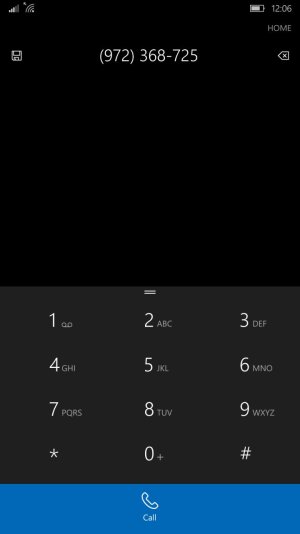
The biggest frustration is the fact that the history, speed dial and dial pad are three separate items with tabs at the top of the screen. On a Lumia 1520 it's really quite difficult to reach those buttons. Could it not be an option to allow the user to move them so they run vertically down the left or right of the screen, depending on the preference of the user.

The phone book should also be properly integrated into the dialler page, rather than just a small icon stuck at the bottom of the screen.

I just don't get why there's a separate call history page...the dial pad and call history really should be one and the same thing.

There must be a better way of integrating contacts with the phone dialler. In fact, taking it to the next obvious conclusion, why is the phone book, text messaging and phone dialling 3 separate tiles? Surely these should be integrated into one cohesive hub from where you can look up a contact and text or call that person. In the same hub you should be able to open the phone dialler and see your call history or key in a new number.
 

Darron Smith1

New member
Mar 18, 2014
14
0
0
Visit site
Yes, I have to agree to an extent. The phone dialer is clunky and unintuitive. I've accidentally called people when attempting to listen to voicemails. I'll see a voicemail notification on my phone tile, click it, see a new number at the top of my list and touch it to listen to the voicemail. Next thing you know, I'm calling the person instead of listening to the voicemail! There's got to be a more streamlined way. I don't remember having this issue with WP 8.1. Or the iPhone for that matter. On the plus side, I like the option of being able to touch the buttons with the letters that correspond to my contact names to pull up the desired contact. Each button tap bubbles contacts to the top, taking the work out of it for me.
 

Rich215

New member
Dec 20, 2013
221
0
0
Visit site
I agree with you guys. I use the phone......as a phone more than a data device. I had no problems using my Icon with Denim, but now find the Win10 dialer to be not as good. When I have to tap in my voice mail pass code....I often miss-touch the numbers. They need to spread out the buttons allowing a larger area for each digit/button.

And yes, I have often called someone while trying to get to voice mails or specific call info with the little icon on the right side of each call line. That area for the call info button needs to be much wider as well.

Hope they will make the UI larger like 8.1 is. I never had any problems quickly navigating and selecting screen taps with it.
 

Musicman247

New member
Aug 29, 2006
802
0
0
www.splashblog.com
In case you missed it, a few updates back they put in the ability to swipe sideways between all the tabs in the phone app. No need to try and reach the tabs at the top.

Call history is also shown on the dial pad screen. Just swipe up in the empty space above the pad.
 

GabrielStorm

New member
Dec 3, 2012
299
0
0
Visit site
In case you missed it, a few updates back they put in the ability to swipe sideways between all the tabs in the phone app. No need to try and reach the tabs at the top.

Call history is also shown on the dial pad screen. Just swipe up in the empty space above the pad.

I was going to post this very thing.
 

Kram Sacul

New member
Mar 4, 2013
750
0
0
Visit site
It's pretty bad still. The 8.1 dialer was better thought out and looked classy. The app in W10M is like if you hit the UI with a shovel.
 

anon(5843918)

New member
Mar 29, 2013
22
0
0
Visit site
I agree the windows 10 mobile phone app is horrible. Horribly designed and unintuitive. The WP8.1 dialer was much better. The rest of the stock apps seem ok. Why can't they improve the dialer app like they did with store and settings.
Personally the windows 10 mobile dialer app gives me the impression that it was hurriedly done and unfinished.

PS - Could we all respond to MS through the feedback on W10M to improve the dialer app.
 

Jcmg62

Member
Oct 8, 2013
760
9
18
Visit site
It really annoys me when people complain <rest of post deleted by moderator>...

No need to get personal and start trolling...

I've been using windows phone since 2011. I've worked my way through numerous windows phone 7, 8, 8.1 and 10 development cycles. I've had the HTC 7 trophy, the Lumia 800 and the 1520. In short, I have a lot of windows phone experience, so when, in my singular opinion, I say that the W10 stock dialler is the worst Microsoft have come up with so far, I'm saying it as someone who's seen and used better.

And yes, I'm aware of the many shortcuts and features in W10, including the home button screen trick, and personally I think it's a cool idea, but it doesn't make up for a mature dialler set up. And it doesn't help the overall lack of integration between contacts, calling and messaging. As this is primarily a communication device it's my personal opinion that these things should be more tightly and cohesively woven.

They managed to do this very well in Windows phone 7. There was even the option baked into the OS to allow for full twitter, LinkedIn and Facebook integration, without the need for separate apps. Don't get me wrong, it wasn't perfect but it was a solid step in the right direction. It all seems to have been abandoned in W10.
 
Last edited by a moderator:

trivishal

New member
May 1, 2015
184
0
0
Visit site
I agree the windows 10 mobile phone app is horrible. Horribly designed and unintuitive. The WP8.1 dialer was much better. The rest of the stock apps seem ok. Why can't they improve the dialer app like they did with store and settings.
Personally the windows 10 mobile dialer app gives me the impression that it was hurriedly done and unfinished.

PS - Could we all respond to MS through the feedback on W10M to improve the dialer app.
Some Windows 10 Mobile insiders should feedback about this.
 

colinkiama

New member
Oct 13, 2013
2,842
0
0
Visit site
It's pretty bad still. The 8.1 dialer was better thought out and looked classy. The app in W10M is like if you hit the UI with a shovel.
You'll be surprised at the amount of people that struggled to find the dialer because it was a small icon at the bottom of the screen
 

colinkiama

New member
Oct 13, 2013
2,842
0
0
Visit site
It's pretty bad still. The 8.1 dialer was better thought out and looked classy. The app in W10M is like if you hit the UI with a shovel.
Really? I think it looks less bland. The black and white text only interface was getting old of old. It was about time they used a bit more colour and reduced the size of the fonts. You still have your pivots and we finally have smart dialling. What's to complain about?
 

Musicman247

New member
Aug 29, 2006
802
0
0
www.splashblog.com
They managed to do this very well in Windows phone 7. There was even the option baked into the OS to allow for full twitter, LinkedIn and Facebook integration, without the need for separate apps. Don't get me wrong, it wasn't perfect but it was a solid step in the right direction. It all seems to have been abandoned in W10.
I have a feeling that a lot of those kinds of things (integrating services from other companies) went away not because of MS, but because of policy changes from the other companies. Look at the Twitter clients that died because of the token policy. My guess is these companies have tied MS's hands in regard to integration.

Back on topic, the "shortcuts" as you call them are the way the UI was designed to work, not tricks somebody found. So you calling them helpful shortcuts and then saying it was badly designed doesn't make any sense to me.

Edit: And I've been using Windows Mobile since 4.0, so I know what I'm talking about.
 

Krystianpants

New member
Sep 2, 2014
1,828
0
0
Visit site
No need to get personal and start trolling...

I've been using windows phone since 2011. I've worked my way through numerous windows phone 7, 8, 8.1 and 10 development cycles. I've had the HTC 7 trophy, the Lumia 800 and the 1520. In short, I have a lot of windows phone experience, so when, in my singular opinion, I say that the W10 stock dialler is the worst Microsoft have come up with so far, I'm saying it as someone who's seen and used better.

And yes, I'm aware of the many shortcuts and features in W10, including the home button screen trick, and personally I think it's a cool idea, but it doesn't make up for a mature dialler set up. And it doesn't help the overall lack of integration between contacts, calling and messaging. As this is primarily a communication device it's my personal opinion that these things should be more tightly and cohesively woven.

They managed to do this very well in Windows phone 7. There was even the option baked into the OS to allow for full twitter, LinkedIn and Facebook integration, without the need for separate apps. Don't get me wrong, it wasn't perfect but it was a solid step in the right direction. It all seems to have been abandoned in W10.

My apologies. It's just you should mention what you have tried because people are trying to use a new operating system the same way as the old. That's not going to be the case. Things will change and features are implemented to make things easier. I really do like windows mobile 10 and i'm not happy with the design discrepancies. Hamburgers in one spot, ellipses or cogs in another. It seems like I have to really try hard just to figure out how to do things when it should be as smooth as butter. But i'm going to give Microsoft a chance. They have seen what google is doing with material design and how ios does things with design. They know that everything is seamless and things are always easy to find based on these design principles. If they can't learn from that then maybe they don't deserve to have more than 3%. But i'll give them a shot. At first I thought i'll buy a new flagship right away. But to be honest after running mobile 10 on my 830. I am not sure they will capture the market. It's a great OS, great vision, just it's all over the place. So we shall see what happens. With Desktop people are more forgiving because it's free. I mean the people app still doesn't have hamburger menu or anything. When I first opened it I looked for the hamburger. Then I saw ellipses on the right which had nothing. And finally in the middle I found the ellipses with settings. That seriously caught me off guard. It just looks like it's not being taken seriously. But either way they have time for mobile. And Desktop was a rush job to get people to adopt.
 

Joe920

Active member
Nov 13, 2012
1,677
0
36
Visit site
Edit: apparently the dialer is supposed to also show search results from the address book, not only from call history. I have run into cases where this didn't seem to work. User error? not sure.
__

original post:

Still occasionally annoyed with the dialer. Smart dialing needs to get a little smarter. It makes sense that it shows recent calls that match the numbers/t9 you type, but once there are fewer than three matching contacts, start including results from the address book, with a little 'Address book' label above these results.

Example below: I tried to dial wpcentral. There are no recent calls to wpcentral, but now I'm stuck, there is no quick way to search the address book for this contact. Why make the user jump through extra hoops to get that info, why not just start populating the available space with address book results?

wp10dialer.jpg
 
Last edited:

manicottiK

New member
Nov 24, 2011
660
0
0
Visit site
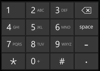
I wish that the backspace key were in the keyboard instead of all of the way at the top near the number that's been entered.

Microsoft has a keyboard for phone number entry. If they leveraged that and replaced the right-hand column with a triple-height "call" key, we'd be well served. Here's how that keyboard looked in Windows Phone 8.x:
IC530999.png

Just imagine that with Space, dash, and period keys replaced by a single Call key. Correcting typos would be both easy and consistent with other keyboards. (On that topic, what where they thinking? No other data entry keyboard puts the backspace button near the cursor -- it's normally at the upper right(ish) of the keyboard. I can't imagine that no one at MS questioned the current dialer UI.)
 

Joe920

Active member
Nov 13, 2012
1,677
0
36
Visit site
Microsoft has a keyboard for phone number entry. If they leveraged that and replaced the right-hand column with a triple-height "call" key, we'd be well served.
Agreed, the location of backspace it's crazy. One mistake and your one-handed dialing is over. :) Fully in favor of your suggested swap.
 
Last edited:

Arunabha Goswami

New member
May 11, 2015
151
0
0
Visit site
Smart dialing needs to get a little smarter. It makes sense that it shows recent calls that match the numbers/t9 you type, but once there are fewer than three matching contacts, start including results from the address book, with a little 'Address book' label above these results.

So smart dialing doesn't include entries from address book? What a shame. I guess I'll continue to use truedialer if/when I upgrade my phone. BTW, that's not a full proof solution either, since truedialer maintains it's own call log.
 

Kimmo Toivanen

New member
Jan 12, 2013
182
0
0
Visit site
In case you missed it, a few updates back they put in the ability to swipe sideways between all the tabs in the phone app. No need to try and reach the tabs at the top.

I thought - based on first post - that tabs should work just like this. Swipe. Phone called my mother-in-law and another contact was opened in foreground :wink: No harm done, she needs their PC upgraded to W10 anyway. Contact list is maybe a little bit too sensitive in making a call...
 

manicottiK

New member
Nov 24, 2011
660
0
0
Visit site
So smart dialing doesn't include entries from address book?
Despite what was written above, smart dialing DOES include entries from the folks in your People app.

When showing matches, it shows matches from the dialing history first. That list is followed by matches from the People app.

I have build 10581, but I think that the new dialer app has worked this way for several months.
 

Joe920

Active member
Nov 13, 2012
1,677
0
36
Visit site
Despite what was written above, smart dialing DOES include entries from the folks in your People app.

When showing matches, it shows matches from the dialing history first. That list is followed by matches from the People app.

I have build 10581, but I think that the new dialer app has worked this way for several months.
Well I'll be darned, this time it did work. I swear, I have tried this and had to go to the address book to find a certain contact. Could it be that the people app or the search process failed or so? Weird. I'll update my posts on this.
 

Members online

Forum statistics

Threads
323,160
Messages
2,243,362
Members
428,031
Latest member
MatthewHilbers