UI Inconsistencies

Lobster A

New member
Jun 27, 2013
5
0
0
Visit site
This post is not intended for insiders who I'm sure are well aware of the UI inconsistencies and may or may not be not bothered. This post is intended for Microsoft who may be lurking in the forums. Perhaps if they have any pride in their work seeing the inconsistencies laid bare will trigger some changes.. but probably not.

Context Menus

Context menu type 1
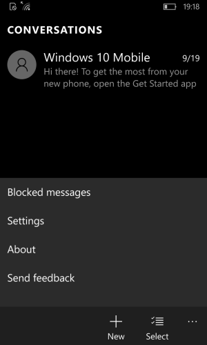
wp_ss_20151002_0011.png

Context menu type 2 (outlook/calendar: icons, different background colour)
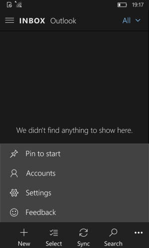
wp_ss_20151002_0010.png

Context menu type 3 (onedrive: transparent, different foreground colour)
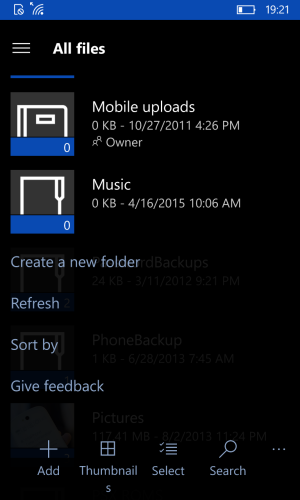
wp_ss_20151002_0016.png

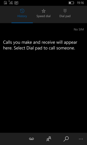
Tab Headers

Type 1 (dialler)

wp_ss_20151002_0005.png

Type 2 (alarms: Similar to dialler but thinner strip)
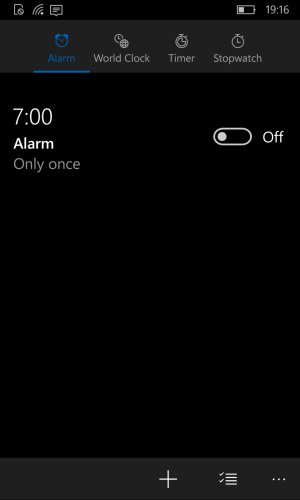
wp_ss_20151002_0006.png

Type 3 (people)

wp_ss_20151002_0008.png

Type 4 (photos: similar to people but has background strip and different sizing and positioning)
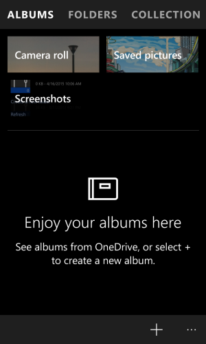
wp_ss_20151002_0018.png

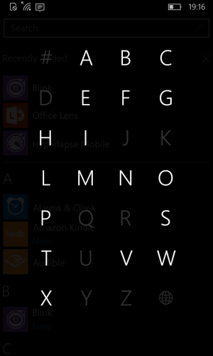
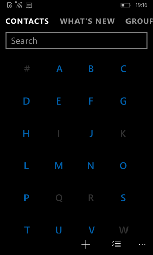
Alpha Grid

Type 1 (apps list)

wp_ss_20151002_0004.png

Type 2 (people)

wp_ss_20151002_0009.png

Other

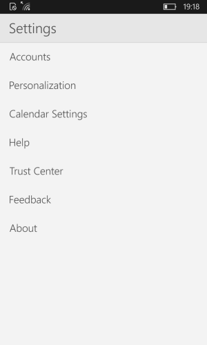
White keyboard, search field and settings in dark theme outlook
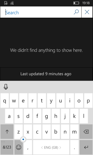
wp_ss_20151002_0012.png

wp_ss_20151002_0013.png
 
Mar 2, 2015
706
0
16
Visit site
And you forget select/copy/paste functionality, somewhere it is single tap, somewhere it is double, somewhere you can copy/paste/select from keyboard while in some apps such as Outlook or Edge you can't paste from keyboard for example, instead you have to take long press and than use pop up ....
 

mbrdev

New member
Aug 9, 2015
53
0
0
Visit site
They are aware of the inconsistencies, as we move closer to RTM these will slowly converge, the whole point of the inconsistency at this stage with so many people testing is to find the best solution. That's what all the telemetry is for. Some inconsistencies are accidental of course because lets face it, no developer or development team is perfect, but they don't go unnoticed for long. Again, try to remember we have peeked behind the curtain earlier than is usually possible, nearly every complaint I've heard about Windows 10 insider builds is just a natural reaction to those unfamiliar with the development process. Worked on a large update to my companies' software earlier this year which included some dramatic UI changes, in the process of about 3 months we went through 7 or maybe 8 evolutions of the design and right up until the release everything was inconsistent. This is the life of development, things develop over time!
 

a5cent

New member
Nov 3, 2011
6,622
0
0
Visit site
I'd also suggest adding examples of these:

Some apps have only an ellipsis menu (Edge)
Some apps have only a hamburger
Some apps have both

Depending on which app you're looking at, the settings entry could be in either of those menues, and sometimes in none (in which case it's likely represented as a cogwheel icon, either at the top or bottom of screen, which also isn't consistent). The entry for settings is just an example. The same inconsistencies exist for almost any common menu entry.

Seriously, decide what is best placed where...
 
Last edited:

grahamf

Member
Nov 19, 2012
324
0
16
Visit site
The consistency doesn't bother me as much as the lack of thought put into the icons and overall design language. Yikes.
Well, yeah. it's far more important to get things working as soon as possible then to wait for the UI team to theme it, only to find there are some major bugs and you wasted too much time by waiting for it to be pretty.
 

Kram Sacul

New member
Mar 4, 2013
750
0
0
Visit site
Well, yeah. it's far more important to get things working as soon as possible then to wait for the UI team to theme it, only to find there are some major bugs and you wasted too much time by waiting for it to be pretty.

You really think they're going to make it pretty at the last minute? Wireframe icons, circle profile pictures, the iOS toggles, etc are part of the new design language. That garbage is here to stay.

The giant search box in the app list and settings always makes me shake my head.
 

SonOfDad

New member
Jun 25, 2011
196
0
0
Visit site
It's pretty sad that you have to point all this out isn't it. Even if you don't go to the detail this post does and open the phone, people and messaging screens you can see differences if MS can't keep three simple core screens looking the same it's only going to go downhill from that point. They also need to add a splash of colour, they've copied the round (I HATE IT SO MUCH) contacts from Android/iOS however if you don't have a contact photo you get a grey icon both alternatives add some colour in. Same with the dialler it appears almost identical in layout to Android M but manages to look really dull by comparison.
 

grahamf

Member
Nov 19, 2012
324
0
16
Visit site
You really think they're going to make it pretty at the last minute? Wireframe icons, circle profile pictures, the iOS toggles, etc are part of the new design language. That garbage is here to stay.

The giant search box in the app list and settings always makes me shake my head.
Compared to system-breaking bugs, a little mismatched UI is not going to hurt you. Remember the software is still in development, and a major change in the underlying code may cause an interface to be thrown out and rewritten. Adjusting an interface to comply with a consistent them isn't that difficult, and it makes logical sense to have all the different teams focus on the underlying code then have a single team go over it afterwards and make everything look the same - as one person doing everything with do everything the exact same thing, while different teams would use their own methods that look similar but can act differently.

Give it time, and be grateful the back button doesn't brick your device.
 

SonOfDad

New member
Jun 25, 2011
196
0
0
Visit site
Compared to system-breaking bugs, a little mismatched UI is not going to hurt you.

Do you work on a "near enough is good enough" basis?

Adjusting an interface to comply with a consistent them isn't that difficult

Then apply a template from the start. Anyone who has worked in software must be aware once something functions developers are rarely willing to go back and clean up an interface and managers are ready to get it out the door.


Give it time

They don't have time, it's fourth generation of a product that hasn't managed to capture any serious market share if it fails to impress at launch it won't get another look in and the people noticing these problems are the ACTUAL SUPPORTERS, ignorance can't be bliss here!
 

Kram Sacul

New member
Mar 4, 2013
750
0
0
Visit site
Compared to system-breaking bugs, a little mismatched UI is not going to hurt you. Remember the software is still in development, and a major change in the underlying code may cause an interface to be thrown out and rewritten. Adjusting an interface to comply with a consistent them isn't that difficult, and it makes logical sense to have all the different teams focus on the underlying code then have a single team go over it afterwards and make everything look the same - as one person doing everything with do everything the exact same thing, while different teams would use their own methods that look similar but can act differently.

I'm talking about the overall design language (or lack of), not a few inconsistent colors and icons from app to app.

Give it time, and be grateful the back button doesn't brick your device.

No. I installed W10M once. That was enough comedy for one day.
 

TechnoReact-Site

New member
Aug 25, 2015
20
0
0
Visit site
If i had to select the best design to keep in different categories, i would go with:-

1)Context menu type 3 (onedrive: transparent, different foreground colour)--> TRANSPARENCY & COLOR
2)Type 2 (alarms: Similar to dialler but thinner strip)--> BETTER POSITIONING AND ICON/LABELING
3)Type 2 (people)--> PERFECT SIZE & COLOR


----
 

fatclue_98

Retired Moderator
Apr 1, 2012
9,146
1
38
Visit site
Anybody that upset with different menu setups across different areas of the OS need to get a BlackBerry Classic like mine and enjoy a physical menu button and be done with it. We're 72 hours away from the "Big Show" and this is what's bothering some people? I guess the TP is finally bug-free and users only have the context menus to complain about.
 

Jazmac

New member
Jun 20, 2011
4,995
4
0
Visit site
Anybody that upset with different menu setups across different areas of the OS need to get a BlackBerry Classic like mine and enjoy a physical menu button and be done with it. We're 72 hours away from the "Big Show" and this is what's bothering some people? I guess the TP is finally bug-free and users only have the context menus to complain about.

Worse than a 6-pack Hollywood Wives. Doesn't matter how much you've done or how hard you work, its about your days off and what you haven't done. Time to break out the Whine Coolers!
whine-coolers1.jpg
 

Kram Sacul

New member
Mar 4, 2013
750
0
0
Visit site
If it bothers you so much, then switch to Apple. Everything always looks perfect, even when it doesn't work.

I wish love to switch but if I did I would have to trade in my man card. That's a little too radical for me.

Being a WP user feels like being a battered wife sometimes. You stick around and put up with abuse and bad decisions and hope it gets better but you know you should've left a long time ago.
 

mileRunner

New member
Jun 8, 2015
18
0
0
Visit site
As someone in the design field I'd like to say thank you for starting this thread! I like the various screen shots, seeing them side by side makes the inconsistencies much more obvious than in an every day experience where you don't necessarily jump across these particular issues from screen to screen.
One of my dislikes with the os is their use of that bold font in the store titles/sections - seems wider than what is used elsewhere, or perhaps it's because it's the only place where the titles are not in all-caps...
 

DoctorSaline

New member
Jul 9, 2014
425
0
0
Visit site
This bothers me. A lot. Oh well, this is my take for any MSFT engineer lurking here.

1) I like context menus of outlook(both icon and typography).

2) I like header of People app but would like it(and every other headers) to ditch all caps and bold font in favor of 1st letter Uppercase rest in lowercase and thin fonts.

3) Keyboard conforms to system theme(and not specific app theme) which is okay I guess.
On the other hand, apps' setting pages, and all other app menus should conform to the theme of the app, if either it is set to match system theme or user selected bright or dark theme.

4) I like alphabet grid jumplist within applist. It is sleek, minimalist and classy. It's fast and fits entire list within a single screen unlike the one in people app whose animation is too slow and it doesn't even fit all alphabets in a single screen.

5) Hamburgers in conjunction with pivots and ellipses.
Ellipses includes: Settings, About, Sign ins etc.
Hamburger includes: Pivot pages which could either be navigated to through tapping within hamburger or through pivots and horizontal swipes. Now there are apps which use pivots for sub pages or other horizontal gestures. In that case main page navigation through hamburger and sub page within a main page navigation through pivots and horizontal swipes. eg. like in Onefootball app though it places all menu and page options under hamburger and use ellipses bar only for shortcuts like share, push notifications or calendar etc.
 

Members online

Forum statistics

Threads
323,126
Messages
2,243,304
Members
428,031
Latest member
quicktravo