Now imagine you have the same hardware/phone..in this case an iPhone 6..which of these 2 home screens do you prefer? For me its just a no-brainer its the Windows 10 Live-Tile Interface..would like to hear your thoughts..:winktongue:

iOS vs Windows 10 Home Screen
- Thread starter Loreto 10
- Start date

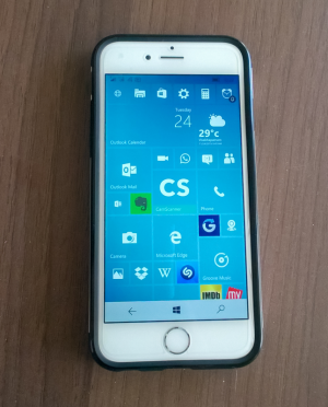

 live tiles are great to keep things like messages, climate and new in check without openning the app
Similar threads
Trending Posts
-
 Post pictures of your latest purchase
- Started by Laura Knotek
- Replies: 3K
-
 Every Dark Souls game gets rare sale for huge discounts ahead of Elden Ring's Shadow of the Erdtree DLC
- Started by Windows Central
- Replies: 0