Windows 10 Mobile: One small step for Windows Phone, one giant step backwards in UI

neo158

Active member
Oct 6, 2011
2,718
0
36
Visit site
Is this supposed to be a trick question? Tap ..., tap Folders.

If the hamburger menu contains a link to the folder list, it would be the same two-step process, although one of the taps might be a swipe. If the Hamburger menu shows the folder list at all times (rather than making you tap a Folders item), the hamburger menu itself will require scrolling to accommodate sometimes long email folder lists or multiple folder lists in the case of linked Inboxes. Showing the list at all times would crowd out the other choices in the hamburger menu.

That's what I'm saying. The hamburger button, at least on the Outlook Preview for Android, shows a folder list at all times. Also a swipe from the left edge brings up that same folder list as well.
 

manicottiK

New member
Nov 24, 2011
660
0
0
Visit site
That's what I'm saying. The hamburger button, at least on the Outlook Preview for Android, shows a folder list at all times. Also a swipe from the left edge brings up that same folder list as well.
What else is in that particular hamburger menu? Are there any other menus/settings/popups to access other functionality and where on the screen are they activated from?

I spent some time with an iPhone today and was stunned at how much real estate my fingers had to cross to do things. I had to go to the upper left, upper right, and lower corners. It some ways, it felt as disorganized as WM 5 or 6 (but was far better looking and more consistent than those).
 

neo158

Active member
Oct 6, 2011
2,718
0
36
Visit site
What else is in that particular hamburger menu? Are there any other menus/settings/popups to access other functionality and where on the screen are they activated from?

I spent some time with an iPhone today and was stunned at how much real estate my fingers had to cross to do things. I had to go to the upper left, upper right, and lower corners. It some ways, it felt as disorganized as WM 5 or 6 (but was far better looking and more consistent than those).

It links to the Calendar, People and OneDrive. But considering this is on Android I would expect those things to show up in the hamburger menu.
 
Feb 2, 2015
154
0
0
Visit site
The more I look at screenshots of Windows 10 for mobile the more I wonder why I don't just get an Android device, since the UI is pretty much heading in that direction anyway. Since Microsoft has put more time and energy into making sure their own apps are updated faster and more often on iOS and Android anyway, the only real differentiator between a Windows Phone and everyone else was the camera and UI. Since its inception, the Windows Phone UI was based on spacing and typography. Little-to-no chrome.

With Windows 10 mobile all I've seen is a major step away from the UI elements that made Windows Phone so great. Look no further than the new email, messaging and photos app. As a longtime WP user this frustrates me. I was willing to constantly be left behind in apps and games because I liked the style of my OS. I'll wait until Windows Mobile 10 comes out to make a final judgement, but I can see myself leaving Windows Phone if they continue to choose not to differentiate themselves with the UI. I suppose the preview time is our platform to let Microsoft know that we don't like the direction they are taking WP with regards to the UI.

View attachment 95101

Get your hands on it first. It may look like Android, but I doubt that it works like Android. My issues with Android were never about the UI, it was with the way it operated, so if Windows 10 for phones is like Android in that regard it wouldn't necessarily be a bad thing.
 

LumiaWorld

New member
May 31, 2013
331
0
0
Visit site
The hamburger thing is okay to me, I have no problems with it...

What I hate about the new UI is the headings, the font size, the text placements, and the status bar.

I still prefer the 'old' headings - you know, those enormously sized texts... Not a fan at all of this Android like heading wherein there is a bar, and an icon and etc. Not also a fan of how small the texts are, take the Settings app for example. Everything just seems so awkwardly placed on that app. Oh, and the status bar... It's a pain in the eyes... They should've made the color of it same with the heading bar...
 

LumiaWorld

New member
May 31, 2013
331
0
0
Visit site
But I believe that most of my complaints will be solved by Microsoft by the time Windows 10 for phone comes out. After all, it still has a long way to go before its launch for consumers... Definitely it will still have lots of refinement, improvement, etc.
 

chalx

New member
Jul 13, 2014
23
0
0
Visit site
Modern UI brought Microsoft diferentiation but it also brought them only few % of market share. Some 8.1 UI elements must go. Personally I'm not big fan of WP menues and general content handling with 90% of blank space and 10% of fine caligraphy.


Sent from my iPad using Tapatalk
 

rollindice

New member
Oct 15, 2014
616
0
0
Visit site
omg, stop the nonsense... so what if there is the hamburger menu? i see a LOT more functions in the mail app, and that's great!
it's not a change of the UI but the developement. while the 8.1 mail app looks very simple, it lacks a LOT of functions (and more people miss functions more than they dislike the new design)

Bring more functions but make it easier to access for the user with their hands, it's not a pc, phone apps should have icons at bottom and not at the top,i haven't installed the TP Win 10 yet, (1020 user) but I've noticed changes that make WP not much metro , from looking at the video that Daniel did showing the TP 10 on the 830 , when he went into Phone app it automatically showed dialer, previously if you launched Phone, it would show History and simple swipe to left or right would show Speed Dial, Dialer was right at the bottom,most persons who have their phones when placing a call you'd call someone you know most likely or spoken to recently, not all the time would you want to DIAL a number since the # would be in History or Speed Dial only if you're calling a new #, so the Phone app now shows dialer first instead of history or speed dial with easy swipes to left or right to access either of the two of them. and Speed Dial is at the TOP , why at the top? why? you have phone in your hand you wanna make call fast ,putting such easily and most frequently used options at the top makes it harder for one to get functions done quickly with one hand, when driving or not you can easily choose speed dial or history which shows up when you select phone and get things done fast, many many of my friends who I've transitioned over to windows phone love how phone app shows history and easily swipe to left or right to get speed dial, We're talking about ease of functions here with use of one hand
 

leo74

New member
Oct 22, 2012
253
0
0
Visit site
As Developer, I may or may not use the hamburger menu in my apps. I do like the current way options are accessed and I think I will stick to it. Bottom right seems like a good place for accessing options on a phone.
Since I don't have the W10 on my developer phones yet, I really can't make a call on how the new design will or will not impact usability of the OS.
I did like the content centered approach a lot, but since the vast majority of potentially new users will come from other mobile OS, I can understand why it might make sense to keep the user experience as consistent as possible.

What concerns me more than the hamburger menu and its placement (after all, I can change that in my apps) is that MSFT might (and here I need to say might, since I haven't tested it yet) move away from the panorama option for applications.
I saw that as not only a great way to move between pages of content, but also as a very elegant way of making content centered applications really a "fluid" experience.
At this point everything is speculation anyway and a lot can happen until the final OS is released.
The fact is that you just can't make everyone happy and it is terribly hard to find a compromise that doesn't end in being "half backed" in all aspects.

I do like reading all the "complaining" and "defending" of the old/new design though, because it provides a good indication about how I will design future apps.
It is important for everyone to provide feedback now. you may or ay not be seeing the results you want, but if you don't, chances are you are not in the majority. How we like designs is based a lot on subjectivity. When designing an app, I tend to think I am focusing entirely on usability and what I believe is the best user experience, but at the end of the day, there is always a good portion of what "I" think looks good in it...
 

Brandon Tobias

New member
May 6, 2014
237
0
0
Visit site
one you should not be driving and using your phone so that point there failed ....
two you really expect to add more functionality and new features and keep the UI the same.
three putting everything at the bottom will make the menu's long and the bar at the bottom crowded ....

as for the phone app i prefer the dailer first with quick access to history but it could be made an option of which you prefer .... i swear all i can see is complaints and what is not liked .... no appreciation for whats new or changed or better ...
 

Brandon Tobias

New member
May 6, 2014
237
0
0
Visit site
As Developer, I may or may not use the hamburger menu in my apps. I do like the current way options are accessed and I think I will stick to it. Bottom right seems like a good place for accessing options on a phone.
Since I don't have the W10 on my developer phones yet, I really can't make a call on how the new design will or will not impact usability of the OS.
I did like the content centered approach a lot, but since the vast majority of potentially new users will come from other mobile OS, I can understand why it might make sense to keep the user experience as consistent as possible.

What concerns me more than the hamburger menu and its placement (after all, I can change that in my apps) is that MSFT might (and here I need to say might, since I haven't tested it yet) move away from the panorama option for applications.
I saw that as not only a great way to move between pages of content, but also as a very elegant way of making content centered applications really a "fluid" experience.
At this point everything is speculation anyway and a lot can happen until the final OS is released.
The fact is that you just can't make everyone happy and it is terribly hard to find a compromise that doesn't end in being "half backed" in all aspects.

I do like reading all the "complaining" and "defending" of the old/new design though, because it provides a good indication about how I will design future apps.
It is important for everyone to provide feedback now. you may or ay not be seeing the results you want, but if you don't, chances are you are not in the majority. How we like designs is based a lot on subjectivity. When designing an app, I tend to think I am focusing entirely on usability and what I believe is the best user experience, but at the end of the day, there is always a good portion of what "I" think looks good in it...

you sir are classy
stated your views without being nagy or whiny while at the same time showing some level of understanding and explaining why you liked certain aspects ... this is how a thread should go ...

1+
for one i like the new design but currently the preview has too little of the new design of windows for me to comment as i have not used it as yet ....

when MS changes the majority of the OS then we can really ascertain the usability impact.

MY VIEWS
The small font and icons in settings and the other new parts is -1 MS.. it should be larger.

Panorama views for content as you said should remain as it can be made to blend in with the new design of windows and is quite elegant and unique as you said.

MS needs to employ navigation gestures like
- slide in from the left opens navigation menu / hamburgers
- slide down and flicks do other options like in the action center i don't wanna tap and arrow to expand anything flicks can work quickly
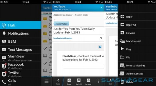
Borrow from Blackberry 10 if you have hamburger menus all options are presented to the bottom of the menu for easy reach ..... + gesture to open the menu. See image below
blackberry_z10_review_sg_29-580x320.jpg
options in the menu are to the bottom for easy reach.

Share menu needs and overhaul that has Bluetooth, WIFI direct, Print and NFC as static options. I should not have to turn on BT for it to show up android /BB10 and IOS have a better sharing structure ...

Dialer number pad needs to be larger by allot but i like the new layout and design.

My last view is Windows 10 on phones needs more colour .... please the black, white and grey thing is too bland this is why i like androids material design .... they even blased MS modern design when they were talking about it saying it was boring.

In terms of UI MS needs to do like BB10 and Google and pay a bit more attention to the details ... i.e colour pallet, animations, iconography and consistency/usability.

all in all i like what MS is doing
 
Last edited:

manicottiK

New member
Nov 24, 2011
660
0
0
Visit site
i swear all i can see is complaints and what is not liked .... no appreciation for whats new or changed or better ...
Complaining does seem to be the default state of online discussions, but I agree with you in general. However, given that this is a thread about UI and not about apps or app functionality, what can you tell us you appreciate about the new or changed UI? If your appreciation is for new or improved apps, (like the finally organized Settings app or the better picture selection feature in the Photos app), please start a new thread.

I wrote the above while Brandon was writing another post. Brandon, in that second post, you say that you like the overall direction, but pretty much every detail that you mentioned was something that Microsoft needed to change or add. What do you like overall if there's still no pano, gestures, color, or larger fonts in some places?

I'm not trying to be sarcastic here, I really want to know that there's something here that someone sees as an improvement. Right now -- and I realize that this preview is soooo young -- I'm seeing nothing to inspire me. I'm really hoping that I'm missing something -- I want someone to tell me that things are moving in a positive direction.

I think that the reason that we never brought our well regarded WP8 app to W8 was because the overall W8 design there seemed un-thought out. I think that I am now seeing that lack of thought being brought to WP in the name of consistency. I have no desire to "update" our app if the result is lowered usability and appearance. Give me hope...
 

Brandon Tobias

New member
May 6, 2014
237
0
0
Visit site
Yes the preview is lacking some things which i mentioned are
1) Gestures need to be added
2) Colour needs to be added

I do like the new direction well at least how i think its headed in my mind and how it will function once complete.
The new icons are nice and cleaner without the circle.
So is the cleaner font although i think people find it small it is refined.
Settings is an app but i do like the organisation it offers.
The look in settings is inconsistent so it will evolve currently there are WP8.1 and new W10 elements mixed in the settings app which suggest its still under construction and some features don't work / are missing.

The new apps designs are nice just lacking color so i can envision where windows is headed and i like it.
Bear in mind i have used android , BB10, windows phone and all versions of nokia S60/S40 and my degree is in I.T which has a bit of UI design in it .

So i like where they are going .... but at the same time moving some stuff to the top may affect others ... who choose to buy big devices so i also have to asses that.

some options to the top of the screen makes the app bar at the bottom cleaner as well as MS seems to be moving the icons that remain to the bottom of the app bar to the right corner which is a good thing for right handers ....

albet the things they need to do that would make some happy is

hamburger menu needs
1 a slide out gesture which i believe is coming...
2 moving the options to the bottom of the menu like in BB10 which we can request they do ...

3 colour is needed throughout the OS
 
Last edited:

rollindice

New member
Oct 15, 2014
616
0
0
Visit site
one you should not be driving and using your phone so that point there failed ....
two you really expect to add more functionality and new features and keep the UI the same.
three putting everything at the bottom will make the menu's long and the bar at the bottom crowded ....

as for the phone app i prefer the dailer first with quick access to history but it could be made an option of which you prefer .... i swear all i can see is complaints and what is not liked .... no appreciation for whats new or changed or better ...
Many people sshouldn't be driving and talking on phone I agree but many don't follow,I use Bluetooth connectivity between car and phone so its not like I will always be head first in the phone,once call is made in hands free but when using phone app most persons would be calling a number that's in their contacts or in history,fast access to get it done is quicker than using dialer
 

mgc418

New member
Feb 22, 2015
5
0
0
Visit site
I am trying to figure out where the shot on the left came from in the OP. The inbox on my 635 running WP10 TP looks nothing like it. It looks like the original on the right. I like the one on the left better to be honest. I am also an android user that is looking for reasons to move to windows phone.
 

doublehelix21

New member
Oct 8, 2015
1
0
0
Visit site
I think the main point people have forgotten here is that all of these new apps are UNIVERSAL apps now... i.e. they run onthe desktop as well...hence the new UI design considerations that have to be made.

Additionally, the new UI lends toward MUCH more functionality than the old design.
Something that was missing from windows phone 8/8.1 was the fine grained level of control you had in the mobile versions of these apps.
 

Kram Sacul

New member
Mar 4, 2013
750
0
0
Visit site
I think the main point people have forgotten here is that all of these new apps are UNIVERSAL apps now... i.e. they run onthe desktop as well...hence the new UI design considerations that have to be made.

Universal shouldn't mean UI compromises everywhere. It is possible to make a aesthetically pleasing and well thought out universal app without making it look and function like a cheap mobile website.

Additionally, the new UI lends toward MUCH more functionality than the old design.
Something that was missing from windows phone 8/8.1 was the fine grained level of control you had in the mobile versions of these apps.

You can still have more functionality and keep good design. 8.1 had a ton of new features over previous versions of WP but still looked unique and Metro/Modern even with the Android style action/notification center. Can't say the same about W10M.
 

Torontonian22

New member
Sep 20, 2013
149
0
0
Visit site
Universal apps are a nice promise from MS but I'm a bit sceptical for a simple reason mentioned by Kram Sacul above. Universal apps, ok. Same Experience accross device, not so much. A phone is not a PC and should not have the same UI pattern. One the other hand, universal apps means: broekn things on one device will be transferred all accross the board...

For example, the photos app on windows 10 pc has an issue (at least on my side): if I don't zoom in, the photo is not completely loaded. Therefore, the sharpness of the picture only turns on if I zoom in. If I don't zoom in, my photo is like low res. Never had that issue on W8.1. When trying the W10M preview, noticed that issues on the phone as well.... besides, pinch to zoom is not working great in the photos app on win10 (on a surface pro). Noticed the exact same behavior on the Photos app on windows 10 M.... and if you look at the WC videos at the microsoft event, you*ll notice a lack of reactivity of the pinch to zoom functionality in the photos app. So, this means each time MS breaks something on an app for the pc, we will get the problem on our phone and vice versa.

Trying to merge the user experience is a good idea but there should still be some clear barriers.
 

a5cent

New member
Nov 3, 2011
6,622
0
0
Visit site
Universal shouldn't mean UI compromises everywhere. It is possible to make a aesthetically pleasing and well thought out universal app without making it look and function like a cheap mobile website.

A phone is not a PC and should not have the same UI pattern.

Both of you have misunderstood the impact universal apps have (or don't have) on W10M's UI design paradigms.

Nothing about universal apps forces a developer to use the same UI pattern on different screen sizes. In fact, W10M explicitly supports the notion of the same app having multiple and potentially completely different UI layouts, where a different layout is chosen based on screen size. In addition to that, a developer that is willing to break with MS' UI recommendations can still make a smartphone UI look and work any which way.

The change in UI paradigms from WP8.1 to W10M is actually the result of MS trying to make it easier for developers to port iPhone and Android apps over to W10M, and making W10M look more like a place where such apps would be "at home". From a UI design perspective, that's completely unrelated to universal apps!

I suspect that iOS and Android sourced apps will eventually replace most of the phone-only apps currently in the WP store. It's not hard to imagine why MS might want the OS and the apps it runs to not look and feel completely different. Whether we agree with that is a different topic.
 
Last edited:

Members online

Forum statistics

Threads
323,275
Messages
2,243,560
Members
428,053
Latest member
JoshRos