How hamburger menus should be implemented universally in Windows

Kram Sacul

New member
Mar 4, 2013
750
0
0
Visit site
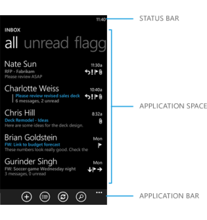
I guess I'm crazy because I'm totally fine with the system that's currently in WP. Need to do something? App bar. Need more options? Ellipsis. It just works. It's one of the nice things about WP that attracted me to the platform in the first place. They should just expand on what they already have instead of going backwards.
IC713299.png

Proper implentation of hamburger menu:

hamburger menu trash small.jpg
 

Alfa Kapa

New member
Sep 29, 2014
195
0
0
Visit site
If ham is the way it will be ,then I only hope that Microsoft will add swipe from the edge of the left to the right to reveal this menu/ ham/ happy meal or whatever this three lines are called.
(You know just like iNi Reader, Spotify, Google's stuff in Android and so on..)
 

NoodleWave

New member
May 3, 2014
3
0
0
Visit site
I'm surprised that devs don't use the ellipses as a replacement for the hamburger menu on WPs. Like ppl have said it works well as a built-in one hand mode. I wouldn't mind if the circle buttons also worked for navigation with the pivot, but the bottom menu could be improved by giving the option for more circle bottoms. Could be done by having the circle button row horizontally scrollable.
 

NoodleWave

New member
May 3, 2014
3
0
0
Visit site
Also, while I really like the pivot in WP. I think it's main weakness is that using more than 3 pivot sections results in more scrolling then clicking an expandable menu when going to a specific view.
 

white_Shadoww

New member
Jan 11, 2015
374
0
0
Visit site
I guess I'm crazy because I'm totally fine with the system that's currently in WP. Need to do something? App bar. Need more options? Ellipsis. It just works. It's one of the nice things about WP that attracted me to the platform in the first place. They should just expand on what they already have instead of going backwards.

View attachment 97799


Proper implentation of hamburger menu:


View attachment 97800


Totally agree with you. There is no need to add yet another navigational method.
 

white_Shadoww

New member
Jan 11, 2015
374
0
0
Visit site
Or maybe, I agree with a5sent as well. App bar is for quick actions, ellipsis for options and settings, pivots for filters. So where do we put categories? There is no way to put categories in a Windows Phone app. So devs either put them in pivots or in the ellipsis. That's why our current e-mail app has a category 'folders' under the ellipsis which seems kinda odd.


Sent from my Lumia 920!
 

neo158

Active member
Oct 6, 2011
2,718
0
36
Visit site
There is another way to solve this issue, a completely configurable UI. That would let the user decide what the most important features are to them while keeping the functionality of the app intact.
 

a5cent

New member
Nov 3, 2011
6,622
0
0
Visit site
Or maybe, I agree with a5sent as well. App bar is for quick actions, ellipsis for options and settings, pivots for filters. So where do we put categories? There is no way to put categories in a Windows Phone app. So devs either put them in pivots or in the ellipsis. That's why our current e-mail app has a category 'folders' under the ellipsis which seems kinda odd.

Exactly. That's why I couldn't give Kram's last post a 'like', although the post was really funny.

It's just not good/workable as it is, because currently devs are required to constantly re-invent navigation on WP. There is no default solution, so devs end up using command bar buttons, command bar menu entries, home-made side panels which are often but not always opened using a hamburger button, and sometimes they misuse pivots. It is an inconsistent mess!

We may have gotten used to that mess, but if it's ever cleaned up we'll wonder how we ever lived with it.

Neo suggested the popular "let it all be configurable" option, but that doesn't change the fact that this mess does need to be addressed and that we still need a default approach to navigation, even if variations can be configured.
 
Last edited:

neo158

Active member
Oct 6, 2011
2,718
0
36
Visit site
Exactly. That's why I couldn't give Kram's last post a 'like', although the post was really funny.
It's just not good/workable as it is, because currently devs are required to constantly re-invent navigation on WP. Because there is no default solution, devs end up using command bar buttons, command bar menu entries, home made side panels which are often but not always opened using a hamburger menu, and sometimes they misuse pivots. It is an inconsistent mess!
We may have gotten used to that mess, but if it's ever cleaned up we'll wonder how we ever lived with it.
Neo suggested the popular "let it all be configurable" option, but that doesn't change the fact that this mess does need to be addressed and that we still need a default approach to navigation, even if variations can be configured.

Exactly, it's an absolute mess at the moment and needs to be addressed. The best example of the correct use of pivots is in the email app.
 

DJCBS

New member
Nov 19, 2012
719
0
0
Visit site
I have no problem with Hamburger Menus IF they're properly implemented...like they are on Android.
And that's by making them actionable through a simple flip from the left to the right.

I can't tell you how many time I've picked up one of my Windows Phones and tried to access hamburger menus on it by flipping from the left as I do on Android...just to find out it does nothing.

Unless Microsoft implements the rest of the Hamburger Menu philosophy that's on Android, they should just stay put and put the menus where they've always been on WP. OR, at least, move the hamburgers to the bottom.
 

Kram Sacul

New member
Mar 4, 2013
750
0
0
Visit site
Or maybe, I agree with a5sent as well. App bar is for quick actions, ellipsis for options and settings, pivots for filters. So where do we put categories? There is no way to put categories in a Windows Phone app. So devs either put them in pivots or in the ellipsis. That's why our current e-mail app has a category 'folders' under the ellipsis which seems kinda odd.

Categories could be put in the app bar. Just another icon that jumps you into the folder view or whatever page you want.
 

white_Shadoww

New member
Jan 11, 2015
374
0
0
Visit site
By the way, hamburgers on Windows 10 are even messier. I just installed Windows 10 on my laptop, didn't install yet on my phone as preview is not yet available, but using it on desktop confuses me a lot. Sometimes settings are listed under hamburger, sometimes there are categories. There are 2 hamburgers in some apps. This is very inconsistent mess. In my own opinion, Windows 8.1 with Synaptics gestures for touchpad was the best non touch OS I've ever used. That experience was brilliant. And on the phone side, it was Windows Phone 8.0, the best experience.
Sent from my Lumia 920!
 

white_Shadoww

New member
Jan 11, 2015
374
0
0
Visit site
On a side note, I've never used a big Android phone. I came from a tiny Xperia U which was 3.5 inches and using hamburgers on it was no problem. And using a 4.5 inch screen with WP8 wasn't even a problem. I saw an iPhone yesterday, at one of my dad's friend, and he was struggling reaching menus at the top of the screen. Constantly adjusting the grip. Honestly, I hate that. If this is what MS are going to implement, I will maybe get Xperia Z1 compact, because of the screen size. On WP front, we don't have a single device with small screen and good specs. All we have are 4.5 inches and above, and MS is screwing one hand usage.
Sent from my Lumia 920!
 

Kevin Rush

New member
Aug 11, 2010
1,039
0
0
Visit site
The endless swiping pivots or panoramas of Windows Phone Modern User Interface (UI) is good for one handed use no matter if you are left or right handed. I like that.

Also, I wonder if the people hating on the "modern design" might be thinking the UI version implemented on Windows 8.0 / 8.1 on computers and computer tablets? That version is no where near as elegant and well thought out as the "Modern design UI" on the Windows phones. It is the phone version, that I have always thought was amazing, functional, and innovative. I wonder if there isn't some confusion in the discussions as to which is being discussed.

Just my thought/opinion.
I voted on UserVoice.
Best Wishes.
 

Members online

Forum statistics

Threads
323,196
Messages
2,243,431
Members
428,035
Latest member
jacobss