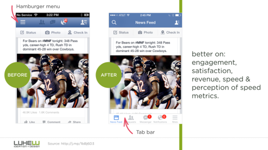
That particular article argues about discoverability, which I agree when it comes to how the Facebook used to hide things that should've been discoverable in the first place. It is about usability, but the reason is it hides functionality and information that is important for users to discover and manipulate. It's less of an attack on the Hamburger menu and more of an attack against designers' lazy use of the hamburger menu.
I will say that Outlook on the current build of W10 Mobile TP is **** poor, but Microsoft said the are planning to add bottom controls and are still finalizing its UX. However, the arguments against usability are the same for both the Hamburger menu and the Ellipses, in that if designers cram into those menus things that should be discovered and not hidden in a separate menu, then it is bad design--whether it's in the upper left or lower right. That being said, I personally never go into the ellipses menu, or the Hamburger menu, once my workflow is set up, and I question how often, really, people go into those menus in everyday usage.
For the people who gripe about how inaccessible the top-left hamburger is, I personally feel fine with it; so much easier to touch that with my left thumb than it is to reach over my phone one handed to touch the ellipses in the lower right. In fact, should they switch to all bottom navigation again, they should put the ellipses/hamburger in the lower left because it's so much easier for me.


