Outlook Mail app design suggestion...

anon(9668900)

New member
Oct 1, 2015
80
0
0
Visit site
I'm 100% sure no one at Microsoft is going to really care about this, but I really don't like the dark theme on the Outlook Mail and Calendar apps, and therefore I made a slightly different design to the dark theme, and I think it looks quite brilliant on my clear-black phone.

So, is there any place I could make this available to the feedback team? Tweeting it to Gabriel Aul doesn't really help.
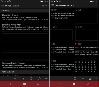
wp_ss_20151114_0001 (2).png
 

anon(9668900)

New member
Oct 1, 2015
80
0
0
Visit site
Get rid of the hamburger menu and use Windows 8 style icons and I'm on board.

I don't understand the fascination with the Windows 8.1 style (vis-?-vis Windows 10). I think Windows 10 icons are more compact, and better designed overall, and the hamburger menu isn't all that bad, to be honest, I quite like it!

I just want it black on the background, not grey, grey everywhere.
 

Kram Sacul

New member
Mar 4, 2013
750
0
0
Visit site
I don't understand the fascination with the Windows 8.1 style (vis-?-vis Windows 10). I think Windows 10 icons are more compact, and better designed overall, and the hamburger menu isn't all that bad, to be honest, I quite like it!

How are they better designed? They basically took the Windows 8 icon set and made them hollow/wireframe like iOS which makes them harder to make out and ugly on lower resolution screen. They also made several icons look more like Android's. To put it bluntly they suck.

As for the hamburger menu it's not even as "good" as Android's implantation where you swipe from the edge to bring it up. So it's a fail on top of a bad idea.

I just want it black on the background, not grey, grey everywhere.

Sadly grey is what MS thinks is dark nowadays. Users with AMOLED screens are not happy.
 

anon(9668900)

New member
Oct 1, 2015
80
0
0
Visit site
How are they better designed? They basically took the Windows 8 icon set and made them hollow/wireframe like iOS which makes them harder to make out and ugly on lower resolution screen. They also made several icons look more like Android's. To put it bluntly they suck.

I like them...


As for the hamburger menu it's not even as "good" as Android's implantation where you swipe from the edge to bring it up. So it's a fail on top of a bad idea.

Yes, that's kind a rather large problem, they don't want people to swipe from the edge, they seem to use the swipe-from-edge for other things (changing week, delete/archive, etc.). Surely, if not in RTM, it needs to come in the next update, otherwise it is indeed a big fail.


Users with AMOLED screens are not happy.

Tell me about it! I chose 730 for the OLED!
 

Members online

Forum statistics

Threads
323,132
Messages
2,243,311
Members
428,029
Latest member
killshot4077