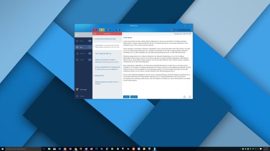
Universal Windows App Font Quality Horrible?

anon(9947068)

New member
Jun 25, 2016
26
0
0
Visit site
It is CLEARLY obvious that there is a difference between the font quality of a UWP app and, say, a WPF app; you notice the difference no matter how many UWP apps you download and test, and no matter what monitor you use. I am currently developing a app (in beta) and am completely frustrated with this fact because I am a UI quality junky.

One minute I'm feeling good about my work, and then a simple glance at something simple as the Windows Explorer's font quality makes me reflect on my decision to put all of this darn time into learning C# and working on a UWP app. I am 6 months into the project, so there is no turning back at this juncture.

Am I the only human being aware of this difference? Is there a technical explanation for what is going on with the fonts? If I am not mistaken, Windows 10 was supposed to introduce even higher fidelity UI components, not worse. For example, they are now supporting 4K monitors at higher DPIs. Looks much better now than on Windows 7 or even Windows 8.1, but font quality seem to have taken 2 steps back.

Thoughts?
 

Chintan Gohel

Active member
May 23, 2014
10,785
1
36
Visit site
It is CLEARLY obvious that there is a difference between the font quality of a UWP app and, say, a WPF app; you notice the difference no matter how many UWP apps you download and test, and no matter what monitor you use. I am currently developing a app (in beta) and am completely frustrated with this fact because I am a UI quality junky.

One minute I'm feeling good about my work, and then a simple glance at something simple as the Windows Explorer's font quality makes me reflect on my decision to put all of this darn time into learning C# and working on a UWP app. I am 6 months into the project, so there is no turning back at this juncture.

Am I the only human being aware of this difference? Is there a technical explanation for what is going on with the fonts? If I am not mistaken, Windows 10 was supposed to introduce even higher fidelity UI components, not worse. For example, they are now supporting 4K monitors at higher DPIs. Looks much better now than on Windows 7 or even Windows 8.1, but font quality seem to have taken 2 steps back.

Thoughts?

can you share a couple of screenshots so I can see the difference?
 

anon(9947068)

New member
Jun 25, 2016
26
0
0
Visit site
Sorry about the late reply. Here a single clear screenshot, taken at 4K resolution. The fonts are only clear when they are set to a certain size. Also, the background color can cause issues as well. Don't know exactly what you will see, but on my 4k monitor some of the text is just sloppy.

screenshot 2016-07-08_5-14-07.jpg
 

Chintan Gohel

Active member
May 23, 2014
10,785
1
36
Visit site
And now that I look at it, you most likely will not be able to see what I mean, because they compress the images when you upload them....

there's a way to change the cleartype for fonts in display settings - so you can change how readable fonts are - but I don't know if this works everywhere
 

anon(9947068)

New member
Jun 25, 2016
26
0
0
Visit site
Well it is not really about how I view things. It's about the users of the app. THEY are the ones who have to put up with it. UWP apps are simply lacking, as I've come to realize during the development process. The SDKs and tools are just not where they should be in the year 2016. So sure you can ask me to change settings in the system to try and get things looking better, but you can tell this to the many users of the app. If you go that far, you will soon be asking them to go into their monitor settings and adjust the contrast, brightness and sharpness before using your app lol. Thanks, though.
 

Chintan Gohel

Active member
May 23, 2014
10,785
1
36
Visit site
Well it is not really about how I view things. It's about the users of the app. THEY are the ones who have to put up with it. UWP apps are simply lacking, as I've come to realize during the development process. The SDKs and tools are just not where they should be in the year 2016. So sure you can ask me to change settings in the system to try and get things looking better, but you can tell this to the many users of the app. If you go that far, you will soon be asking them to go into their monitor settings and adjust the contrast, brightness and sharpness before using your app lol. Thanks, though.

I've been thinking of learning to develop too, so I can a couple of apps released.

From the apps that you have seen, is the font issue random or prevalent? And how do most people see it?
 

Members online

Forum statistics

Threads
323,196
Messages
2,243,431
Members
428,035
Latest member
jacobss