- Aug 3, 2012
- 193
- 0
- 16
A while ago I felt like I figured out what was wrong with the Settings app on Windows 10 and decided to give it a small tweak, thinking I managed to introduce massive UX improvements with a small change.
I kept thinking about how the Windows 10 we've got has inherited a lot of inconsistencies along the way, especially elements borrowed form Windows 8 for touchscreens. I believe those inconsistencies still plague Windows, even though Windows 10 is an improvement for desktop users that make up the bulk of Windows users and a step back in terms of tablet and 2 in 1 usability compared to 8.
So I decided to give the desktop on Windows 10 a refresh, with my thoughts on how the ideal desktop would look like.
To me it is obvious that Windows 7 was a better desktop OS, UI wise. So I took from 7 and updated it with the good parts of 10:
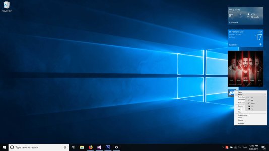
1) On the desktop, Tiles are basically widgets with limited functionality, and bad placement within the Start menu. So I took them out, put them on the desktop and gave them some intractability. The result is a consistent Tile design that is actually useful on the desktop.
I suggest enabling the tiles to have up to 3 buttons, configurable by app developers. Also a carousel that allows the user to dispatch next and previous commands, that can be employed in many scenarios: next and previous track in the Groove tile, next and previous photo in the Photos app, next and previous news in the News app, appointments in Calendar, etc. etc.
2) Start picks up the good parts of Windows 7, and seeing as Windows 10 1809 introduced cards for apps in search results, similar to Windows 7, the same design can be used to give us a compact Start menu that can expand to include more details about apps when you select them. This way Windows 7 users will also get a more familiar experience and desktop users in general won't feel the Start menu is bloated for no good reason.
3) Settings looks barren and empty in some places, and I realized those places are meant to be actually pop up dialogs. I gave them the pop up treatment and believe they look much better now.
4) I haven't gotten around to redesigning the tablet mode but I never understood why tablet mode has to have the same Start menu layout that it has on the desktop. Obviously people use 2 in 1s differently when in desktop or tablet mode, so I believe tablet mode's layout needs to be laid out independently from how it looks on the desktop - and that's only part of tablet mode's problem.
So here goes my ideas for tweaks and redesigns:


What do you guys think? Is this better than having non-interactable Tiles in the Start menu? Let me know.
I kept thinking about how the Windows 10 we've got has inherited a lot of inconsistencies along the way, especially elements borrowed form Windows 8 for touchscreens. I believe those inconsistencies still plague Windows, even though Windows 10 is an improvement for desktop users that make up the bulk of Windows users and a step back in terms of tablet and 2 in 1 usability compared to 8.
So I decided to give the desktop on Windows 10 a refresh, with my thoughts on how the ideal desktop would look like.
To me it is obvious that Windows 7 was a better desktop OS, UI wise. So I took from 7 and updated it with the good parts of 10:
1) On the desktop, Tiles are basically widgets with limited functionality, and bad placement within the Start menu. So I took them out, put them on the desktop and gave them some intractability. The result is a consistent Tile design that is actually useful on the desktop.
I suggest enabling the tiles to have up to 3 buttons, configurable by app developers. Also a carousel that allows the user to dispatch next and previous commands, that can be employed in many scenarios: next and previous track in the Groove tile, next and previous photo in the Photos app, next and previous news in the News app, appointments in Calendar, etc. etc.
2) Start picks up the good parts of Windows 7, and seeing as Windows 10 1809 introduced cards for apps in search results, similar to Windows 7, the same design can be used to give us a compact Start menu that can expand to include more details about apps when you select them. This way Windows 7 users will also get a more familiar experience and desktop users in general won't feel the Start menu is bloated for no good reason.
3) Settings looks barren and empty in some places, and I realized those places are meant to be actually pop up dialogs. I gave them the pop up treatment and believe they look much better now.
4) I haven't gotten around to redesigning the tablet mode but I never understood why tablet mode has to have the same Start menu layout that it has on the desktop. Obviously people use 2 in 1s differently when in desktop or tablet mode, so I believe tablet mode's layout needs to be laid out independently from how it looks on the desktop - and that's only part of tablet mode's problem.
So here goes my ideas for tweaks and redesigns:
What do you guys think? Is this better than having non-interactable Tiles in the Start menu? Let me know.
Attachments
Last edited:
 Twitter