Is this user interface looks good or bad, please give your opinion

AtefShehata

New member
Mar 27, 2012
22
0
0
Visit site
Hello,

I need to get your feedback and help about the user interface design of my new app “Duplex Player”.

Please not that: this is not a try to promote my app; just I have some hesitations about keeping the current user interface or changing it to something else.

I was trying to make the home screen to show all the expected & frequently used functions, but sometime I feel it is crowded!!
Also, sometimes I like the colors and the theme of the app, and sometimes I feel it is very ugly!

Just to let you know some info about the app, it is a media player that provides features such as Picture inPicture (Pip), casting to Chromecast and DLNA, media recording and playing from different local and online sources, ...

What do you think?

Here is the screenshot of the home screen

a6PYX5g.png

[Updated to add more images]

Here is how it looks when resized on desktop or in mobile landscape layout. The sections of the home screen are re-arranged into the side menu

5UK6uQN.png

And here how it looks when opened on mobiles (portrait layout)

s3NwaWE.pngrUP9xud.png


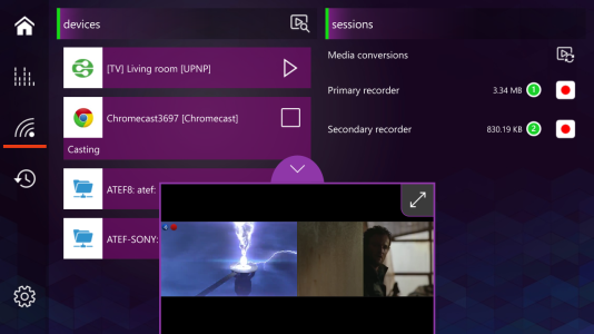
And here is an example of the multiplayer
htldWQD.png

Your feedback is appreciated,

Atef
 

Attachments

  • 0oa4C6J.png
    0oa4C6J.png
    426.5 KB · Views: 2
Last edited:

xandros9

Active member
Nov 12, 2012
16,107
0
36
Visit site
Well here goes. I'm assuming this is meant as a tablet/desktop/PC app first.

The background isn't bad but it feels odd considering the usually white, grey or black backgrounds of "modern" apps.

Regarding the section headers (quickplay, playlists...) I feel the green line and purple gradient distract and there should be more emphasis on the typography as opposed to putting them into boxes to emphasize them.

I see you have a settings button on the bottom and a home button up top, maybe you can move some main sections to that area, a la the Windows 10 Weather app?

The more than one set of media playback controls is odd to me as well.

I'm no UI designer but you don't have to cram everything into the home screen like that. You can even make it customizable if you're really unsure.

Now this is just my two cents and I'm no expert. I'm a sucker for the old Metro design but that'll be a bit out of place on Windows 10 now unfortunately.
 

AtefShehata

New member
Mar 27, 2012
22
0
0
Visit site
Well here goes. I'm assuming this is meant as a tablet/desktop/PC app first.

The background isn't bad but it feels odd considering the usually white, grey or black backgrounds of "modern" apps.

Regarding the section headers (quickplay, playlists...) I feel the green line and purple gradient distract and there should be more emphasis on the typography as opposed to putting them into boxes to emphasize them.

I see you have a settings button on the bottom and a home button up top, maybe you can move some main sections to that area, a la the Windows 10 Weather app?

The more than one set of media playback controls is odd to me as well.

I'm no UI designer but you don't have to cram everything into the home screen like that. You can even make it customizable if you're really unsure.

Now this is just my two cents and I'm no expert. I'm a sucker for the old Metro design but that'll be a bit out of place on Windows 10 now unfortunately.

Thanks xandros9 for your help,

Sorry I didn't mention that the app is universal and its layout will change based on the active resolution. I have added more images to show more layouts to clarify the design.

Regarding the background:
Yes, I agree, what I'm trying to do is to make something colorful. But maybe I need to think again.
Regardless of the standards, do you prefer white/gray/black backgrounds or colorful ones?

Regarding the section headers:
You are right, I don't like it too. I need to find alternatives.

Regarding the settings button:
You are right, I have added some images to show that: in small resolution, the sections are re-arranged into the menu. Please take a look. I was trying to differentiate the settings button from section buttons. that is why the settings button appears alone at the bottom of the screen.

Regarding the two sets of media playback controls:
One of the main feature of the app is to enable playing, casting and recording two media content at the same time. That is why you may have two playback controls. The second set of playback controls shouldn't appear unless you choose to use this feature. I have added an image to show what the user gets when using the Pip feature.

Regarding the home screen:
Yes it is crammed with a lot of things. I was trying to make a global view to easily control playback, recordings and also the casting from a single view. I like the feature, but like you, I don't like that there are many things on the home screen. Maybe as you said, I should allow the user to customize the home screen.
 

Staff online

Members online

Forum statistics

Threads
323,249
Messages
2,243,517
Members
428,049
Latest member
velocityxs