
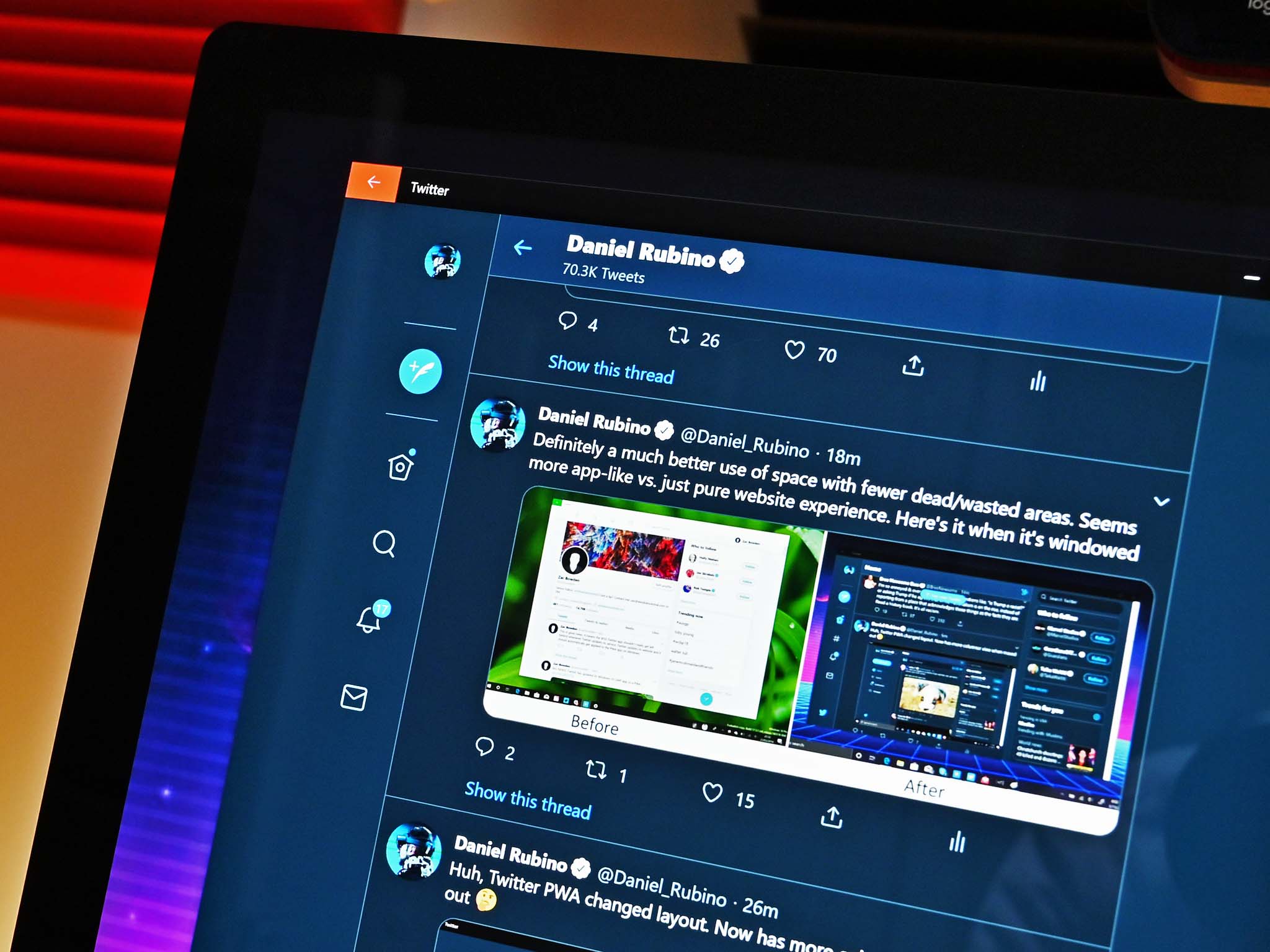
Bye-bye dead and wasted areas for a new app-like design.
Twitter seems to be having fun with the concept of progressive web apps (PWA). The company just pushed out an update to its PWA site and app for Windows 10 that changes the layout dramatically.
The refreshed design pushes the home, explore, notifications and direct messages tabs to the left-hand side instead of being on top. On the right-side Twitter has expanded "Who to follow" and "Trending now" with more graphics and making it a bit more eye-catching to boost engagement. There's also your most recent uploaded media and images. That leaves the center area for the chosen view of home, explore, notifications and direct messages.
Full story from the WindowsCentral blog...