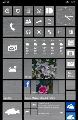
UI- there should be three screens. First one for home screen. Second for tile screen and the last for applications list. For the home screen there should only be a plain wallpaper with some basic tiles like call, message etc and the icons should be customized to the bottom so that the wallpaper will be visible. Now by swiping left, here we get the tile screen. The home screen wallpaper will be dimmed and the tiles will be arranged completely as our wish and looks like floating on the home screen wallpaper.Again by swiping left we get application list. If we want to go for tile screen when we are in the application list screen, we can get out by simply reading the windows symbol button one time, If we want the home screen then double time.if we are in the tile screen, we can go to home screen by swiping right or by single taping the windows symbol button.if we are in the home screen and we want to go directly to the application list then by simply clicking the arrow mark in the bottom right side corner. How is it guys. Hope you may like it please comment on it
Windows phone 9 UI
- Thread starter swyrik
- Start date
You are using an out of date browser. It may not display this or other websites correctly.
You should upgrade or use an alternative browser.
You should upgrade or use an alternative browser.
Torcher Death
New member
I'd rather have fastlane or a task manager of sorts than a wasted homescreen...though what I'd really like would be an interactive action center.
dKp1977
New member
Hmm.. Why that additional home screen? That'd be somewhat redundant imho. I much prefer having the homescreen and the app list, just like it has always been. Three things I'd like to see improved/added though:
1) option to not display games in the app list (that's what the friggin' games hub is for, god damnit)
2) interactive live tiles
3) interactive action center
1) option to not display games in the app list (that's what the friggin' games hub is for, god damnit)
2) interactive live tiles
3) interactive action center
YanivC
New member
I am not talking about you are.i am talking about UI changes.
No you are talking about YOUR UI changes. He is talking about what HE would like.
YanivC
New member
Quite frankly, I think the UI is almost perfect. I would really like to see an interactive notification center. I hate pushing on the wifi button only to flip screen and end up on the wifi settings screen. It should simply turn it off right there.
What really needs to happen is marketing and enticing developers. Android was built from the ground up by developers. They opened the platform in such a way that anyone was able to write (albeit garbage) apps. Then... the true dev's got involved and we saw adoption skyrocket. Cyanogen became a "business model" and ROM's became common place. Suddenly, the least tech savvy people I know were rooting their phones and dropping in new roms and apps. The developers built android. The developers need to build WP. The problem is that the OS is "almost" there. With 8.1 we are given a much more robust mechanism for interacting with the OS and hopefully it will get better but..... remember that in the business world.... first to market usually conquers it. Build a better mousetrap and you win.... the short history has proven that. Apple was first to market and it conquered it. Android built a better (thats arguable still) mousetrap and they now are winning. Microsoft needs to somehow build an even BETTER mousetrap. And that aint no easy task!
What really needs to happen is marketing and enticing developers. Android was built from the ground up by developers. They opened the platform in such a way that anyone was able to write (albeit garbage) apps. Then... the true dev's got involved and we saw adoption skyrocket. Cyanogen became a "business model" and ROM's became common place. Suddenly, the least tech savvy people I know were rooting their phones and dropping in new roms and apps. The developers built android. The developers need to build WP. The problem is that the OS is "almost" there. With 8.1 we are given a much more robust mechanism for interacting with the OS and hopefully it will get better but..... remember that in the business world.... first to market usually conquers it. Build a better mousetrap and you win.... the short history has proven that. Apple was first to market and it conquered it. Android built a better (thats arguable still) mousetrap and they now are winning. Microsoft needs to somehow build an even BETTER mousetrap. And that aint no easy task!
SSgt Bruskowiz
New member
For the larger screens.

Better backup options and a option to create your backup outside the onedrive ( Sd card ),
including the apps so after a restore the system don't need to donwload them again.
More collors for the homescreen, instead of only black or white for the background.
The rest as it is.

Better backup options and a option to create your backup outside the onedrive ( Sd card ),
including the apps so after a restore the system don't need to donwload them again.
More collors for the homescreen, instead of only black or white for the background.
The rest as it is.
xArgieboy
New member
The UI is great and simple and doesn't require big hardware, that's why performs great in every device, different from Android. What it need to be added and improved is the app suspension and multitasking. Should be faster and it could have a launcher (Linux sort of) to quickly change between apps and other things and it would also work under lock screen.
jameswblackwell
New member
I'd quite like a third screen to the left for cortana. So app list by swipe to the one side and cortana to the other. Kind of like the google now launcher.
Squachy
New member
Im kind of wondering if the UI should be modified so that it matches the desktop UI.
Instead of endlessly scrolling up/down and swiping left/right for the app list (on the phone), its a sideways swipe for extra tiles and a swipe up/down for the app list. (on desktops). Also if you go in landscape mode on the phone the UI can shift to accommodate like it does on the desktops already.
For one, that'd be more consistent with the ecosystem, and 2 it'd be more familiar with ios and android which does left/right swipes to different 'pages'. I think their app lists are just tacked onto the last 'page'.
emperor_skull
New member
smoledman
Banned
I'd start with scrapping the live tile concept completely, and adopt Android's icon + widgets approach. That seems to be what people like.
moegumby
New member
Then you might as well have an Android, what's the difference if not for the look and feel of the OS? An apps a app!
Sent from my Verizon Icon
Sent from my Verizon Icon
Similar threads
- Replies
- 0
- Views
- 1K
- Replies
- 0
- Views
- 4K
- Replies
- 0
- Views
- 2K
- Replies
- 7
- Views
- 9K
Trending Posts
-
Quake 2, State of Decay 2, and more get mouse and keyboard support on Xbox Cloud Gaming
- Started by Windows Central
- Replies: 0
-
Did the Fallout TV show just make a Fallout 4 ending canon?
- Started by Windows Central
- Replies: 3
Forum statistics

Windows Central is part of Future plc, an international media group and leading digital publisher. Visit our corporate site.
© Future Publishing Limited Quay House, The Ambury, Bath BA1 1UA. All rights reserved. England and Wales company registration number 2008885.

