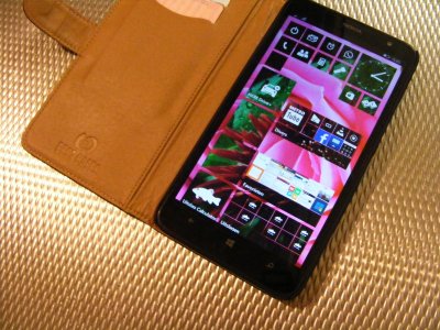
A simple example of transparent tiles

Alfa Kapa

New member
Sep 29, 2014
195
0
0
Visit site
Here is a simple start screen background with transparent tiles I quickly made in photoshop.
Each tile has soft shadow to create a distinction from the background (in case of same color)

(Don't mind Bob Marley's dreads, they are a victim of background eraser)

21ce23n.jpg


I think this is a way better way to showcase the tiles, as each tile (and the background image) is perfectly visible.
Also a tile transparency slider (ex. 60% - 100% opacity) would be a great addition!

Anyway waiting for the official words of MS on Windows 10 for phones!
 

nicfromwales

New member
Apr 15, 2014
330
0
0
Visit site
Looks awful. And what would happen to the background photo as you scrolled, would it remain static, or follow you down so that those with several pages of tiles don't run out of background? Neither option is as good as what we have now.
 

Makm

New member
May 15, 2014
324
0
0
Visit site
Not that bad. I don't mind the current style though. But it would be nice if we had this as an additional option.
 

alex athanasopoulos

New member
Sep 14, 2013
180
0
0
Visit site
I think that's better than some other concepts that change the icons style. But what really bothers me is the background image, its not good, too much noise. A more abstract/ simple photo would be better.

Also remember how some people hated the background photo for the tiles. I believe we will love it or hate depending on the used photo.
 

Alfa Kapa

New member
Sep 29, 2014
195
0
0
Visit site
Guys I'm not working at Microsoft chill out! :p
This is only an example to show how easy is to transform the tiles with a simple background and transparency!
 

Alfa Kapa

New member
Sep 29, 2014
195
0
0
Visit site
I think that's better than some other concepts that change the icons style. But what really bothers me is the background image, its not good, too much noise. A more abstract/ simple photo would be better.

Also remember how some people hated the background photo for the tiles. I believe we will love it or hate depending on the used photo.

Exactly my thought!
Tiles color was petrol, so this was the only matching image I had :p
Αντε να δουμε!
 

a5cent

New member
Nov 3, 2011
6,622
0
0
Visit site
I also think the shadows need to go. You have a good reason for putting them in, but I think you need to look for a better solution.

Otherwise, it's not that different from the mockups made by windowsphoneitaly who claim to have seen the actual W10M start screen.

I am sorry but metro is about FLAT style.

While true, being flat is one of the least important aspects of metro. It's just the first thing that stands out. Far more important are concepts like "content before chrome", "heavily reliant on typography rather than buttons", "use of navigational concepts made popular by the web", and "consistency across OS and apps" etc. Those things represent the true essence of metro. The rest, particularly the flat part, is "just" the superficial window dressing.
 

rockstarzzz

New member
Apr 3, 2012
4,887
1
0
Visit site
Here is a simple start screen background with transparent tiles I quickly made in photoshop.

Each tile has soft shadow to create a distinction from the background (in case of same color)

(Don't mind Bob Marley's dreads, they are a victim of background eraser)

http://i58.tinypic.com/21ce23n.jpg

I think this is a way better way to showcase the tiles, as each tile (and the background image) is perfectly visible.

Also a tile transparency slider (ex. 60% - 100% opacity) would be a great addition!

Anyway waiting for the official words of MS on Windows 10 for phones!


But it ain't fun or colourful now.
 

WanderingTraveler

New member
Dec 23, 2012
4,974
0
0
Visit site
OT: Doesn't look like it'll work with a lot of my backgrounds. It also seems like an admission of defeat to Google's Material Design, so you might want to consider that.
 

Slawootsky

New member
Nov 1, 2013
14
0
0
Visit site
Of all transparent-tiles-with-background concepts I've seen (which are horrible) this is actually pretty nice and refreshing one! Except for the status icon shadows. They don't look good.
 

Members online

No members online now.

Forum statistics

Threads
323,183
Messages
2,243,404
Members
428,036
Latest member
Tallgeeselll05