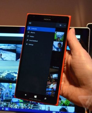
Hamburger menu!!

dkediger

New member
Aug 29, 2013
671
0
0
Visit site
Frankly, I must be missing something. I've never found a place to order anything from the Hamburger Menu. Its getting close to lunch, and I'm hungry, and McDonald's is just right across the street. They call this thing a Hamburger Menu, and yet I can't use it to place my order at McDonald's and have it ready for me to pick up. WTH!
 

Torcher Death

New member
Apr 28, 2014
488
0
0
Visit site
I for one like the ellipses & the menu below as opposed to damnbuger. For one, it takes some time getting used to & then, it would ruin the existing consistency, meaning all apps & settings would have to be changed from ... to =, which I feel is rather cumbersome & wasteful. Why change something that works & works well too, instead employ the resource to other things that need improvement such as the Xbox apps.
 

Jonathan J

New member
Jan 22, 2015
1
0
0
Visit site
The main problem of the hamburger menu is that you never know what there is inside, counter to the bar icons where you can guess the functionnality of them and have a quickly access.
Plus, for not nerd users, hamburger menu is hard to understand :
www .o3world.com/blog/usability-and-the-hamburger-icon
exisweb.net/mobile-menu-abtest
 

Donny James

New member
Jun 13, 2013
279
0
0
Visit site
The main problem of the hamburger menu is that you never know what there is inside, counter to the bar icons where you can guess the functionnality of them and have a quickly access.

Tap the menu and you will find out whats inside.

Plus, for not nerd users, hamburger menu is hard to understand :

Hamburger menus are all over Android and Android is the most popular mobile OS, so I this makes no sense. It's definitely not hurting Android.
 

Slawootsky

New member
Nov 1, 2013
14
0
0
Visit site
Yeah hamburger can also mean that we can say goodbye to the top- and bottom-edge swipes to show menu on tablets, which is lame. MS seems to yet again give up on their original ideas to please the crowd (which simply cannot be done in the first place).
 

stephen_az

Banned
Aug 2, 2012
1,267
0
0
Visit site
It's a terrible UX decision probably made just to appeal to terrible Android developers... There's a uservoice page but I can't post links yet :(
No, it is a compromise to facilitate universal app development. Of course they could punt on it and then people can just keep whining about not having the same version of Office as ios and Android, or should the maintain a separate development track just for a few people here?
 

stephen_az

Banned
Aug 2, 2012
1,267
0
0
Visit site
Yeah hamburger can also mean that we can say goodbye to the top- and bottom-edge swipes to show menu on tablets, which is lame. MS seems to yet again give up on their original ideas to please the crowd (which simply cannot be done in the first place).
Perhaps you might want to take a look at the demos before making statements laden with assumptions?
 

stephen_az

Banned
Aug 2, 2012
1,267
0
0
Visit site
I liked having the menu button on the bottom of the screen though. I couldn't care less about the three dots vs. the hamburger.

All a matter of preference. I like WP 8.1 but have always hated the bottom orientation of certain things. When not paying careful attention, I end up spending too much time having to tell Cortana to shut up when I hit the hardware search button. Granted, I have large hands and lost a bit of dexterity to a neck injury and cervical fusion. It really is just about preference and I am sure people will adapt.

As to other claims that this signals the death of Metro/Modern, I just don't see it. The UI is still very distinctive and maintains the flat design principals. It just also incorporates elements more familiar to the rest of the world.
 

Vlada Nehez

New member
Dec 13, 2014
138
0
0
Visit site
I don't get why is everyone so mad that they wanted to simplify settings app. I came to WP 2 weeks ago and was kinda surprised with the settings. It should be simplified and everything should be well organized. That's what a good OS is all about.
 

anon(5325154)

New member
Feb 18, 2011
230
0
0
Visit site
The hamburger menu completely negates the thoughtfulness that went into the metro UI's placement of actions/menus in the bottom action bar, where it is easy for the user's fingers to reach while holding the phone. What comes next... are they going to move the Spartan browser's address bar up to the top as well? Why not throw in one-handed usability toggle while they're at it? I also dislike it for the fact that it breaks the established convention of using ellipses to signal more options (and when an app has both hamburger *and* ellipses now that's really confusing!)

So I really hope they rethink the inclusion of the hamburger menu in so many places. However, if it must be included, then I think the only way I would be ok with it is if the following simple conditions are met:

- if there's a hamburger menu, don't also have ellipses
- the user must be able to swipe from the left edge to reveal the menu contents, this is so they can still use it while holding the phone one-handed
- [update] the hamburger menu should have wraparound scrolling, to let users bring the actions at the top of the menu to the bottom where it can be easily selected while still holding the phone with one hand.

On a related note, under no circumstances should the ellipses appear at the top (this can be seen in a few of the demoed apps and I think this is actually a worst offence than the hamburger menu)
 
Last edited:

Ma Rio

New member
Sep 28, 2013
1,291
0
0
Visit site
Ehh..if it's the way we have to go,I guess I'll get used to it.
I didn't like the elipsis too much, but I prefer them over the burger of ham.
 

Shobin Drogan

New member
Apr 5, 2014
192
0
0
Visit site
Although this is a very small problem, criticisms are what fixes problems. The action center should've been either from the bottom or either sides and buttons should be at the bottom, its simple common sense.
 

envio

New member
Jun 20, 2012
320
0
0
Visit site
Who in the world invented the hamburger menu anyway? That's what I'd like to know...

Good question -- I don't know but I think hamburgers in websites had good intentions originally. They're a way to get rid of navigational and menu controls that would otherwise reduce the screen real estate for content. But they've quickly become a product of lazy web development that has spilled over into mobile apps. Why spend time organising the look and feel and navigation of a site or app when you can throw it all into a hamburger, right?

On Windows Phone though, that quickly becomes very problematic. Windows Phone already has a very well defined and IMHO superior method for organising navigational and menu controls. When you try and add the two together, those design principals get horribly lost and worse, honest and well intentioned apps start to look ugly, less intuitive and lead to frustration and annoyance. Which menu does what? Where do I go for this action or that? Who knows anymore and developers wouldn't need to take as much care since the rule book has been torn up anyway.

The other major concern for me is the placement of the hamburger in the top left of the screen. On a desktop, (arguably) that can work where the input is a mouse, can even work with touch since the screen sizes are that much bigger. On a phone, it's the worst place for a menu that you need to interact with frequently. Your finger has to move to the top of the phone, making it less easy using the phone with one hand. Secondly, you cover the entire screen with your hand whilst you navigate and thirdly, the menu itself has no rules over how much screen it takes over, meaning the original intention to allow for as much content is now also forgotten.

#WindowsPhone #saynotohamburgerUI
 

a5cent

New member
Nov 3, 2011
6,622
0
0
Visit site
No, it is a compromise to facilitate universal app development. Of course they could punt on it and then people can just keep whining about not having the same version of Office as ios and Android, or should the maintain a separate development track just for a few people here?

No Stephen. Either way, there is zero need for a second development branch. The touch Office apps already contain a lot of code that is executed conditionally, depending on what type of device the app is running on. Ideally, app developers would have to do very little of this UI reconfiguration themselves, provided MS has thought out a default mapping between the large screen and small screen layouts. The ribbon at the top being moved into the bottom command bar is one example of such a reconfiguration, that likely occurs fully automatically for app developers.

These questions raise zero technical problems that aren't easily overcome. The only difficult questions are these:

A) Is it most important for a UI to be perfectly tailored/optimized for the screen real estate that is available, or is it worth sacrificing some of that optimization in favor of having apps be visually more similar across large and small displays? It's impossible to have both.

B) What is the benefit of spreading navigational chrome and command buttons across the screen (in top and bottom app bars and side panels), vs finding an approach that keeps them more out of the way and in one spot at the bottom, and also keeps mid- to small sized devices usable with one hand?

C) Is there no way to evolve the Metro design language into a more capable version of itself? A way that provides more utility while staying true to its principles, or is it necessary to sacrifice Metro in favour of other benefits?

There are probably more, but those are the most important I think. People can have valid reasons for answering those questions differently.
 
Last edited:

a5cent

New member
Nov 3, 2011
6,622
0
0
Visit site
As to other claims that this signals the death of Metro/Modern, I just don't see it. The UI is still very distinctive and maintains the flat design principals.

Being flat is the most superficial trait of Metro. It's almost irrelevant, and the main focus only of those who can't see past the surface coating (definitely not saying you belong to that group). What is important are the principles Metro puts forward. "Content over Chrome", "Design consistency across OS and apps", "Emphasis on typography rather than skeuomorphic representations", etc.
Such principles are what sits at the heart of Metro. We can differ over how important these principles are, but I think it's obvious that they are being thrown to the wind. In that sense I would definitely say Metro is dead... always with the caveat that what we saw was very far away from complete, and could still all change of course.
 

Staff online

Members online

Forum statistics

Threads
323,293
Messages
2,243,584
Members
428,054
Latest member
moocher720