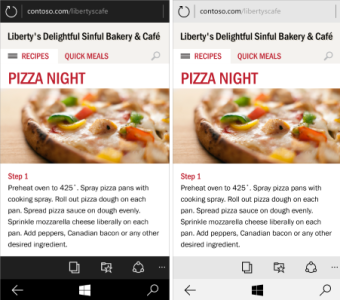
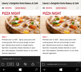
All buttons are going to the top! Horrible
- Thread starter anon(5969054)
- Start date
You are using an out of date browser. It may not display this or other websites correctly.
You should upgrade or use an alternative browser.
You should upgrade or use an alternative browser.
Ebuka Allison
New member
YashHarf
New member
I think Windows 10 for Phones are safe in Satya Nadella's hands.. Wait for the Preview OS and start giving feedback.. And be a part of creating Better UI for WP 
Paul Kinslow
New member
We don't need to wait and see to decide if we don't like it. Anyone who tries to use a phone with one hand should instantly not like it since it is so much harder to reach than when its on the bottom.
jasqid
Member
If I wanted hamburgers on my phone I would go with iPhone or android. I went with WP because of the freshness of the UI, the way (linked) email, contacts, calendar and tasks work. I really liked the metro UI and we're watching it die a slow death. Just like Hubs. Let me beat that dead horse again! Photo Hub, Me, People, GAMES!? I mean really? it doesn't really do anything for me anymore. Not even peek my xbox avatar unless I get into it.
Any person with a little UI intelligence should know that navigation belongs at the bottom and content at the top. It should be a law in UI design rules for screens that have a single hand user experience.
I had to set up an iPhone last week for my aunt, and o my god what a horrible experience that way. All the time I had to use my second hand to navigate all those stupid arrows and buttons at the top. And blocking my the view with my hands. And Apple was always yelling they made the perfect UI, an entity of holy perfection? Don't make me laugh. Windows phone 8.1 navigation is light years ahead. I can do everything with my thumb.
Also a keyboard is always at the bottom, that means when you are busy at the bottom with your fingers the other buttons are nearby which makes sense because your fingers are already there, and a developer has the whole upper screen free for design. When you put the buttons at the top you are spreading out the input places across the screen and it breaks the free space of design that should belong to developers to present content.
mortici
New member
What a5cent mentions is valid but not correct. There is no correct UI, many different designs work.
The design you describe was a total failure. I agree with tcp in this. A more compact design where actionable parts of the UI are where makes sense is better. The old, bad and failed metro had too much structure, too much space wasted, too much monochrome, too much dull geometry.
Notifications could be thinner and run through the top border, so they don't cover the commands, or any other solution.
WP 8.1 can't be used with one hand, there many elements in the UI that aren't reachable. Android needs a little more use of the other hand. It's not an all or nothing situation.
I don't feel any annoyance using other platforms with the menus at the top.
Sure, that's why the improved the UI so much, breaking the shackles of the boring and dull old metro, and making the new design consistent throughout Windows 10.
By the way, the UI guidelines for Metro was completely relaxed with Windows 8.1. I remember Jensen Harris like a bald dictator when he presented Windows 8, saying they you had to respect pixel perfect the sacred proportions of the Modern UI elements, or your app could be rejected. All that was dropped with 8.1, and the do whatever you want guideline was established.
I agree, after some retrospect, I hope the insider program lets us shape the UI/UX to a much better extent. I agree there are good UI implementations and poor ones, finding the right balance is what we should strive for. For instance I see no issue with the Word/Excel/PowerPoint UI with the menu burger up top and the tabs in the appbar, its a complex app that could benefit from these elements, it can't be a pivot or a panorama at least I couldn't envision it as so. The only way I can see maintain the appbar in these apps is if a quick action brought up a similar screen above it somehow, I dunno think there is just some thinking and feedback needed. I just think simple apps use should use simple UI elements that are easy to access. This can still be seen in the messaging app, the photos app doesn't need this you main tasks are editing, sharing, and viewing photos all that can be managed from the appbar, and navigation can continue to function as a pivot or panorama... But then again most consumers think of it as too hard or foreign and just are intimidated to learn to use it. Again balance needs to be found.
I am of the opinion that I would rather swipe and view than tap and go back if you know what I mean. To me its faster and easier as you don't have to track where you are...
The other thing they could be doing is, taking several steps back in UI, then moving back forward with fixing the UI with each iteration of the OS, slowly getting people to adapt one UI change at a time, rather than BAM ALL OF THESE CHANGES!
Discussion and feedback is the way to go!
Wevenhuis
New member
I agree with the sentiment of this thread. When it comes to quick action buttons in apps for windows 10 on a phone, these buttons should be at the bottom as much as possible. Settings should still be part of an app bar design philosophy at the bottom. Textboxes can be put more at the top. Putting more buttons at the top makes me think that microsoft wants us to use big phones for two handed use iin the future. Interesting paradox to some degree.
humanhowever
New member
Isn't this mail app, basically the app they bought recently? The one that has a great app on iPhone? I see the iPhone lot on the trains to and from work using basically the same app (in terms of the left and right swipe?). But maybe the Windows 10 version is slightly different in an 'Outlook' kinda way. Maybe Microsoft could push this onto the other platforms too, seeing as they own the app.
onysi
New member
notlikingtheaddress barat the top
http://www.windowscentral.com/sites...partan-windows-phone-screen.png?itok=jIuZTYk2

http://www.windowscentral.com/sites...partan-windows-phone-screen.png?itok=jIuZTYk2

Kram Sacul
New member
Sure, that's why the improved the UI so much, breaking the shackles of the boring and dull old metro, and making the new design consistent throughout Windows 10.
By the way, the UI guidelines for Metro was completely relaxed with Windows 8.1. I remember Jensen Harris like a bald dictator when he presented Windows 8, saying they you had to respect pixel perfect the sacred proportions of the Modern UI elements, or your app could be rejected. All that was dropped with 8.1, and the do whatever you want guideline was established.
No wonder that's when things started to go down hill. If you don't have basic guidelines or a quality standard on the user experience you can end up with chaotic garbage. The embarrassing UI mistakes we've seen in Windows 10 are evidence of that.
buddy007
New member
My only major gripe with the windows 10 event was the least amount of focus they gave to windows 10 on phones and the f*$king hamburger icons on the universal ms apps and all the metro design gone..... Man I really hope to give feedback to change things back to pivot design.... And lets hope they hear it
buddy007
New member
Totally agree and lets put this issue forward in the insiders feedbackHaving buttons at the top is idiotic, apart from requiring two handed use it also blocks the screen as your hand reaches up there. Is there some kind of industrial espionage going on at Microsoft where someone is deliberately putting these things in place to slowly destroy the modern interface? No way this and some of the other decisions can be intentional.
TheCudder
New member
Yes, let's keep Windows Phone exactly the same because clearly that's working for Microsoft. If they keep listening to you guys there won't be a Windows Phone in 2 years. You guys are over reacting to an OS you haven't even had hands on yet (one that's not complete at that) Something to think about, how many Android or iOS user are running from their devices because it's so difficult to use?
wuiyang
New member
Slovenix
New member
Yes, let's keep Windows Phone exactly the same because clearly that's working for Microsoft. If they keep listening to you guys there won't be a Windows Phone in 2 years. You guys are over reacting to an OS you haven't even had hands on yet (one that's not complete at that) Something to think about, how many Android or iOS user are running from their devices because it's so difficult to use?
I shall like all your comments!
Yes, let's keep Windows Phone exactly the same because clearly that's working for Microsoft. If they keep listening to you guys there won't be a Windows Phone in 2 years. You guys are over reacting to an OS you haven't even had hands on yet (one that's not complete at that) Something to think about, how many Android or iOS user are running from their devices because it's so difficult to use?
They don't know better. When you don't know better it's easy to get used to bad habits.
Alfa Kapa
New member
Yes, let's keep Windows Phone exactly the same because clearly that's working for Microsoft. If they keep listening to you guys there won't be a Windows Phone in 2 years. You guys are over reacting to an OS you haven't even had hands on yet (one that's not complete at that) Something to think about, how many Android or iOS user are running from their devices because it's so difficult to use?
Yes, change is good, but it is idiotic to move the majority of buttons at the top of the screen.
In my opinion MS got it backwards.
With WP7 , 8 (and even 8.1), which devices at the time had 3.7'' - 4.7'' screens, they made the decision to put the buttons on the bottom, and now with many devices with 5''+ screens, they want to move the buttons at the top? What the hell MS?
If everybody jumps of the cliff we are going to do the same?
I don't think there is anyone on this forum not wanting WP to evolve but clearly this is NOT the way forward.
And we are not talking about not getting unified apps or new designs, we are talking about the buttons moving to the top!
Look at the spartan browser.. WHY the address bar is on the top?!
People using WP, can make an impact on the future release and we only want the best.
I don't think there will be people saying ''nah, I won't get a windows phone because the buttons is at the bottom''!
It's a simple matter of practicality and ease of use. And if WP succeed, I sense that firstly ANDROID and then iOS will slowly move towards bottom located buttons which are clearly the way forward (since devices getting bigger and bigger).
Narathan
New member
If you look at it from another perspective - if the buttons were still on the bottom, how are you going to translate this to the xbox and desktop/tablets? Seems akward to use on those. Also, they want to unify the OS for the same experience on other platforms. Both the Android and iOS apps have these buttons at the top because the OS doesn't support it. It could be confusing for new users that are searching for that "menu" button from other platforms.
Not saying I love this approach, but I've seen enough people getting frustrated with using my phone because the layout "doesn't make sense" for buttons to be on the bottom. Honestly, I can't really blame them. I think its a good move - for now. And we can always sound off in the feedback forums they provide.
But honestly, if people really didn't want to see the hamburger buttons top, it makes me wonder why they are still there since the first preview. I find it hard to believe they just put them up there "because thats how we like it". Surely there's people that actually dig it?
DrewT3
New member
I think MS had some visionary designers in the Zune/WP7 days, when they were a little island in MS running Windows CE. Once the Windows 8 group got involved it was taken over by design hacks, and that is what we are stuck with today.No wonder that's when things started to go down hill. If you don't have basic guidelines or a quality standard on the user experience you can end up with chaotic garbage. The embarrassing UI mistakes we've seen in Windows 10 are evidence of that.
Windows getting uglier, Android and IOS getting better looking.
Similar threads
- Replies
- 0
- Views
- 4K
- Replies
- 2
- Views
- 2K
- Replies
- 2
- Views
- 4K
- Replies
- 0
- Views
- 545
Trending Posts
-
Microsoft's Xbox has taken over the Sony's PlayStation Store 🤯
- Started by Windows Central
- Replies: 17
-
Manor Lords FAQ: Release date, Xbox, Early Access, price, and other questions answered
- Started by Windows Central
- Replies: 0
-
Could 'Diablo' get a TV show like Fallout? We asked Blizzard.
- Started by Windows Central
- Replies: 0
Forum statistics

Windows Central is part of Future plc, an international media group and leading digital publisher. Visit our corporate site.
© Future Publishing Limited Quay House, The Ambury, Bath BA1 1UA. All rights reserved. England and Wales company registration number 2008885.


