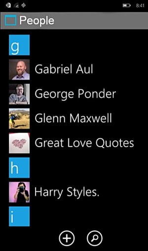
wp10's PEOPLE app looks ugly:/
- Thread starter namy_grooves
- Start date
You are using an out of date browser. It may not display this or other websites correctly.
You should upgrade or use an alternative browser.
You should upgrade or use an alternative browser.
hotphil
New member
Ugh. Some dude from OneErection.
And with a full-stop (or period if you're that way inclined) after the name.
Other than that, it's great.
And with a full-stop (or period if you're that way inclined) after the name.
Other than that, it's great.
I3unny
New member
RichardBurt
Banned
View attachment 96437
if this screenshot of people's app for wp10 isn't fake,
then i would rather prefer sticking to wp8.1!
wbu guys?
I suggest you have a look at the people hub on 8.1 and you will see that they are 99% *identical*
Laura Knotek
Retired Moderator
SamJHannan
New member
Ma Rio
New member
Alin Iulian
New member
JamesDax
New member
Please be sure to express your feelings about this change, assuming it's real, using the feedback App that is sure to come with this "TECH PREVIEW".
Jazmac
New member
Other than the grey bar at the top, it doesn't look that much different to me.
Looks the same to me too.
GrandGerminator
New member
TheCudder
New member
Real or Not, the only difference is the 'People' header & the lack of the "..." in the bottom bar. You guys have to be trolling with these W10 for phones is ugly posts.
nohra
New member
While 'ugly' is somewhat subjective, I think there will be an option for having better looking people in your hub than the leaked image. I can't remember where I read that though. :grin:
In all seriousness, try not to get too caught up with the possibility that things may look different from the current UI. I'm not immune to that either, (I don't want hamburger menus, I don't want buttons at the top of screens) but a grey bar with a slimmer "people" label would be a pretty mild change from what MS could do. Hopefully they make it better than it is now, but until we see it we just have to be patient.
In all seriousness, try not to get too caught up with the possibility that things may look different from the current UI. I'm not immune to that either, (I don't want hamburger menus, I don't want buttons at the top of screens) but a grey bar with a slimmer "people" label would be a pretty mild change from what MS could do. Hopefully they make it better than it is now, but until we see it we just have to be patient.
goran1898
New member
Jonnie LasVegas
New member
View attachment 96481 Here is the official aplication.
I hope they don't stick with the circles. I love the squares. I'm excited for the features of WP10, but so far am hating the look of WP10.
msirapian
New member
Circles on the new login screen on W10, circles in Skype, I think you won't escape from circles...
F3rzz
New member
adrian1338
New member
Why are you showing us a fake ? That's the question
i was just confirming that it's a fake!
i found it on some random person's twitter wall who claims it to be a leak ss!
Similar threads
- Replies
- 0
- Views
- 448
- Replies
- 1
- Views
- 1K
- Replies
- 6
- Views
- 1K
- Replies
- 0
- Views
- 2K
Trending Posts
-
Remnant 2 'The Forgotten Kingdom' gives us yet another reason to play one of the best games of the past year
- Started by Windows Central
- Replies: 0
-
PSA: It doesn't matter if your computer runs on ARM, all of your apps will work on Windows 11
- Started by Windows Central
- Replies: 7
Forum statistics

Windows Central is part of Future plc, an international media group and leading digital publisher. Visit our corporate site.
© Future Publishing Limited Quay House, The Ambury, Bath BA1 1UA. All rights reserved. England and Wales company registration number 2008885.


