Beyond hamburgers and pivots! Ideas for the new menu design

anon(5969054)

New member
May 7, 2013
685
0
0
Visit site
Okay there are two things we have to accept first.
1. They want to get rid of pivots, we have to accept this.
2. They are currently aiming for a hamburger menu.

Most people with a sense for good or bad UI will agree that a hamburger placed top left is a bad implementation. Windows 10 should wow people. It should open the gates for the future. It should not run after Android and iOS. Given that hamburgers are bad, some day Android and iOS will get rid of them and WOW everyone with a better implementation. And Microsoft will be behind again.

So in order to make Windows 10 future proof and an OS that everyone will like we have to think beyond hamburgers and pivots. Just whining 'we want pivots back' won't bring us anywhere. Lets think about other solutions as well.

Here are my design rules in no particular order.
1. You must be able to switch between the most used sections of an app with one tap or by swiping with one hand without stretching any fingers. (pivots win here)
2. Users must easily discovers that there are other sections to go to. (pivots and hamburgers tie because hamburger are known better but pivots give away more)
3. It must use as few screen space as possible. (hamburgers win here)
4. It must work great on all devices. (pivots win here)
5. No competing gestures. That is when swiping to change pivots interferes with swipe stuff on the screen like sliders. (hamburgers win)

So you see, pivots are overall better but are not the holy grail.

Lets help Microsoft and find that holy grail.

In this topic share your constructive ideas and share your opinions on them. Once we have several good ideas, I would like to ask Windows Central to feature them in a frontpage article and let people vote on them. Then we could share this information with Microsoft.

Why on this website instead of giving feedback straight away to Microsoft?
Because first we have to discover the best solution ourselves here. Once we have found it, we can present it to Microsoft. There are already tons of uservoices on this topic. All a little different but not one uservoice with a clear constructive solution. All votes spread out too much without giving Microsoft a real idea what to do. Once we have an idea what we want, we make 1 uservoice we can vote on.

So share your ideas here. Please describe them well. Please don't whine but be constructive. When you don't like someone's idea give constructive feedback and focus on the positives. Take elements from several ideas and combine them. Don't dismiss ideas that sound far etched too quickly. You can also make mockups but it's not required. If you have a good idea but lack the skills to make a mockup maybe someone else will make it for you.

Lets go!

My idea: http://forums.windowscentral.com/wi...rgers-pivots-share-your-idea.html#post2996628
 
Last edited:

GrandGerminator

New member
Mar 13, 2014
202
0
0
Visit site
Re: Beyond hamburgers and pivots! Share your idea.

Hello.
Love your idea.
I come there with a simple idea just to share my minds.

Here is Zbox. For those who don't know, it's a really nice music player. As you can see, there is a lot of pivots, enough to see them all at the top of the screen. That's easy to swipe and navigate inside the app. I would change the bottom app bar and make them match with those for W10 style anyway, but this app feel geat and it's easy to understand how it works.

wp_ss_20150216_0001.jpg

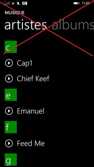
Here we go, you all know this Xbox Music app. There is the top app bar plus the large and useless pivots titles. The point is that you can easily add a hamburger to solve the problem there. But you can easily solve that optimizing the wasted space of the screen by deleting the useless top bar and reduce the titles...

wp_ss_20150216_0002.jpg


Tell me what you think.
 

Ebuka Allison

New member
Feb 19, 2013
1,391
0
0
Visit site
Re: Beyond hamburgers and pivots! Share your idea.

Hello.
Love your idea.
I come there with a simple idea just to share my minds.

Here is Zbox. For those who don't know, it's a really nice music player. As you can see, there is a lot of pivots, enough to see them all at the top of the screen. That's easy to swipe and navigate inside the app. I would change the bottom app bar and make them match with those for W10 style anyway, but this app feel geat and it's easy to understand how it works.

View attachment 97300

Here we go, you all know this Xbox Music app. There is the top app bar plus the large and useless pivots titles. The point is that you can easily add a hamburger to solve the problem there. But you can easily solve that optimizing the wasted space of the screen by deleting the useless top bar and reduce the titles...

View attachment 97302


Tell me what you think.
And that, in a nutshell is the issue with the hamburger menu. Just toss everything we can't fit there...
 

Praxius

New member
Jun 23, 2014
229
0
0
Visit site
Re: Beyond hamburgers and pivots! Share your idea.

Alright, I'll bite.

While I do like the "Pivot" system (the swiping left/right to jump to sections or menus) the biggest problem with the Pivot system is that you can not instantly jump to the section you want without having to cycle through every section in between.

Another issue with the pivot system is that because it doesn't all fit on the screen at once, you don't know what your options are until you manually cycle around in a full circle back to the start.... Then have to cycle through again once you figure out what section you really want.

There is no such thing as a quick jump to what you want. While cycling through doesn't take very long in most cases, to a new user not impressed by eye candy of different objects sliding at slightly different intervals, it could be a bit annoying.

While GrandG. has a decent idea of reducing the size of the top menu, you can still end up not having the entire menu list showing up for quick reference if there are too many sections and thus, still end up with the same problem.

What if you have 8-15 or so different sections? How small should the font go? How many times should you swipe to see and get to what you want?

What if you want to swipe through to see the various available sections but don't want to leave the section you are currently on until you are ready?

There is no such thing as the perfect UI, but if one wanted to stick to the pivot style system, what needs to be done is to have to top menu reduced in font size to display more sections at once, with arrows left/right to indicate that there is more to view.

When you decide to cycle through that menu, the section you are currently on remains highlighted. When it goes off screen, the arrow closest to the menu you are on highlights to the same colour.

When you wish to select a different section, rather than just swiping around in view/pan mode, you click once which activates the top menu similar to what happens when you set the date/time in the alarm app on WP.... You then swipe to where you want to go (or touch) and then the section you want highlights, followed by a quick panning effect from the section you were on to the section you want to be on.

I was also thinking this option could be done with an alternative look with a thin vertical bar on the left or right which pulls out (similar to the three dot menu) and the cycling/scroll viewing works the same way but in a vertical manner. When not being viewed, it compresses back into the thin bar, allowing for more display area.

But then again this compression effect could be done to the horizontal top menu previously described, but you have the problem of hitting the action centre.

One thing I would like in regards to eye candy, would be a literal feel of "pivot" in that the sections to the left and right of the section you are on are slightly in the background, blurred and curved to appear as though you are in a cylindrical effect of the sections panning around you while the current section is brought forward towards you.

This is all just an idea that came to me as I started typing.... What do I know? :p
 

eruptflail

New member
Aug 12, 2012
326
0
0
Visit site
Re: Beyond hamburgers and pivots! Share your idea.

I think the best solution would be to use the bottom bar as a way of navigating menus. Put all the options there.

A good example would be the music app. Put "playlists, artists, albums, store, etc" as icons on the bottom. If there are too many, make the bottom slideable like a pivot, even include a little arrow so that 1st time users don't get confused.

Another option is making it like the stock twitter app. Pivots and the ability to quickly choose one at the top.

The other solution is to put the hamburger button at the bottom
 

William Sandbrink

New member
Feb 13, 2015
2
0
0
Visit site
Re: Beyond hamburgers and pivots! Share your idea.

The exploding title concept would be cool, with it being on every phone, and for the ones without the 3d touch I prefer a single tap for that feature, and double tap to open the app, instead of a long press. But, what MS should incorporate with the long press should be a color option for that title in one corner, and a display control for what information that one title shows you live, with the last two remaining the resize, and unpin. There is no reason way you can't change the colors, and transparency on titles separately, and pick what info that app shows on the live tile. Custom fronts for any, and everything. The return of the people hub that synced all your social networks together, with Xbox live, Facebook, etc. Better synchronize services from Microsoft throughout apps, and normal phone actions. Hamburgers are pointless, the pivots are the best solution, I don't know why MS abandoned them.. Tip too Microsoft: Create your own UI, stop following others..
 

Jesper017

New member
Sep 29, 2014
3
0
0
Visit site
Re: Beyond hamburgers and pivots! Share your idea.

What if you could zoom out to get an overview of the full app, like for example when viewing multiple-page pdf files. You can zoom out and you'll get an overview of all the pages. What if that could be combined with a small pivot bar, at the bottom doesn't actually sound like a bad idea. I do totally agree with the fact that the pivots could be made a lot smaller. It looks better, too, from what I've seen of fan art and such. This thread is a good initiative, I hope more people will drop their idea's here, as there's plenty of creativity on the internet :)
 

arunsandeep

New member
Jun 23, 2012
19
0
0
Visit site
Re: Beyond hamburgers and pivots! Share your idea.

I like the way UC browser avoids hamburger menu, horizontal scroll in the menu. excellent!!!

wp_ss_20150219_0003.jpg
 

Attachments

  • wp_ss_20150219_0001.jpg
    wp_ss_20150219_0001.jpg
    92.5 KB · Views: 22

anon(5445874)

New member
Dec 6, 2012
673
0
0
Visit site
Re: Beyond hamburgers and pivots! Share your idea.

Just put a big red button on the bottom of the screen that says "menu" on it. Just to make sure it's good and ugly, make the font something horrible and yellow. Perhaps top it off with an ugly gray border around the red box.
 

WhiteNiteLite

New member
Dec 5, 2011
144
0
0
Visit site
Re: Beyond hamburgers and pivots! Share your idea.

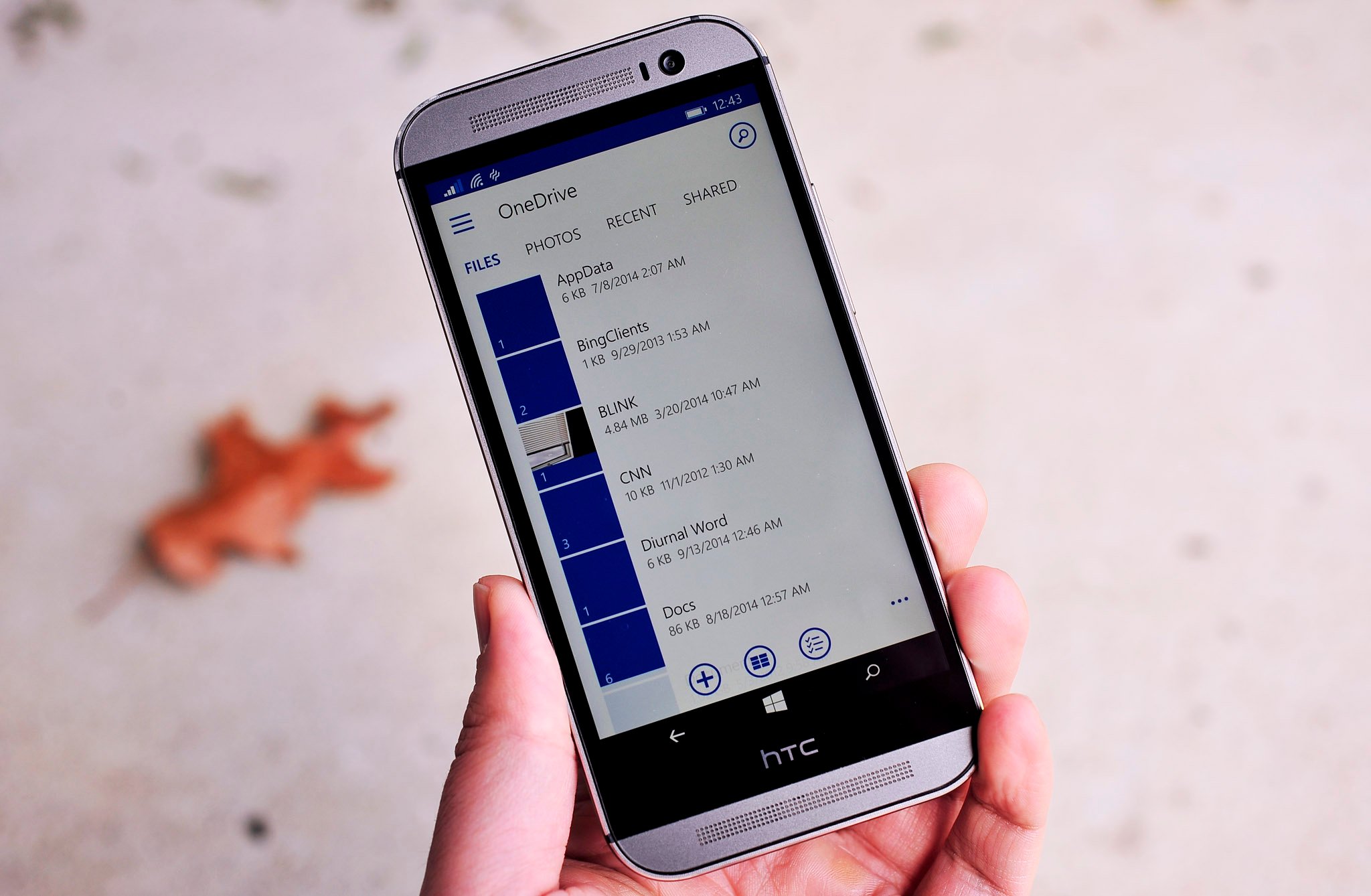
I think the most recent OneDrive update is a good example of what they should aim for if they insist on wanting something "familiar" to iOS and Android users without totally sacrificing ease of use. Basically it combines both the hamburger with a shrunken down version of the pivot. The things that people will probably use the least are hidden within the hamburger. The more common navigations are done via the pivot. Here's a picture to refresh your memory:

onedrive_windows_phone_new_ui_leade.jpg


If they really insist on wanting a hamburger only, then my next suggestion would be to do as some others have suggested and move the hamburger to the bottom of the screen. Instead of having an ellipsis on the app bar that swipes up, have a hamburger on the app bar that swipes to the side. The menu should list the items from bottom to top to keep things easy to reach.

Lastly, if that still isn't good enough and they really want the hamburger at the top, then they need to do what a lot of apps on the other platforms do and allow you to swipe anywhere on the screen to pull open the menu. This will avoid the need to have to reach all the way to the top of the screen to open the menu.
 

elwin lobo

New member
Apr 19, 2013
68
0
0
Visit site
Re: Beyond hamburgers and pivots! Share your idea.

yup I was about to post the same.. I feel this is the best implementation of pivots and hamburger... you can click on the names as well as swipe across the screen.. and the options in the hamburger seem to be appropriate if MS feels they need to have it
 

negative1ne

Member
Jun 8, 2013
161
3
18
Visit site
Re: Beyond hamburgers and pivots! Share your idea.

The UC browser has the most confusing menus i have ever used.
Half the time i'm not sure where they are, or how to bring them up or if they scroll, etc.

the combination of hamburger menu with a limited pivot is probably the only way to
create something that is familiar to people.

when you start trying to go beyond that, it either doesn't scale well, or is non-intuitive.

later
-1
 

anon(5969054)

New member
May 7, 2013
685
0
0
Visit site
Re: Beyond hamburgers and pivots! Share your idea.

The exploding title concept would be cool, with it being on every phone, and for the ones without the 3d touch I prefer a single tap for that feature, and double tap to open the app, instead of a long press. But, what MS should incorporate with the long press should be a color option for that title in one corner, and a display control for what information that one title shows you live, with the last two remaining the resize, and unpin. There is no reason way you can't change the colors, and transparency on titles separately, and pick what info that app shows on the live tile. Custom fronts for any, and everything. The return of the people hub that synced all your social networks together, with Xbox live, Facebook, etc. Better synchronize services from Microsoft throughout apps, and normal phone actions. Hamburgers are pointless, the pivots are the best solution, I don't know why MS abandoned them.. Tip too Microsoft: Create your own UI, stop following others..


We are sharing ideas for the menu system here. Even though we all appreciate your other ideas please stay on topic.:)
 

anon(5969054)

New member
May 7, 2013
685
0
0
Visit site
Re: Beyond hamburgers and pivots! Share your idea.

Well, here is one of my ideas: The 'floating menu nubbin'

The inspiration for my idea is the new nubbin feature in the keyboard. A nubbin like this could be used to scroll through menu's.

How about allowing the user to place this nubbin at any place on the screen. It is only a tiny dot so the rest of the app has the whole screen available. See it as a floating dot on top of the app. Like that new action button on android lollipop that is on the bottom right corner. http://www.myandroidsolutions.com/wp-content/uploads/2015/01/floating.gif (the + button bottom right). The nubbin needs to be smaller of course.
At default the nubbin could be placed at the bottom in the middle. This way it would be easy to reach for left and right handed people. But the user should be able to drag the nubbin to any place on the screen where it is comfortable for him.

Now what happens when you use the nubbin? You can press the nubbin and a menu will slide in, from a position that's relative to where you have placed the nubbin. At this very instant you can make tiny swipes to scroll through this menu vertically. Vertically, because the menu items are listed vertically. This allows for many items to fit on the screen. So you press and scroll directly to the screen where you want to go. Other gestures for this nubbin could be:
- hold and quick swipe to the left to go go to screen on the left. (no menu appears)
- hold and swipe to the left and hold to scroll to the left through the screens. Stop at the screen you desire. (no menu appears)
- hold and quick swipe to the right to go to screen on the right. (no menu appears)
- hold and swipe to the right and hold to scroll to the right through the screens. Stop at the screen you desire. (no menu appears)
- hold and scroll up and down through the menu that appears. In this mode the menu appears as an overlay on the screen. Stop at the menu item you want, remove your finger from the nubbin and it goes automatically to that menu item.
- one quick tap on the nubbin to go to the app's home screen.
- do some other gesture to enter edit mode to be able to drag the nubbin to any place on the screen. If this is too difficult to implement this could also be done in system settings, not real time. Maybe it would be nice though if it remembers per app where it is positioned.

Extra idea:
When 3d sensors available this nubbin could hide when removing hands from screen. When approaching screen the nubbin could appear.

The advantages of this menu system:
- uses almost no space at all.
- free placement wherever user wants.
- app developer doesn't have to think about menu layout. The whole screen is available for free design.
- it works really fast with quick swipes.
- it is better than pivots in a way that the whole screen is 'gesture free'. That means swiping left and right on the screen isn't used to change screens but is available to the developers to do other things with. So this means no more competing gestures. That was a problem with sliders too.
 
Last edited:

mjrtoo

New member
Sep 28, 2011
896
0
0
Visit site
Re: Beyond hamburgers and pivots! Share your idea.

I think the most recent OneDrive update is a good example of what they should aim for if they insist on wanting something "familiar" to iOS and Android users without totally sacrificing ease of use. Basically it combines both the hamburger with a shrunken down version of the pivot. The things that people will probably use the least are hidden within the hamburger. The more common navigations are done via the pivot. Here's a picture to refresh your memory:

http://www.windowscentral.com/sites..._windows_phone_new_ui_leade.jpg?itok=hqZse3U_

If they really insist on wanting a hamburger only, then my next suggestion would be to do as some others have suggested and move the hamburger to the bottom of the screen. Instead of having an ellipsis on the app bar that swipes up, have a hamburger on the app bar that swipes to the side. The menu should list the items from bottom to top to keep things easy to reach.

Lastly, if that still isn't good enough and they really want the hamburger at the top, then they need to do what a lot of apps on the other platforms do and allow you to swipe anywhere on the screen to pull open the menu. This will avoid the need to have to reach all the way to the top of the screen to open the menu.


Personally, I think it's stupid to have two menus like OneDrive has, why? How about pivots within the ellipses menu system, like a ribbon.
 

manicottiK

New member
Nov 24, 2011
660
0
0
Visit site
Re: Beyond hamburgers and pivots! Share your idea.

Well, here is one of my ideas: The 'floating menu nubbin'.
You've replaced direct manipulation (touch something and work with it) on a touchscreen with indirect manipulation (touch one thing to manipulate another) on a touch screen. This doesn't seem like a step forward.
 

WhiteNiteLite

New member
Dec 5, 2011
144
0
0
Visit site
Re: Beyond hamburgers and pivots! Share your idea.

Personally, I think it's stupid to have two menus like OneDrive has, why? How about pivots within the ellipses menu system, like a ribbon.

The main problem with combining the pivots and ellipsis is that they technically have different use cases. The pivots are supposed to be for navigating between the different views in the app. The ellipsis menu is supposed to be for options within that view. Your ribbon analogy would be correct if there were a bunch of options that needed to be sorted through, just like how in Office the ribbon organizes all of the options there. But the hamburger menu is mainly used for navigation.

If anyone remembers the Panorama layout from WP8.0 and earlier, the very first pivot in that was usually like an equivalent to a hamburger menu. It usually listed several deeper views within the app that could be chosen to go to. However in terms of functionality, it was more ergonomic since it didn't require tapping on the upper left corner to get to. In addition, the large header shifted the content down far enough that the first listing was within thumb's reach.

As a side note/rant, I remember when Windows 8 was being developed, everyone complained about how it seemed to ignore Fitts Law in a bunch of places. On the other hand, Windows Phone really was the most perfect model of Fitts Law and one-handed ergonomics. It's really sad to see a lot of this go away. In addition, being different from everyone else is something that I think made Windows Phone special. Apple never added a Start Menu to OS X or menu bars to each window just because 90% of the world was used to those kinds of layouts. But I suppose Microsoft isn't in a similar situation to let its OS languish with a small marketshare like Apple was...
 

mjrtoo

New member
Sep 28, 2011
896
0
0
Visit site
Re: Beyond hamburgers and pivots! Share your idea.

The main problem with combining the pivots and ellipsis is that they technically have different use cases. The pivots are supposed to be for navigating between the different views in the app. The ellipsis menu is supposed to be for options within that view. Your ribbon analogy would be correct if there were a bunch of options that needed to be sorted through, just like how in Office the ribbon organizes all of the options there. But the hamburger menu is mainly used for navigation.

If anyone remembers the Panorama layout from WP8.0 and earlier, the very first pivot in that was usually like an equivalent to a hamburger menu. It usually listed several deeper views within the app that could be chosen to go to. However in terms of functionality, it was more ergonomic since it didn't require tapping on the upper left corner to get to. In addition, the large header shifted the content down far enough that the first listing was within thumb's reach.

As a side note/rant, I remember when Windows 8 was being developed, everyone complained about how it seemed to ignore Fitts Law in a bunch of places. On the other hand, Windows Phone really was the most perfect model of Fitts Law and one-handed ergonomics. It's really sad to see a lot of this go away. In addition, being different from everyone else is something that I think made Windows Phone special. Apple never added a Start Menu to OS X or menu bars to each window just because 90% of the world was used to those kinds of layouts. But I suppose Microsoft isn't in a similar situation to let its OS languish with a small marketshare like Apple was...


Supposed to be and what works best might have to change. 😊
 

Members online

Forum statistics

Threads
323,196
Messages
2,243,431
Members
428,035
Latest member
jacobss