Mail app live tile

BluetoothFairy1

New member
Oct 21, 2015
42
0
0
Visit site
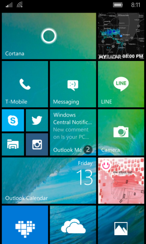
I'm on 10581, just did a complete reinstall and Outlook Mail live tile in medium size shows message previews with a black circle in right lower corner, sort of covering the app name. The circle is not even properly aligned with the corner, is a bit offset to left, the mail app logo is not there, so I have hard time locating my app on the start screen now. This live preview used to be only on the wide tile and not in medium.
Not only is it harder to use, it looks fugly. If MSFT is reading this, can you bring the old icon and unread message count big white numbers back to medium sized tiles?

Anyone else having this issue?
 

TechFreak1

Moderator
May 15, 2013
4,611
5
38
Visit site
Can you please post a screenshot?

It would be pretty helpful and also if you're in the insider programme, submit it as feedback.

Unless you have already done so?
 

manicottiK

New member
Nov 24, 2011
660
0
0
Visit site
The last two builds have used that style for the count on both "old" tiles (the ones that used to have the number in the upper right) and the newest form of tiles. The WP8-style "iconic" tile, which used to show the count as a large text item next to a fairly large app icon with both centered in the tile, seems to be going away.

The new way appears designed to match the style on Windows 8, 8.1, and 10, with the tile count in the lower right in a font that's just slightly bigger than the tile name. The background circle, which shows on W10M, but not W10, is ugly IMO, but may be needed for tiles that allow photo backgrounds. I'd prefer it if MS showed the background only if the tile used a background, but that's just me.
 

BluetoothFairy1

New member
Oct 21, 2015
42
0
0
Visit site
It is just plain awful looking. Whoever had this idea should be put out to pasture. I'm on a Mobile app and cannot post screenshots. Will do when I'm at my pc
 
Last edited:

BluetoothFairy1

New member
Oct 21, 2015
42
0
0
Visit site
This live tile for Outlook Mail is a huge step backwards IMO.
- can't tell it's Mail just by looking at it, since the circle covers the app name
- the circle is not straight in the corner, it is offset a bit to left of where I would expect it (correction - I'd expect the circle to be GONE!)
- the app logo is gone, so if I take a glance, I have no clue what app I'm looking at
- I need to squint on a small display to see how many emails I have
- the dark circle looks completely out of place with the rest of the tile design

I have no problem seeing previews in Wide tile size as it used to be in 8.1, but in medium size?? It's a total loss - not only can't I tell how many emails I have without having to squint, I can't even read the message preview in such a small tile. It is completely counterproductive.

Microsoft, did your design team go out on vacation or something?
OR were you trying to copy Apples red banners on app icons? Because....yikes....
Whatever junk the current design team is smoking, I want it! It must be some powerful stuff...
 

Attachments

  • wp_ss_20151113_0002.png
    wp_ss_20151113_0002.png
    461 KB · Views: 3

BluetoothFairy1

New member
Oct 21, 2015
42
0
0
Visit site
The last two builds have used that style for the count on both "old" tiles (the ones that used to have the number in the upper right) and the newest form of tiles. The WP8-style "iconic" tile, which used to show the count as a large text item next to a fairly large app icon with both centered in the tile, seems to be going away.

The new way appears designed to match the style on Windows 8, 8.1, and 10, with the tile count in the lower right in a font that's just slightly bigger than the tile name. The background circle, which shows on W10M, but not W10, is ugly IMO, but may be needed for tiles that allow photo backgrounds. I'd prefer it if MS showed the background only if the tile used a background, but that's just me.

I see that. I noticed it first on the Alarm app and did not pay much attention, but now this blasted circle is on my heavily used Mail tile and I am starting to be concerned about the direction MSFT is heading design wise. I dare any of them try to read the numbers in these circular banners in the middle of a sunny day while walking outside. I am posting this to the insider feedback and am making no bones about how horrible UX this has become. True kindergarten quality graphics right there....
 

ven07

New member
Jan 27, 2014
6,892
2
0
Visit site
I see that. I noticed it first on the Alarm app and did not pay much attention, but now this blasted circle is on my heavily used Mail tile and I am starting to be concerned about the direction MSFT is heading design wise. I dare any of them try to read the numbers in these circular banners in the middle of a sunny day while walking outside. I am posting this to the insider feedback and am making no bones about how horrible UX this has become. True kindergarten quality graphics right there....

It really is subjective :) you hate it, but the other guys might like it? Who knows.. I tend to check as soon as I know there's a mail in, unless I'm sure it's not a priority, so I don't really focus on the number
 

Members online

Forum statistics

Threads
323,182
Messages
2,243,401
Members
428,035
Latest member
powerupgo