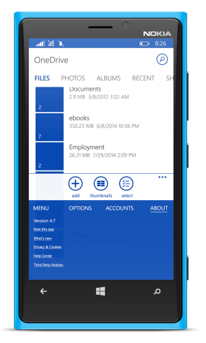
A concept for combining hamburger and ellipsis menu
- Thread starter Farshadatis
- Start date
You are using an out of date browser. It may not display this or other websites correctly.
You should upgrade or use an alternative browser.
You should upgrade or use an alternative browser.
Kaushik Banerjee
New member
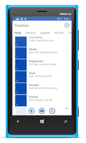
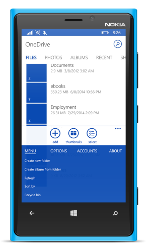
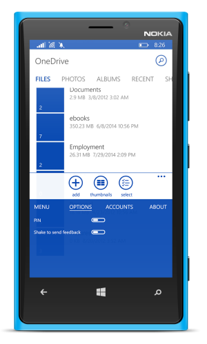
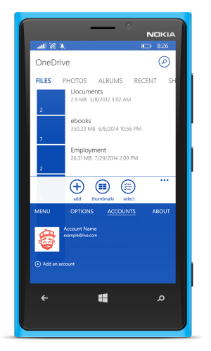
Kindly consider posting some screenshots or explain the mechanism, that would be useful to our fellow developers and they can implement it in their apps.I just designed a concept to combine hamburger and ellipsis menu in one drive app. What do you think?
RJ Priest
New member
Mohamed Ashid
New member
teckris
New member
made me think of UC Browser... But it will work.
I prefer the WCentral post with Combined Pivot/Hamburger
I prefer the WCentral post with Combined Pivot/Hamburger
Ekmeet Singh
New member
This is the best idea as I was saying the same in one of the article and if u have put this idea in the uservoice page a will give all my vote for it.
P.S if u have a uservoice page for this plz add the link!!
P.S if u have a uservoice page for this plz add the link!!
Kaushik Banerjee
New member
I added some screenshots, don't you see them?!
Wasn't showing then maybe some problem with the app...
But nice concept though...like it....although it would take time for developers to implement it sometime un the near future, it would be able to satisfy all those people how want hamburgers and then those who doesn't and the list goes on and on...
Thanks, I want to add the link but forum doesnt allow me to post links because I am below 10 posts 
Kaushik Banerjee
New member
Thanks, I want to add the link but forum doesnt allow me to post links because I am below 10 posts
You can send me a PM and I can post the link here if you want!
Kaushik Banerjee
New member
Link for the uservoice :
Vote for it guys...one of the best concepts if it can be implemented !
https://windowsphone.uservoice.com/...ept-for-combining-hamburger-and-ellipsis-menu
Vote for it guys...one of the best concepts if it can be implemented !
https://windowsphone.uservoice.com/...ept-for-combining-hamburger-and-ellipsis-menu
taymur
New member
I actually think this is one of the best implementations.
Very easy to reach, very rich in content.
Looks very much like menus from 8.1.
Very easy to reach, very rich in content.
Looks very much like menus from 8.1.
EspHack
New member
Aziz Abdurachman
New member
TechFreak1
Moderator
Pretty good, also had a similar idea but your implementation is better!
Feedback:
Perhaps add icons to the menu section (I'm aware this is the same menu as the one drive app, just want to see how it looks for comparison ) and utilise the space on the right a tad more if possible?
In the about screen the links are some what congested, they would need spreading out so you could increase the font size a tad bit so it is easier to read and tap otherwise I can see some people tapping two links at the same time.
.
In the account screen, move the +add account a few pixels to the bottom and increase the font size a little.
Feedback:
Perhaps add icons to the menu section (I'm aware this is the same menu as the one drive app, just want to see how it looks for comparison
In the about screen the links are some what congested, they would need spreading out so you could increase the font size a tad bit so it is easier to read and tap otherwise I can see some people tapping two links at the same time.
.
In the account screen, move the +add account a few pixels to the bottom and increase the font size a little.
a5cent
New member
Well, congratulations!
I think this is the best concept I've seen yet. If this allows me to switch between menu, options, accounts, and about by swiping left/right rather than tapping I think that might work really well!
I think this would also fit well with how touch office is already intended to work.
The best thing about this is that it removes the hamburger entirely and integrates a more powerful menu system into the ellipsis menu.
P.S. I would also support the suggestions TechFreak1 mentioned above.
Last edited:
a5cent
New member
I prefer the WCentral post with Combined Pivot/Hamburger
The combined pivot/hamburger is an insufficient solution that achieves nothing beyond unified cosmetics.
WCentral staff were probably out late partying when they cast their support behind that approach.
This thread explains why the combined approach doesn't actually solve a single one of WP's navigational UI problems (it brings us no farther than we already are with WP8.1):
http://forums.windowscentral.com/wi...lemented-universally-windows.html#post2996298
This concept represents a far better step towards a real solution.
Last edited:
teckris
New member
The combined pivot/hamburger is a terrible idea that achieves nothing beyond unified cosmetics.
WCentral staff were probably out late partying when they cast their support behind that approach.
This thread explains why the combined approach doesn't actually solve a single one of WP's navigational UI problems (it brings us no farther than we already are with WP8.1):
http://forums.windowscentral.com/wi...lemented-universally-windows.html#post2996298
This concept represents a far better step towards a real solution.
Now i get it.. I also think that there can be Scrolling of options under each Section. that will give better size and readability...
what you feel?
Similar threads
- Replies
- 0
- Views
- 59
- Replies
- 0
- Views
- 121
- Replies
- 1
- Views
- 170
- Replies
- 5
- Views
- 438
Trending Posts
-
The Fallout Season 1 viewing figures are absolutely INSANE, no wonder Season 2 was confirmed so quickly
- Started by Windows Central
- Replies: 0
-
Fallout show creators pretty much confirm what we expected for season two
- Started by Windows Central
- Replies: 0
-
PSA: It doesn't matter if your computer runs on ARM, all of your apps will work on Windows 11
- Started by Windows Central
- Replies: 3
-
Microsoft's Xbox has taken over the Sony's PlayStation Store 🤯
- Started by Windows Central
- Replies: 18
Forum statistics

Windows Central is part of Future plc, an international media group and leading digital publisher. Visit our corporate site.
© Future Publishing Limited Quay House, The Ambury, Bath BA1 1UA. All rights reserved. England and Wales company registration number 2008885.


