- Jan 10, 2011
- 5
- 0
- 0
I really like the NEW WP8 Start Screen that Microsoft revealed in June. I definitely think it's an improvement over the current one, but not the best it can be. Some of the main complaints are:
It looks too busy
It looks to cluttered
It looks un-organised
We need MORE + CUSTOM backgrounds
We need HUBS
We need GROUPS
We want LANDSCAPE View
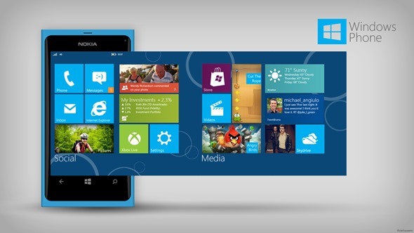
I have created two quick mock-ups (Portrait & Landscape), that show the Grouping Feature, that I think fits in with the design language. I think this along with Windows 8 Semantic Zoom would make organising/de-cluttering/renaming groups much easier.
This would enable people that prefer a better organised/ less busier looking screen to manage it more effectively.
(Please see attachments for the mock-ups).
Hopefully Microsoft takes note and gives us something similar.
It looks too busy
It looks to cluttered
It looks un-organised
We need MORE + CUSTOM backgrounds
We need HUBS
We need GROUPS
We want LANDSCAPE View
I have created two quick mock-ups (Portrait & Landscape), that show the Grouping Feature, that I think fits in with the design language. I think this along with Windows 8 Semantic Zoom would make organising/de-cluttering/renaming groups much easier.
This would enable people that prefer a better organised/ less busier looking screen to manage it more effectively.
(Please see attachments for the mock-ups).
Hopefully Microsoft takes note and gives us something similar.
")


 Twitter