Waste of screen real estate

Rohit Sharma1

New member
Dec 18, 2012
10
0
0
Visit site
I am sure this question must have been asked before but want to know your thoughts and work around, if any?

I am running WP 7.5 on my Omnia 7 with a 4" screen, apparently almost all the apps I use (FB, Sessmic, Aljazeera, BBC etc) take almost 1/3 of the screen real estate with the logo and WP group header in bold fonts right in my face (as if i am short sighted). If i am sitting in a bus, I am sure the person sitting at a distance of four or five rows behind me can read the header. I have limited screen estate on my phone and the real content that I want to read is limited, is this design not oxymoron to what Microsoft dictates in it's WinRT design i.e. the content should fill up the space.

I quite like the design of WP but these fugly in your face headers just pisses me off, I would like to read 3 more tweets and not see the useless headers.
 

Mr. MacPhisto

New member
Aug 7, 2012
403
1
0
Visit site
I am sure this question must have been asked before but want to know your thoughts and work around, if any?

I am running WP 7.5 on my Omnia 7 with a 4" screen, apparently almost all the apps I use (FB, Sessmic, Aljazeera, BBC etc) take almost 1/3 of the screen real estate with the logo and WP group header in bold fonts right in my face (as if i am short sighted). If i am sitting in a bus, I am sure the person sitting at a distance of four or five rows behind me can read the header. I have limited screen estate on my phone and the real content that I want to read is limited, is this design not oxymoron to what Microsoft dictates in it's WinRT design i.e. the content should fill up the space.

I quite like the design of WP but these fugly in your face headers just pisses me off, I would like to read 3 more tweets and not see the useless headers.

It's poor design in the app. They do not need to use the large moving headers. I have the BBC app and the FB app. I think the concept in the FB makes a bit more sense since the notification, messaging, and friend request icons are all in the header, so it is trying to mimic the full blown web version in that way.

The BBC app, frankly, is not as well designed.

This is not dictated by MS in the design, but is more of a branding in the app. The Drudge Reader uses a much smaller header up top. You can also see the smaller header in the MS designed weather app.

It largely depends on who makes the app. Same goes in all the other platforms. I've seen many iOS and Android apps with some serious icon and header clutter.

Most phone apps waste a lot of space due to visual aesthetics. I find the Metro UI ends up looking better and often wastes less space in equivalent apps, such as the IMDB app across platforms.
 

Rohit Sharma1

New member
Dec 18, 2012
10
0
0
Visit site
It is not only third party but even Microsoft stock apps that comes with the phone has the aesthetics issue. See People Hub, Music etc. It's been 2 years since WP7 major was released and why is this not an issue? OR is it just me who feels these bold header are shouting at me?
 

spaulagain

New member
Apr 27, 2012
1,356
0
0
Visit site
I am sure this question must have been asked before but want to know your thoughts and work around, if any?

I am running WP 7.5 on my Omnia 7 with a 4" screen, apparently almost all the apps I use (FB, Sessmic, Aljazeera, BBC etc) take almost 1/3 of the screen real estate with the logo and WP group header in bold fonts right in my face (as if i am short sighted). If i am sitting in a bus, I am sure the person sitting at a distance of four or five rows behind me can read the header. I have limited screen estate on my phone and the real content that I want to read is limited, is this design not oxymoron to what Microsoft dictates in it's WinRT design i.e. the content should fill up the space.

I quite like the design of WP but these fugly in your face headers just pisses me off, I would like to read 3 more tweets and not see the useless headers.


This is where old digital design standards drive me nuts. People think their screen needs to be stuffed edge to edge with content like a pizza.

Microsoft's new UI language takes lessons from print design and GOOD design practices. It creates clear visual hierarchy, white space, and clean minimalism that lets the content be the focus.

Yes, this means you can't put a million words on a screen. But it also means its clear where to focus your eye, where content separates, etc.

Its like old websites where everyone wanted to have all the content above the fold on the home page. Ever seen the GoDaddy site 6 years ago? You know what happened? People didn't read any of the content because they couldn't figure out what they should focus on.

If you look at most of the best websites today, they are done much the same way as Windows Phone with typographical hierarchy and clear "sections" of content.

If you think the headers are fugly, then maybe you should go to the cluster**** UI of Android. Where all the content is scattered all over the screen in a chaotic mess.

I'm a UI designer and even I can't figure those damn phones out. I'll take the one less tweet on the screen for some sanity.

If you think Microsoft is going to change this, then you are expecting them to dump the UI language and destroy what defines Windows Phone.
 

jhguth

New member
Sep 26, 2012
580
0
0
Visit site
Hey guy, this website is not affiliated with Microsoft in any way. If you don't like the basic design style, then clearly it's not the device for you. You should check out the iPhone 5 or Samsung Galaxy SIII and decide what you like, they are great phones too.

What is the point of your post, just to vent? Okay. All of the windows phones look the same, if you don't like it just try something else.
 

Rohit Sharma1

New member
Dec 18, 2012
10
0
0
Visit site
This is where old digital design standards drive me nuts. People think their screen needs to be stuffed edge to edge with content like a pizza.

Microsoft's new UI language takes lessons from print design and GOOD design practices. It creates clear visual hierarchy, white space, and clean minimalism that lets the content be the focus.

Yes, this means you can't put a million words on a screen. But it also means its clear where to focus your eye, where content separates, etc.

Its like old websites where everyone wanted to have all the content above the fold on the home page. Ever seen the GoDaddy site 6 years ago? You know what happened? People didn't read any of the content because they couldn't figure out what they should focus on.

If you look at most of the best websites today, they are done much the same way as Windows Phone with typographical hierarchy and clear "sections" of content.

If you think the headers are fugly, then maybe you should go to the cluster**** UI of Android. Where all the content is scattered all over the screen in a chaotic mess.

I'm a UI designer and even I can't figure those damn phones out. I'll take the one less tweet on the screen for some sanity.

If you think Microsoft is going to change this, then you are expecting them to dump the UI language and destroy what defines Windows Phone.

What you just explained is complete opposite to Win 8/RT design philosophy, according to which titles taking 1/3 space, chrome, drop shadows etc is a big no no, the content should always take focus.
First look at any W7 app, what I first focus on is the headers, still reading the content i am cursing for lost of space and then scrolling kicks in.

OK it looks beautiful and all, but if i am reading something I want to read as much content as possible in the limited visual estate, I do not care how cool the next element to it looks like. Maybe you are looking from a designer perspective, as a content user I care about seeing content not the beauty around it. I think it should be good if these headers automatically fade out.

I completely agree with you that android is a clusterfk where content is scattered all over, but apple on the other hand gets it well done.
 
Last edited:

iPwnza

Banned
Oct 30, 2012
236
0
0
Visit site
It is not only third party but even Microsoft stock apps that comes with the phone has the aesthetics issue. See People Hub, Music etc. It's been 2 years since WP7 major was released and why is this not an issue? OR is it just me who feels these bold header are shouting at me?

Yeah, this really isn't the phone for you. Microsoft's design style isn't an "issue" to me, but it was in the beginning. You really begin to love the UI after a few weeks.
 

casab1anca

New member
Dec 3, 2012
129
0
0
Visit site
OK it looks beautiful and all, but if i am reading something I want to read as much content as possible in the limited visual estate
Actually I think most of the built-in apps are designed very well. Also the higher resolution displays of WP8 make this a non-issue in the first place.

Note that you aren't really "reading" content on the People/Music hub -- you're just flicking through and you can use jump lists to navigate quickly. Where there is actual content involved, there is indeed more real estate -- the browser only has a small bar at the bottom, and the "what's new" tab of the People hub hides the bottom menu to make more space.

apple on the other hand gets it well done
The iPhone uses just as much space for the header and footer as WP does with the large header. Compare this screenshot of the iOS Contacts app to the People hub in WP: http://www.topproductivityapps.com/appimg/514/contacts-journal-lite-screenshot-1.jpg
 

Gaichuke

New member
Jun 14, 2012
288
0
0
Visit site
What you just explained is complete opposite to Win 8/RT design philosophy, according to which titles taking 1/3 space, chrome, drop shadows etc is a big no no, the content should always take focus.
First look at any W7 app, what I first focus on is the headers, still reading the content i am cursing for lost of space and then scrolling kicks in.

OK it looks beautiful and all, but if i am reading something I want to read as much content as possible in the limited visual estate, I do not care how cool the next element to it looks like. Maybe you are looking from a designer perspective, as a content user I care about seeing content not the beauty around it. I think it should be good if these headers automatically fade out.

I completely agree with you that android is a clusterfk where content is scattered all over, but apple on the other hand gets it well done.

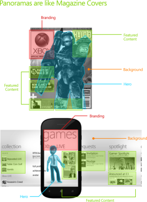
The 1/3 headers are only there for the Panorama view. For the Pivot view where the content consumption is supposed to happen the margins are much smaller. Panorama view is meant to be only a 'magazine cover' for the application, showing a preview of the most interesting content:


MagazineCover.png


"...but apple on the other hand gets it well done."

Sure, I especially like that back button placement. Most convenient one ever.
 

spaulagain

New member
Apr 27, 2012
1,356
0
0
Visit site
What you just explained is complete opposite to Win 8/RT design philosophy, according to which titles taking 1/3 space, chrome, drop shadows etc is a big no no, the content should always take focus.
First look at any W7 app, what I first focus on is the headers, still reading the content i am cursing for lost of space and then scrolling kicks in.

OK it looks beautiful and all, but if i am reading something I want to read as much content as possible in the limited visual estate, I do not care how cool the next element to it looks like. Maybe you are looking from a designer perspective, as a content user I care about seeing content not the beauty around it. I think it should be good if these headers automatically fade out.

I completely agree with you that android is a clusterfk where content is scattered all over, but apple on the other hand gets it well done.

Windows 8 is the exact same philosophy. The screen size is much bigger though so more content makes sense comparatively. Also, something like a desktop or tablet you are more likely to stay focused where as a smartphone is a glance and go so bigger text makes the headings easier to identify quickly. If the heading fades away what happens when I lock my screen and come back, how will I know what app/section Im in?

I've used both Android and iPhone alot as I've worked on apps for them. I often find the headings blend into the UI too much.

Also, as noted by others, if you compare it to iOS you'll find iOS takes up about the same real-estate once you count the chrome effects and the upper and lower nav bars.

I use the people hub often to view updates and I find the 1-3 Facebook or twitter updates to be the perfect consumable amount. I glance at a few scroll, glance and scroll. It helps my eye break down the content and focus on it easier.

being content focused isn't just about putting more content on the screen. Its also about letting the content breathe so your eye can segregate sections of focus.

Large text as headings provides glancable context and also provides white space as the text visually has more space between its elements.

I understand everyone has an opinion, but you're complaining about a defining element of Windows Phone. Its like buying a Miata and complaining it has no trunks space.
 

bitteryetsweet

New member
Dec 18, 2012
2
0
0
Visit site
It's pure wastage of space.


rDQmD.jpg


Only 213 out of 1280 pixels (16.6%) are used to display the chat.

304 out of 1280 pixels (23.75%) are completely wasted displaying nothing.

If those pixels had been utilized, the screen space could be improved by 143%.


I'm sure even more space could be squeezed out if they allowed for smaller fonts and decreased the space between stuff, or even allowed for a smaller keyboard.
 

James8561

New member
Dec 3, 2012
1,282
0
0
Visit site
^not many would be happy with smaller fonts and especially not smaller keyboard. the keyboard is as small as it is. smaller = >% error
 

Gaichuke

New member
Jun 14, 2012
288
0
0
Visit site
Nothing is wasted there as you can view the conversation without the keyboard too. It's far more important to keep the keyboard as it is to ensure as good typing experience as possible. Besides, 120 px on top of the keyboard is used for word suggestions, hardly wasted space no?
 

futurix

New member
Mar 25, 2011
64
0
0
Visit site
If someone doesn't like the elements of Metro - there are many other choices: iPhone, Android, BlackBerry, Jolla/Meego, Bada, and every other iPhone clone OSs.

There are many ways to increase the amount of content in Metro - both for developers (use pivots instead of panoramas) and users (use HTC 8X or Samsung ATIV S - both give you more vertical space).
 

Rohit Sharma1

New member
Dec 18, 2012
10
0
0
Visit site
Windows 8 is the exact same philosophy. The screen size is much bigger though so more content makes sense comparatively. Also, something like a desktop or tablet you are more likely to stay focused where as a smartphone is a glance and go so bigger text makes the headings easier to identify quickly. If the heading fades away what happens when I lock my screen and come back, how will I know what app/section Im in?

I've used both Android and iPhone alot as I've worked on apps for them. I often find the headings blend into the UI too much.

Also, as noted by others, if you compare it to iOS you'll find iOS takes up about the same real-estate once you count the chrome effects and the upper and lower nav bars.

I use the people hub often to view updates and I find the 1-3 Facebook or twitter updates to be the perfect consumable amount. I glance at a few scroll, glance and scroll. It helps my eye break down the content and focus on it easier.

being content focused isn't just about putting more content on the screen. Its also about letting the content breathe so your eye can segregate sections of focus.

Large text as headings provides glancable context and also provides white space as the text visually has more space between its elements.

I understand everyone has an opinion, but you're complaining about a defining element of Windows Phone. Its like buying a Miata and complaining it has no trunks space.

In simple words, it is a feature not a design/bug :)
 

bitteryetsweet

New member
Dec 18, 2012
2
0
0
Visit site
^not many would be happy with smaller fonts and especially not smaller keyboard. the keyboard is as small as it is. smaller = >% error

Half the world's smartphone users use the iPhone which has a way tinier keyboard. I'm sure many people would be would be fine with a smaller keyboard (height wise).

Besides, there's no harm giving people an option for smaller fonts. Not everybody likes small fonts but not everybody likes big fonts either. Give everyone an option and everyone will be happy.

Nothing is wasted there as you can view the conversation without the keyboard too. It's far more important to keep the keyboard as it is to ensure as good typing experience as possible. Besides, 120 px on top of the keyboard is used for word suggestions, hardly wasted space no?

You're right, I forgot about the suggestions. But I feel it should have just been integrated together with the bottom bar to give us more space. It's barely possible to read the conversation especially when my friend texts me a long paragraph, or when she texts me multiple messages in a short time, or when I want to scroll up to view the conversation again. I thought the space was already pretty little on my iPhone's 4:3 screen, but apparently I can view even less words on this huge 16:9 screen.
 

Gaichuke

New member
Jun 14, 2012
288
0
0
Visit site
You're right, I forgot about the suggestions. But I feel it should have just been integrated together with the bottom bar to give us more space. It's barely possible to read the conversation especially when my friend texts me a long paragraph, or when she texts me multiple messages in a short time, or when I want to scroll up to view the conversation again. I thought the space was already pretty little on my iPhone's 4:3 screen, but apparently I can view even less words on this huge 16:9 screen.

When there's an option to read the conversations in full screen, you don't have to see the messages anymore when the keyboard is up unless you have a memory of a goldfish and can't remember what the conversation was about. Best situation would of course be if you could see the messages but when the space is limited you have to get rid of something, and keyboard can't be among that.
 

Members online

No members online now.

Forum statistics

Threads
323,274
Messages
2,243,559
Members
428,053
Latest member
JoshRos