I have been on the WP ship since it's debut with WP7. I was using a HTC HD7 on contract back when WP was new. I would have gone with a Lumia 800 if I could, but I was stuck on my contract. Upgraded to a Nokia Lumia 920 when I was eligible for a re-contract. Basically, I have gone through the "growth" of WP.
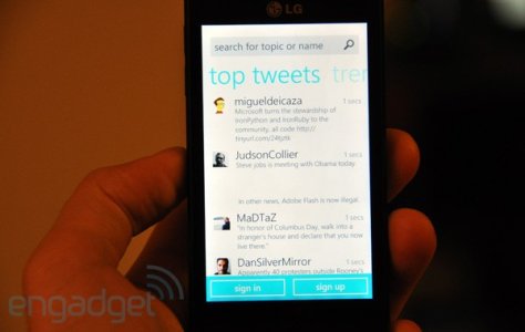
Now that WP is quite stable in terms of app choices as more and more developers are beginning to develop for WP, I can't help but think back of the times when apps' UI looked more or less like this :

That was the design I "grew up" with. It is quite sad to see that most apps today are basically a port of iOS or Android counterparts, just "flatter" and has the ability to scroll(swipe) between the "tabs". I love how the headers went out of the screen to the right in the old design. You can just look at that design and call it "metro", which you cannot do to the current ones as they look the same on iOS and Android.
Is it not possible to bring back the old design now? I mean, that is one unique UI/UX for WP right? It is still present in the People's Hub, Settings, Messaging, Calendar etc. Pretty much all the default system apps. I really prefer it loads more than the current icons-as-header kind of design.
Can you imagine if all the apps are design with the "metro" headers? Instagram, for instance, would look really different and unique from its iOS and Android counterparts. Same goes for Twitter, Vine etc.
Now that WP is quite stable in terms of app choices as more and more developers are beginning to develop for WP, I can't help but think back of the times when apps' UI looked more or less like this :

That was the design I "grew up" with. It is quite sad to see that most apps today are basically a port of iOS or Android counterparts, just "flatter" and has the ability to scroll(swipe) between the "tabs". I love how the headers went out of the screen to the right in the old design. You can just look at that design and call it "metro", which you cannot do to the current ones as they look the same on iOS and Android.
Is it not possible to bring back the old design now? I mean, that is one unique UI/UX for WP right? It is still present in the People's Hub, Settings, Messaging, Calendar etc. Pretty much all the default system apps. I really prefer it loads more than the current icons-as-header kind of design.
Can you imagine if all the apps are design with the "metro" headers? Instagram, for instance, would look really different and unique from its iOS and Android counterparts. Same goes for Twitter, Vine etc.


