WASTED Screen space!

Status
Not open for further replies.

Checki

Banned
Apr 17, 2013
200
0
0
Visit site
Hi guys.
We always talk about the 3rd tile column. Some say, the icons would be too small and so on.
Well, i wanted to talk about this for a long time:

First:
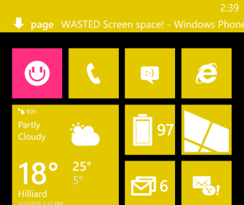
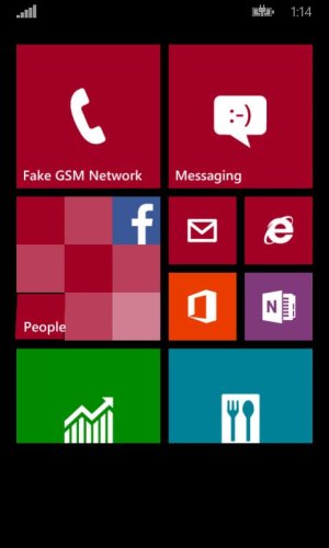
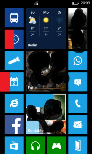
As you can see on the Screenshot, on the left and right there is much unused space! If you put it together, it is HALF the size of a small tile !!!!
So if this space would be used, we could easyily fit at least another small tile column on the screen! I have the LUMIA 620...

Second:
Same on the the top. There is much unused space when you press the HOME button. Ok, has nothing to do with the topic, but it annoys me. Why??? When i press HOME i want to see as much as possible, and this way the bottom row of tiles is half hidden, because of this stupid wasted space on the top!!!

Hope this will change. Its just useless :(
wp_ss_20140302_0001.png
 

RJ Priest

New member
Feb 13, 2013
364
0
0
Visit site
I like the space at the top. Also, the 7th row of tiles (when talking all small tiles) is only cropped off on 768 resolution screens. On 720p, 7 rows of small tiles fit perfectly.

Edit: I'm wrong. On very careful inspection, a very small, almost impercevable amount of the bottom row is cropped off on 720p.
 

Checki

Banned
Apr 17, 2013
200
0
0
Visit site
Why do you like the space on the top???

But the topic here is the REALLY unnecessary useless wasted space on the sides. And dont tell me, you like that!
 

DaviUnic

New member
May 31, 2013
27
0
0
Visit site
There has to be some space between the tiles and the edges of the screen, otherwise, everything would look squashed and ugly. I suppose you're right that the space around the edges could be a bit smaller, e.g. same as between tiles. Honestly, it wouldn't make much of a difference, the tiles would be only a tiny bit bigger. Still, remember that this is better than WP7, where the space on the right was wasted for that single arrow button. So definitely could be worse...

However, I'm also wondering why they left extra space at the top (way more than it's needed for the status bar), but I'll have to check to see if it's still there in 8.1...
 

Jas00555

Retired Ambassador
Jun 8, 2013
2,413
0
0
Visit site
They leave that space at the top to shift everything down so people that pick up the phone for the first time will know that you can scroll down to see more apps. Otherwise, they might look at it and think "this is it?".
 

DaviUnic

New member
May 31, 2013
27
0
0
Visit site
Here's a quick mockup I made (yes, I know the middle column is wrong, but you get the idea):

GsnEZKA.png
 

Jupast

New member
Feb 24, 2013
307
0
0
Visit site
I agree for the most part. While there needs to be some spacing of course, i do feel it could be optimized somewhat.

Catering to new users by leaving half-tiles at the bottom is all very well, but once you get the idea of scrolling, there's really no need for it to stay permanent.

What i wouldn't mind, is the Tiles aligning to an invisible grid in the background (much like Photoshops 'Snap' feature works). Then, how you leave your Start Screen position is how it stays.
 

jmshub

Moderator
Apr 16, 2011
2,667
0
0
Visit site
There needs to be some whitespace in any UI. I don't see the benefit in your idea. As your photoshop showed, if you increase the size of the tiny tiles, then it doesn't line up with the larger square tiles. You could stretch the entire Home area to eat into the whitespace on the sides, but you end up gaining no more than a few pixels. Not enough for a meaningful change.
 

DaviUnic

New member
May 31, 2013
27
0
0
Visit site
It was a quick mockup in Photofiltre, so far from photoshop. The reason why the middle column is misaligned/wrong size is because I miscalculated the size increase for the medium tiles, so it ended up like that. And that's all because it's just a 5-minute mockup. If the tiles were actually resized in the OS, it would look fine...

But yeah, the size gain is basically none (barely ~8 pixels).
 

Curtieson

New member
Jul 26, 2011
1,363
0
0
Visit site
The gap at the top of the phone is to make space for the Toast notifications and the "In Call" banner you have. When you get a toast, it fits in there perfectly...it seems like it fits right with the 'half tile' space you calculated out before.

It is also the exact amount of space that is left when in SMS for the users name. That one feels hard to notice though.

wp_ss_20140303_0001.png
 

manicottiK

New member
Nov 24, 2011
660
0
0
Visit site
What makes you think that a pixel that's background-colored is wasted?

What if the developers chose to make those pixels background-colored for a reason?

It isn't the job of a UI or a UX designer to jam as much content onto the screen as is possible. "Empty" space can have value.
 

xkinn

New member
Oct 26, 2013
20
0
0
Visit site
Hi guys.
We always talk about the 3rd tile column. Some say, the icons would be too small and so on.
Well, i wanted to talk about this for a long time:

First:
As you can see on the Screenshot, on the left and right there is much unused space! If you put it together, it is HALF the size of a small tile !!!!
So if this space would be used, we could easyily fit at least another small tile column on the screen! I have the LUMIA 620...

Second:
Same on the the top. There is much unused space when you press the HOME button. Ok, has nothing to do with the topic, but it annoys me. Why??? When i press HOME i want to see as much as possible, and this way the bottom row of tiles is half hidden, because of this stupid wasted space on the top!!!

Hope this will change. Its just useless :(

View attachment 58492

It's called "Design".
If you hate it, just bear with it. Or switch to other phone


Sent from my iPad using Tapatalk
 

rockstarzzz

New member
Apr 3, 2012
4,887
1
0
Visit site
You can't just cram things in because you have little space.

That space which is "wasted" for you on sides is breathing room for me. The tiles have that white space for a reason. If they went all the way to the edge, you will frequently keep opening apps on the edges - its just how humans scroll or hold phones.

Also edge to edge tiles won't look as good. However, with these additional tiles on the extra column in WP8.1 will show how they've used this wasted space. Personally I am from the crowd who loved the gutter on the right with WP7.1 and WP7.5 - so will never understand people who want to cram stuff in a 4.5 inch screen.

Also - the one of top is necessary - to prevent toast notifications overlapping content on top of the screen in app. I would hate it if I get toasts and they cover up the news articles I am reading.
 

jmshub

Moderator
Apr 16, 2011
2,667
0
0
Visit site
Y
Also edge to edge tiles won't look as good. However, with these additional tiles on the extra column in WP8.1 will show how they've used this wasted space. Personally I am from the crowd who loved the gutter on the right with WP7.1 and WP7.5 - so will never understand people who want to cram stuff in a 4.5 inch screen.

I never minded the WP7 gutter, until after having been on WP8 for 1.5 year. Now, going back, it does bug me a little.
 

Checki

Banned
Apr 17, 2013
200
0
0
Visit site
" .
.

Also - the one of top is necessary - to prevent toast notifications overlapping content on top of the screen in app. I would hate it if I get toasts and they cover up the news articles I am reading.


I'm talking about the wasted space on the HOMESCREEN! that's not an app! And a toast notification is always on top, in every app, in every screen...and for me its more important to have a clean home screen with as much information as possible, so I don't want this stupid crap on top!!


L620 - Tapatalk
 

Checki

Banned
Apr 17, 2013
200
0
0
Visit site
Nobody in the world calls the home screen an app! And who cares if ita on top of the home screen, covering half a tile? I just swipe it away!?!

L620 - Tapatalk
 
Status
Not open for further replies.

Members online

Forum statistics

Threads
323,256
Messages
2,243,531
Members
428,052
Latest member
ayven