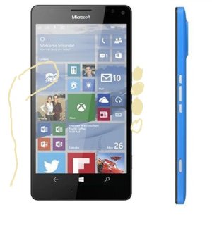
Volume button positions

jdballard

New member
Sep 20, 2011
547
0
0
Visit site
So in the renders that were on the front page a few days ago, there were lots of comments on how the power button was between the volume up and volume down buttons and that it was an odd placement. At first I thought "What the heck?" to myself but now I'm wondering if I might like it. The number of times I've been on a call and tried to hit one of the volume buttons and get the wrong one is quite high. I'm thinking with the large power button in the middle I'll be able to figure out which is up and down much easier.

Of course, it's all speculation until we a) know that is how the buttons are actually placed, and b) if that's how they are placed whether I'll like it. But, assuming it is as rendered I will be curious to try it and see what I think in actual usage. It might actually make some sense.
 

RumoredNow

New member
Nov 12, 2012
18,134
0
0
Visit site
Ingrained habits are hard to overcome. Everybody making the switch will have to adjust.

I can hear the screaming in the forums now...
 

jdballard

New member
Sep 20, 2011
547
0
0
Visit site
I can hear the screaming in the forums now...

I'm sure it will be loud before people have even tried it. People don't like change reflexively, when change can actually be good. I suppose it's because we as people typically like to control change and not have it foisted upon us despite the fact that having things change out of our control isn't always a bad thing. (It isn't always a good thing, either).

Here endeth my run-on sentence and philosophizing...
 

Rooks308

New member
Nov 9, 2014
86
0
0
Visit site
I think that it will be an adjustment, and unfortunately even after getting used to it people will still accidentally suspend their phone by hitting the wrong button now and then. On every device I own that has the power button next to the volume buttons I occasionally hit the sleep/wake button. Not a problem on devices where the volume buttons are located on a different side of the device. At the end of the day though after using it for a few weeks/months you'll probably just forget about it and live with it. Especially with tap to wake. Also if you get a case that can distinguish the buttons well enough it would be less of an issue.

I really wish Speck made cases for Windows Phone, the button responsiveness is very good on their cases.
 

Kram Sacul

New member
Mar 4, 2013
750
0
0
Visit site
Other than trying to be different from WP there's no practical reason to suddenly jam the power button in between the volume keys. It's just another case of poorly thought out design which sadly has been a theme with Windows 10 in general (circle profile pictures, iOS toggles, etc).
 

jdballard

New member
Sep 20, 2011
547
0
0
Visit site
Other than trying to be different from WP there's no practical reason to suddenly jam the power button in between the volume keys. It's just another case of poorly thought out design which sadly has been a theme with Windows 10 in general (circle profile pictures, iOS toggles, etc).

You really think that a company of Microsoft's size doesn't have people that actually think this through? You may disagree with it, but I'm pretty sure that they have thought about it quite a bit and even tried testing it out to gauge reactions to the change.

I haven't used it, but I can see where having them separated might actually make it easier to identify the up and down buttons by feel if I have a larger button in the middle. I may change my mind after I've actually used it, but until then I'm going to assume a fair amount of research and planning went into the design decision and give it a try to see how it actually works. It may have been poorly researched and end up being a bomb, but I'm pretty sure it's been thought through and discussed.
 

Kram Sacul

New member
Mar 4, 2013
750
0
0
Visit site
You really think that a company of Microsoft's size doesn't have people that actually think this through?

After seeing some of the boneheaded decisions in Windows 10... no. I think it's more like they saw LG's G2 and thought the power and volume buttons bunched together looked cool.
 

SonOfDad

New member
Jun 25, 2011
196
0
0
Visit site
You really think that a company of Microsoft's size doesn't have people that actually think this through?

After using the new operating systems I don't believe they are thinking anything through, whichever post-it note the dart strikes is what they try out. The Windows 10 login screen is the greatest design mismatch I've seen in some time.
 

oldpueblo

New member
Jan 14, 2011
892
0
0
Visit site
I'll take a stab at it. Since the phone is larger the new button placement will prevent you from having to re-grip/shift fingers between the power/volume. You can hold the phone in one hand and hit all three buttons with three fingers (or your thumb if you're left handed) without shifting/stretching grip ever. Now we can have all three typical fingers on all three buttons resting comfortably while the pinky focuses on grip. But wait! Now add to that the fact that I'm willing to bet 99% of us use our middle finger already to toggle power on/off, and our pointer finger usually slid up to handle volume/up down. So now we all have that muscle memory stored up over the years. So if we then had volume up/down and power right below it bunched together on the 950XL, our middle finger would rest on the volume down button, not power.

Now I don't know if this was their thought process, but it fits a certain kind of logic and honestly I could see it being better once we start holding the phone. The only new thing to learn now will be volume down is our third finger, not our pointer switching between the two, and it allows us to efficiently use all four fingers and thumb, instead of wasting two fingers (lower two) on just grip. Thanks Microsoft for thinking about our digits! If you're left-handed then I'm thinking nothing really changes for you, it's all thumb.

hgmJUzL.jpg

I remember when the 900 first came out and people were freaking out about the power button not being on the top, until people realized having them all on one side was way easier. Maybe it will be the same with this.
 

nemov888

New member
May 2, 2013
50
0
0
Visit site
old pueblo - I agree with your explanation - makes sense. It also explains why the 950XL has the new button layout, but the 950 does not.
 

EvilGardenGnome

New member
Oct 17, 2014
12
0
0
Visit site
(a) OldPueblo [silly I can't put in a link...]

The logic of what you're saying makes sense, I figured something similar.

However, this is another case of non-standard design by MS in phones. This has hurt them before, and I think it'll do so again. Doesn't matter if it's "better", because people will resist change. Personally, I think that having power on one side and volume rocker on the other (index finger on one, thumb the other depending on handedness) would have made more sense for single-handed use.

On a personal note, I have long fingers and don't need to shift my 1520 around to reach all the buttons. My index finger rests in the middle of the volume rocker and my middle finger on the power button. This will require me to relearn holding my phone.
 

Members online

Forum statistics

Threads
323,183
Messages
2,243,405
Members
428,037
Latest member
Brilliantick99