New Leaked SPARTAN Web Browser Shot for Windows 10
- Thread starter Kazekage1981
- Start date
You are using an out of date browser. It may not display this or other websites correctly.
You should upgrade or use an alternative browser.
You should upgrade or use an alternative browser.
afnan_mc
New member
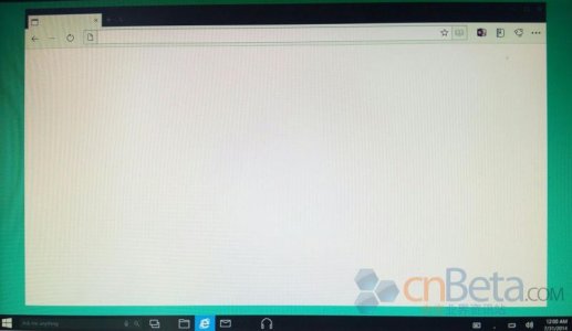
I happen to really, really like it so far. Only thing in the entire screenshot that gave me Android vibes were the music icon. Everything else looks gorgeously Metro.
stephen_az
Banned
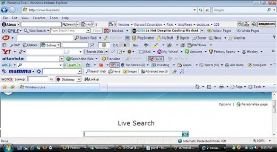
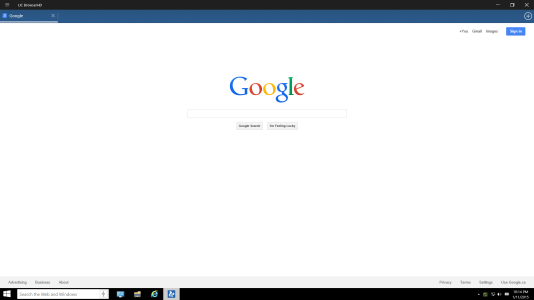
I guess Android is in the eye of the beholder. To me it looks like a beta of a browser with no tabs open that looks similar to any existing browser if you customize the buttons and turn off tool bars. Does it really that different from the following?
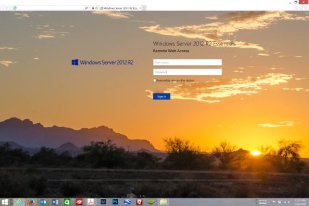
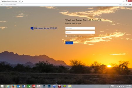
I am also still perplexed as to why people seem to be hung up on the code name Spartan, as if that means anything at all with respect to the eventual form of the browser. Quite frankly, if it meant Spartan as in simple or austere it misses the boat since there is hardly anything out there with a simpler screen than the Windows 8.X Modern browser. That screen is completely free of chrome - can't get more Spartan than that. While I expect the eventual browser will be simple in layout, I think Spartan itself is as meaningful as Sparta was for Windows for Workgroups 3.1. In fact, when they through in voice commands and pen optimizations, I doubt many people will consider in any way Spartan in the real world. Of course by then I am inclined to think it will also just be called IE12 or some other more stupid IE name akin to New Coke.


I am also still perplexed as to why people seem to be hung up on the code name Spartan, as if that means anything at all with respect to the eventual form of the browser. Quite frankly, if it meant Spartan as in simple or austere it misses the boat since there is hardly anything out there with a simpler screen than the Windows 8.X Modern browser. That screen is completely free of chrome - can't get more Spartan than that. While I expect the eventual browser will be simple in layout, I think Spartan itself is as meaningful as Sparta was for Windows for Workgroups 3.1. In fact, when they through in voice commands and pen optimizations, I doubt many people will consider in any way Spartan in the real world. Of course by then I am inclined to think it will also just be called IE12 or some other more stupid IE name akin to New Coke.
anon(5348756)
New member
Dadstar0410
New member
I for one love the new Spartan browser and think it fits in perfectly with the Modern UI Microsoft is trying to achieve with Windows 10. Looks a lot like the new Xbox app, and it looks unified. Very unified in terms of looks with the theme of the rest of the OS.
GoodThings2Life
New member
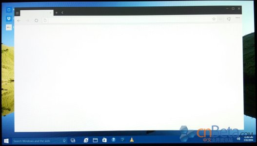
Here's another even newer one.
View attachment 93439
That one looks a lot better, if only because it doesn't have the word gaps in the taskbar. Less wasteful, but still I hope they've improved that since this was conceived.
jpal12
New member
I think both these screenshots are fakes, or early mockups. The first reason is that they have no microsoft confidential and build number, and the second reason is that the time for both is 12:00 AM July 31, 2014. That is almost 6 months ago, so I suspect they are not real. They may be mockups of windows 10 with spartan, but are most likely not showing features which will be included in future windows 10 builds, like the taskbar.
Last edited:
Dadstar0410
New member
I think both these screenshots are fakes, or early mockups. The first reason is that they have no microsoft confidential and build number, and the second reason is that the time for both is 12:00 AM July 31, 2014. That is almost 6 months ago, so I suspect they are not real. They may be mockups of windows 10 wit spartan, but are most likely not showning features which will be included in future windows 10 builds, like the taskbar.
It could be possible that they haven't set the system time yet, or that they're running it through VMware where the time isn't set (I don't think that's possible in VMware, but I could be wrong)
davidofmidnight
New member
ajst222
New member
I for one love the new Spartan browser and think it fits in perfectly with the Modern UI Microsoft is trying to achieve with Windows 10. Looks a lot like the new Xbox app, and it looks unified. Very unified in terms of looks with the theme of the rest of the OS.
I couldn't disagree with you more. I think it looks nothing like the modern UI design language they're going with. It's not nearly flat enough and it's not square enough. It just looks...completely out of place. It just don't look right.
GoodThings2Life
New member
It's not Spartan I have a problem with. It's the so called taskbar improvements that are making me vomit. It's horrific. It smells of Android/Chrome, and I definitely don't want that.
ajst222
New member
It's not Spartan I have a problem with. It's the so called taskbar improvements that are making me vomit. It's horrific. It smells of Android/Chrome, and I definitely don't want that.
I agree. It just looks awful. Luckily though, reports say that Spartan isn't completely replacing IE. IE will still be there, but Spartan will be a downloadable app
Shobin Drogan
New member
Asskickulater
New member
Why can't they just remove the ie name for good?
legacy reasons for buisnesses
daveey
New member
aerosidinc
New member
Similar threads
- Replies
- 0
- Views
- 129
- Replies
- 0
- Views
- 180
- Replies
- 1
- Views
- 313
- Replies
- 0
- Views
- 113
Trending Posts
-
Corsair brings some of its best features to this new gaming keyboard — and it won't take up a lot of space
- Started by Windows Central
- Replies: 0
-
Microsoft is struggling to get Windows Recall out the door — delays releasing first public preview
- Started by Windows Central
- Replies: 0
-
Microsoft is making you pay to use Windows 10 securely after 2025. Here's how much it'll cost you
- Started by Windows Central
- Replies: 1
Forum statistics

Windows Central is part of Future plc, an international media group and leading digital publisher. Visit our corporate site.
© Future Publishing Limited Quay House, The Ambury, Bath BA1 1UA. All rights reserved. England and Wales company registration number 2008885.


