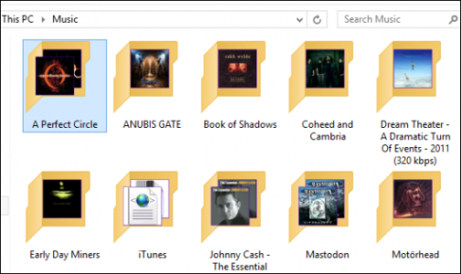
The horrible, horrible icons
- Thread starter AstroPop
- Start date
You are using an out of date browser. It may not display this or other websites correctly.
You should upgrade or use an alternative browser.
You should upgrade or use an alternative browser.
Alex Rodriguez Jr.
New member
- Feb 16, 2011
- 476
- 0
- 0
Gwenddoleu
New member
- Jan 13, 2013
- 114
- 0
- 0
I wouldn't say they are "horrible", but I don't like at all some of them and also think they don't look professional at all. Imo the "This PC" for example is very ugly and inappropriate.
Tastes, tastes, tastes... But I have to say I was very surprised (and disappointed) when I discover them.
Tastes, tastes, tastes... But I have to say I was very surprised (and disappointed) when I discover them.
Jan Ernemyr
New member
- Jan 4, 2013
- 3
- 0
- 0
sorry to say , but to me, it looks like its children that have drawn the Icons (manner to the style) they're a bit too simple for my taste.
but I will survive.
/ just my five cents
but I will survive.
/ just my five cents
123gettothechopper
New member
- Jan 21, 2014
- 84
- 0
- 0
I found the icons mediocre in appearance. I changed them to some cool android design thingy. If you don't like them, then change them simple as that.
Cheers,
Cheers,
TheJoester09
New member
- Mar 16, 2012
- 584
- 0
- 0
I also think they are ugly, but i don't think it is because of the colors.
I actually think the colors are what make them so bad. The bold colors look great in Metro/Modern, but it's kind of jarring in this context. If they toned that down a bit, I wouldn't mind them at all.
Sekyal
New member
- Jun 8, 2013
- 94
- 0
- 0
Some of them are fine, but some just went too simple I think. It just feels out of place, especially where some are a straight on view and others like This PC are slightly sideways.
In the end the icons don't matter much, just matters so you understand what they represent - which will take time.
In the end the icons don't matter much, just matters so you understand what they represent - which will take time.
Ed Boland
Retired Ambassador
- Nov 17, 2012
- 4,706
- 5
- 38
I'm hoping that all of these are just placeholders for the real icons that will come with the official release. For preview and functionality purposes, and to get this build out to the people quicker, maybe they just stuck these "Windows Classic" style icons there for the time being... Yeah, I'll go with that! 
LumiaWorld
New member
- May 31, 2013
- 331
- 0
- 0
anon(5335899)
New member
- Jan 28, 2012
- 292
- 0
- 0
It's easy enough to change them. Personally I like the minimalist look although I do feel they are a bit to 'childish'..
Avik Biswas
New member
- Jul 3, 2014
- 58
- 0
- 0
those icons are fugly, if anyone say it is good, they are either joking or trolling. seriously if they can't make better icons before release, it will backfire at them again.
i definitely hope this are just placeholder for the mean time. :| but what bothers me is that MS was really stupid in the past, when it comes to UI and UX. ;(
find a post on reddit about this too
https://www.reddit.com/r/pcmasterrace/comments/2vx1b3/found_out_what_editor_microsoft_is_using_to/
i definitely hope this are just placeholder for the mean time. :| but what bothers me is that MS was really stupid in the past, when it comes to UI and UX. ;(
find a post on reddit about this too
https://www.reddit.com/r/pcmasterrace/comments/2vx1b3/found_out_what_editor_microsoft_is_using_to/
dkediger
New member
- Aug 29, 2013
- 671
- 0
- 0
Heh....Been waiting a long time for a reason to bust this one out:
http://jonyiveredesignsthings.tumblr.com/
http://jonyiveredesignsthings.tumblr.com/
Similar threads
- Replies
- 2
- Views
- 3K
- Replies
- 1
- Views
- 2K
- Replies
- 0
- Views
- 15K
- Replies
- 1
- Views
- 15K
- Replies
- 0
- Views
- 16K
Trending Posts
-
-
Network connection post router firmware upgrade.
- Started by ZBB
- Replies: 3
-
-
Marketplace Still Around? Windows Phones to Get Rid Of
- Started by kdk24z
- Replies: 4
-
Solved Windows 10 extended support button not showing on old business laptop
- Started by CarolC
- Replies: 0
Forum statistics

Space.com is part of Future plc, an international media group and leading digital publisher. Visit our corporate site.
© Future Publishing Limited Quay House, The Ambury, Bath BA1 1UA. All rights reserved. England and Wales company registration number 2008885.


