- Jan 22, 2013
- 464
- 0
- 0
As far as I'm concerned, Windows 8.1 is an improvement, but Microsoft lacks serious design execution when it comes to the interface. Especially when compared to the design execution of XBox One and Windows Phone. I mean, compared to the other two, Windows is a design DISASTER. The design concept and overall user experience is the same, but the appearance varies greatly from the others. It looks just like what you'd expect from the Windows team: Experience first, design second; A clash of a modern design with an old way of doing things. From the mixed color tiles to the over prominent Start Screen backgrounds; From the outdated desktop to the cluttered situation of the Start Screen controls.
Microsoft honestly needs to create a "User Experience & Design" team that's a combination of the interface designers from the XBox Team & Windows Phone Team to be put in charge of the "One interface" design for Microsoft's Operating Systems, with the Windows team in a consulting position for this team in relation to the levels of productivity. Anything is better than the mess we have now, and the upcoming mess that is the return of the start menu with a small start screen slapped on in the near future, if some reports are to be believed.
Anyways, I thought we, the Windows (Phone) community could post concepts and ideas of what we feel would make a better Windows UI, and give feedback on each other's said concepts & ideas.
To start off with, here are a few concepts I made that attempt to combine the current UI & XBox, while keeping with the general method(s) of operation. Now, I'm no UI designer, and these are by no means complete, but what do you guys and gals think for starters?
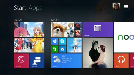
The new start screen greatly dims the desktop background (or whatever start screen background you chose) with a gradient in order to emphasize content of the Start Screen. Apps are more easily found within a new pivot header, and the menu options have been revamped, with user options (Personalize, Log off, etc...) being under the enlarged user image, and a search bar & power options under the "hamburger" button.
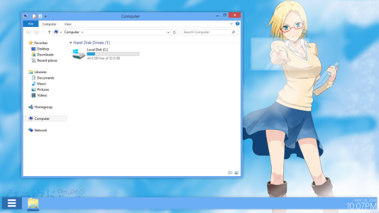
The taskbar is now larger and "detached" from the bottom of the desktop, and start is replaced by the burger. The date & time are redesigned to be stylish, but still functional.
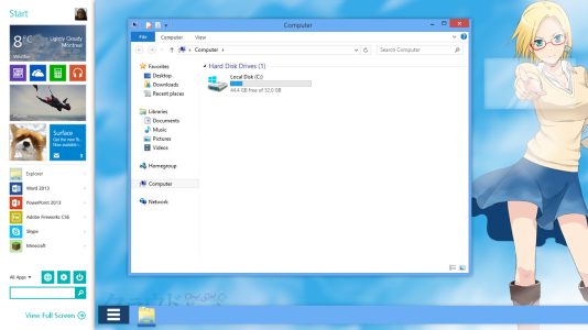
The quick start is a stylish yet functional answer to a desktop user's prayers. A simple swipe to the right from the hamburger (or a mere click for mouse users) reveals the quick start underneath the desktop. A user car pin a small amount of apps & programs, and your recent programs display underneath. (This was partially taken from a previous concept covered by WPCentral)
Microsoft honestly needs to create a "User Experience & Design" team that's a combination of the interface designers from the XBox Team & Windows Phone Team to be put in charge of the "One interface" design for Microsoft's Operating Systems, with the Windows team in a consulting position for this team in relation to the levels of productivity. Anything is better than the mess we have now, and the upcoming mess that is the return of the start menu with a small start screen slapped on in the near future, if some reports are to be believed.
Anyways, I thought we, the Windows (Phone) community could post concepts and ideas of what we feel would make a better Windows UI, and give feedback on each other's said concepts & ideas.
To start off with, here are a few concepts I made that attempt to combine the current UI & XBox, while keeping with the general method(s) of operation. Now, I'm no UI designer, and these are by no means complete, but what do you guys and gals think for starters?

The new start screen greatly dims the desktop background (or whatever start screen background you chose) with a gradient in order to emphasize content of the Start Screen. Apps are more easily found within a new pivot header, and the menu options have been revamped, with user options (Personalize, Log off, etc...) being under the enlarged user image, and a search bar & power options under the "hamburger" button.

The taskbar is now larger and "detached" from the bottom of the desktop, and start is replaced by the burger. The date & time are redesigned to be stylish, but still functional.

The quick start is a stylish yet functional answer to a desktop user's prayers. A simple swipe to the right from the hamburger (or a mere click for mouse users) reveals the quick start underneath the desktop. A user car pin a small amount of apps & programs, and your recent programs display underneath. (This was partially taken from a previous concept covered by WPCentral)

