- Jan 20, 2012
- 156
- 0
- 0
Sorry if this was mentioned already as I didn't read all the posts.. But I read somewhere an idea someone had for swiping in a left menu for notification center.. Since you have start and swipe right and get the "all apps" page.
[notications] [start] [all apps]
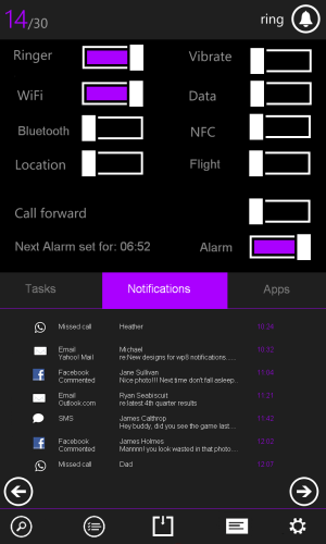
that sort of format.. I really liked that idea and perhaps doing something like that and merging it with some of the stuff you pointed out there.. swipe right and you get a menu of popular settings and notifications... I like the concept of the buttons at the top and then instead of a series of drop down menus of sorts, change the page below.. I think that would be cool..
though I really do like the concept are you showed here.. I hope MS sees them.
If you read through what I wrote in my initial post, you would see that I mentioned this implementation also. I wouldn't say that would be a bad idea at all, I think that MS has to do something and bring a proper implementation of these features to this OS if they want it to grow on a larger scale. The way I see it, I think the charms implementation would work better as to get to what you want you never have to leave the page you're working within to get to the home screen and then swipe to the left, and after you're done to press the back button twice (or keep holding it) and tap to get back to where you left. This can be made easier with a charms-like implementation. It can be accessed from anywhere, you don't need to leave your work or navigate through different places to get where you want, it addresses more issues (including a universal search, a universal share button, showing date and time from anywhere and the closing an app issue), and more importantly, it makes sense with Windows 8 and the dream of having a one screen on different devices. Think of all the possibilities that you might get with this charms bar, it really surpasses anything implemented in other OS's, not just catches up with them.
Thank you for sharing your thoughts. =)


