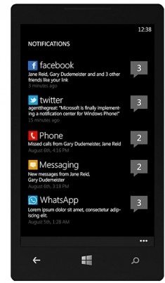
Okay, so as we all know that windows phone really needs a good and quick notification centre, which is different and original.
So i have come up with this concept..
please excuse the fact that I do not have Photoshop skills and hence have just made a drawing to explain my concept
So we need something that can be accessed at all times. since the top status bar is not always there we cannot make a concept based on that as full screen applications will not have the status bar.
So why not make a concept based on the volume control bar?
We can press either volume buttons at all times so as to get the volume bar be it the home screen, YouTube or a full screen application.
As we can see in the first picture the concept is very simple, press either volume buttons so that the volume bar appears.
Then we can can do two things:
1) Swipe right or left
2) Pull the volume bar down
If we swipe right or left then we will get quick settings or quick toggle.
If we pull the volume bar down then notifications will appear.

But how will we know that we have a notification? There will be an indication of notifications on the status bar.
IF WE SWIPE RIGHT OR LEFT
So when we swipe right or left we will get quick settings or quick toggle as I said before.
This is how it will look:
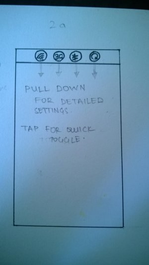
So in this sample I have taken WiFi On and Off, Network Switching, Bluetooth Settings and Screen Rotation.
It will be customised so that every person can choose whatever he or she wants to for quick settings.
The reason why there are only 4 options available is because we can stay true the basic Windows look as they do not allow more than four circles anywhere.
So its very easy you tap on every circle for toggle on and off and pull the circle down for detailed settings.
IF WE PULL DOWN.
So if we press either volume buttons and pull the volume bar down notifications will appear.
This is how it will look:
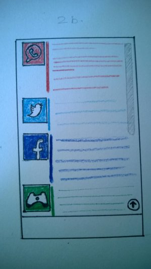
As we can see, it's pretty simple. Say there are 4 Whatsapp notifications, 2 Twitter notifications 3 Facebook notifications and 1 Games notifications.
The vertical lines next to the symbols will be the same colour as the tiles. these lines are basically only for beautification and identification purpose.
you can simply tap on a certain notification to open it.
This same concept will also apply when music is playing.
Only thing is when music is playing the volume bar will be bigger and when we swipe right or left the music controls will remain and the 4 circles for quick settings will appear.
In case we pull down the volume bar for notifications then the music controls will also go down and appear the the bottom of the screen and the notifications will appear right above it.
So this is my concept. Please share your views in the comment section and if someone with Photoshop skills want to put this to life please let me know before you do so
So i have come up with this concept..
please excuse the fact that I do not have Photoshop skills and hence have just made a drawing to explain my concept
So we need something that can be accessed at all times. since the top status bar is not always there we cannot make a concept based on that as full screen applications will not have the status bar.
So why not make a concept based on the volume control bar?
We can press either volume buttons at all times so as to get the volume bar be it the home screen, YouTube or a full screen application.
As we can see in the first picture the concept is very simple, press either volume buttons so that the volume bar appears.
Then we can can do two things:
1) Swipe right or left
2) Pull the volume bar down
If we swipe right or left then we will get quick settings or quick toggle.
If we pull the volume bar down then notifications will appear.

But how will we know that we have a notification? There will be an indication of notifications on the status bar.
IF WE SWIPE RIGHT OR LEFT
So when we swipe right or left we will get quick settings or quick toggle as I said before.
This is how it will look:

So in this sample I have taken WiFi On and Off, Network Switching, Bluetooth Settings and Screen Rotation.
It will be customised so that every person can choose whatever he or she wants to for quick settings.
The reason why there are only 4 options available is because we can stay true the basic Windows look as they do not allow more than four circles anywhere.
So its very easy you tap on every circle for toggle on and off and pull the circle down for detailed settings.
IF WE PULL DOWN.
So if we press either volume buttons and pull the volume bar down notifications will appear.
This is how it will look:

As we can see, it's pretty simple. Say there are 4 Whatsapp notifications, 2 Twitter notifications 3 Facebook notifications and 1 Games notifications.
The vertical lines next to the symbols will be the same colour as the tiles. these lines are basically only for beautification and identification purpose.
you can simply tap on a certain notification to open it.
This same concept will also apply when music is playing.
Only thing is when music is playing the volume bar will be bigger and when we swipe right or left the music controls will remain and the 4 circles for quick settings will appear.
In case we pull down the volume bar for notifications then the music controls will also go down and appear the the bottom of the screen and the notifications will appear right above it.
So this is my concept. Please share your views in the comment section and if someone with Photoshop skills want to put this to life please let me know before you do so

