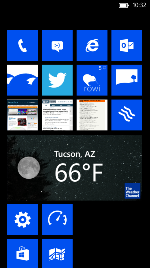
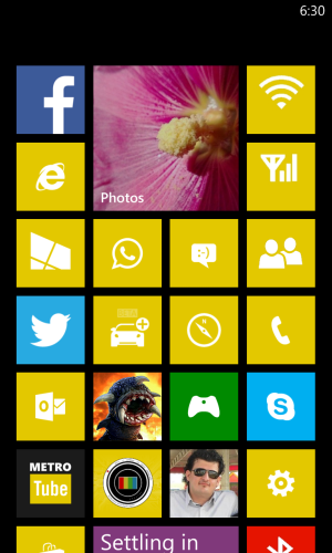
This article is meant to explain the Live Tiles concept to new WP8 comers or people outside of the platform who think you can get Live Tiles via a launcher !
Live Tiles are not widgets; they don't serve the same purpose, nor are they the same.
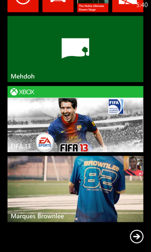
Live Tiles are not meant for interactions with apps, they're instead highly sophisticated links that provide custom made data at a glance (visual/text/numerical).
Some People would argue that Widgets do that too with the added benefit of interacting with them, however Live Tiles have many advantages that Widgets just can't match at its current form.
For starters Live Tiles do not break the UI in any way unless the developer wants to do so and even then the breakage will be minimal; they adopt to our color of choice and fit well within our homescreen.
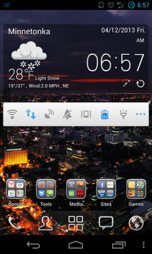
Widgets however break the UI constantly not helped by the gazillions of custom firmware, themes, launchers and developers who want their branding to bleed your eyes (looking at you Twitter widget).
Widgets also aren't defined by shapes or sizes all of which creates a cluttered feeling in any homescreen, some people will luck out with widgets that match their UI, but those will mostly be superficial ones (clocks or toggles mostly).
Live Tiles bring to life old ideas! (no pun intended)
Remember when you used to modify Half Life's shortcut to get to Counter Strike directly instead of loading it in Half Life? Legacy Windows apps always had some sort of options you can activate by using preset commands (Generals.exe -quickstart = no long story lines you can't skip)
Live Tiles are meant to replicate this effect but in an easy and strict manner, not only can they take you to specific sections in their respective apps buy they can also load a small part of the apps in question, the part that is relevant to you! (faster launch times of the apps and less RAM usage, more time spent on context rather than UI navigation)
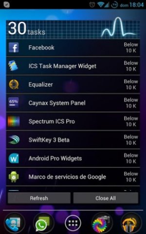
Widgets ARE apps, they interact with their apps but they're separate entities, you can see that in any task manager, they take RAM and separate processing consumption and depending on the developer sometimes lots of both.
Live Tiles are fool proof for developers, you won't see a buggy Live Tile in WP8, bare in mind It may not function properly or at all but it would not create a problem on your home screen or hog memory/CPU it won't even drain bandwidth, in fact the whole Modern UI/ Metro approach makes making Live Tiles/ or apps a breeze for any developer that gives it some time, the same can't be said about widgets which are hard to program and even harder to design, which explains the sea of ugly widgets and even apps that inhabits the Android Play Store.
Live Tiles are your own notification center that is infinitely more customizable than any other platform, but comes at the price of scheduled update instead of the instantly updated notification.
You can get the latest Instagram pics from your favorite Instagrammer or get the latest tweets on a hot subject you're following, you can follow your Xbox games, you wordaments highscore or your AlphaJax current score and next move.
Live Tiles are not perfect they're still a work in progress but you can bet they're here to stay and I wouldn't trade them off for any visual effect or gimmicky looking widgets.
Share your thoughts down in the comments and be sure to hit me up on Twitter too @nabkawe5
Thanks for reading.


