- Sep 20, 2013
- 572
- 0
- 0
So, I'm posting this here first to see if many agree with me before wasting Microsoft's time with this.
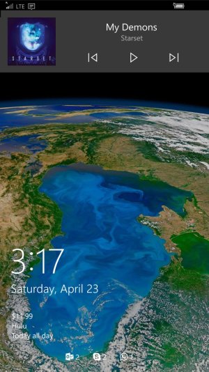
When Microsoft implemented media controls on the lockscreen, I wasn't very excited, I always felt it was redundant since it's on the volume rocker, and their implementation of it was pretty.. well.. in my opinion bad. It doesn't seem to fit, it just seems thrown up there! One day on the crapper (or the epiphany throne?) as I was messing with my phone I thought of a way I believe to make it look more consistent, while also helping with the "duplication" issue. I made a mock-up below. (I'm not a designer so just take the general idea from the image) The basic idea, is to take the media controls straight from the volume rocker, and just pin it to the lockscreen, removing the volume bar to save space, all the while removing the actual media controls from the volume rocker when on the lockscreen. Pressing the volume button would then just push the media controls down to show the volume bar, and the media controls would push the volume bar back up when it times out. what do you guys think? Does this improve the experience any? Think it's worth putting on the feedback hub?
When Microsoft implemented media controls on the lockscreen, I wasn't very excited, I always felt it was redundant since it's on the volume rocker, and their implementation of it was pretty.. well.. in my opinion bad. It doesn't seem to fit, it just seems thrown up there! One day on the crapper (or the epiphany throne?) as I was messing with my phone I thought of a way I believe to make it look more consistent, while also helping with the "duplication" issue. I made a mock-up below. (I'm not a designer so just take the general idea from the image) The basic idea, is to take the media controls straight from the volume rocker, and just pin it to the lockscreen, removing the volume bar to save space, all the while removing the actual media controls from the volume rocker when on the lockscreen. Pressing the volume button would then just push the media controls down to show the volume bar, and the media controls would push the volume bar back up when it times out. what do you guys think? Does this improve the experience any? Think it's worth putting on the feedback hub?
![wp_ss_20160425_0001[1].png](https://windowscentral-data.community.forum/attachments/87/87999-578ba1fc0c3135790a0a6789b6f81e9a.jpg?hash=V4uh_AwxNX "wp_ss_20160425_0001[1].png")
")
 Twitter