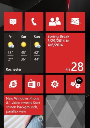
Microsoft: Please give us start screen backgrounds instead of skinned tiles!

WTF? I said that what you want doesn't make any sense in the metro design language. And it doesn't. So I will not use it but where the hell did you see me saying that I would like them to remove it so that they can add what I want? I say, let this feature stay for those who don't give a sh*t about design consistency and just want their iron man photos on their start screen, despite making the core of the OS (the live tiles) losing its identity and functionality (easy to spot at a glance). No problem, let this feature stay, but IN ADDITION, give those who like and respect the metro design language the features they want! It's that simple.

See? It's all about choice. Not removing features to add new ones. This choice I'm talking about... You have it, I don't. That's my point.

One question. Did you vote for this? If yes, then you do realize the post says "We want this NOT skinned tiles". It boldly states that. And I said in my early post I would have supported this if it said this along with skinned tiles but it doesn't. This vote doesn't give the choice. So if you voted for this , you didn't support the "choice" you're talking about. There :)
 
I'm just talking about what I want here because it makes no sense to create another thread on this. It doesn't mean that I agree 100% with this proposal.

Now that Microsoft invested time adding this to the OS, of course I'll not say. "Screw it! Delete all your work and lets do something else!" I say "Lets keep it for those who don't give a damn about design consistency but please understand that you have to do better because this work isn't, by any means, representative of the design language we have been trying to create!"

But if I was in charge and no work had been done in this regard, I would say to the team:

- "Guys, lets start something new, lets add some colours to the start screen background or the ability to chose from some predefined gradients to keep consistency between WP8.1 and W8.1"

- "Sure boss! Should we also work on live tile skins?"

- "Don't even think about that! Haven't you been working with us for the last 4 years, John? You should know better what we are trying to do here!"
 
I'd like Windows 8.1-like backgrounds. But not semantic zoom or tile grouping. Maybe interactive tiles if they are done well.
 
To poiman and the OP, would this be a compromise to you guys?
https://scontent-a-fra.xx.fbcdn.net...x720/1911924_633440650036756_1427387451_o.jpg

piture from WPLovers

It's a nice mockup:

1) Doesn't kill the main purpose of Live Tiles, which is the ability to spot them at a glance;

2) Does't kill the identity of the Live Tiles, meaning, they keep their colour, just like the way they were designed to be.

But it still has a few drawbacks, such as:

1) Background photos with many details make the hole OS less clean and make you lose that flat feeling;

2) Translucency isn't a part of the metro language.

In my opinion the best solution is the ability to change the colour of the background or to chose from a couple of built in gradient photos.

Anyway, if I had to chose between this mockup and the skinned tiles Microsoft is giving us, I would go for the mockup any day!

I think this gives a middle ground...I still expect the skinned tiles to be MS's way of implementing it tbh but this would satisfy(to a large extent) those who don't want skinned tiles and those who want to see the picture they used...Well, we'll know in 3 weeks
 
I just played around real quick with the background in W8.1 and there are a few things ive noticed.
1) There is a color picker for both background and accents. WP NEEDS this if anything. It's been wanted since WP7 honestly....
2) Those default backgrounds that have those designs/tattoos and the interactive movements (like the dragon background, theres a few others too) most of them have huge empty blank space at...guess....yup, where the tiles are located. The middle of these backgrounds are completely blank (just solid background color that fits the choice) while the designs themselves flank the tiles (some pass through behind but from bottom to top.
3.) You can still add a picture (again, choice is good), but it reaffirms the drawback to having such a thing. My desktop background is a car, which kind of sits in the middle of the screen. If I put this background as my metro start screen background, the tiles completely cover it up. The good thing is that Win8.1 has enough large blank space (above and below the screen, separating the tiles by category, the transition from the tiles to the 'system' tiles list, that scrolling across you can see the background image.

In conclusion, WP8.1 should have all the options (background image, background color, skinned tiles) and then we can just go on with our lives. Seriously, its already implemented in Win8. (well not the skinned tiles). Ill be glad when the convergence is damn near happening or already happening because WP has been living in its own little world while Win8 and WinRT were pretty much side by side...and WP and RT should have been the same product from the beginning.

And I'd add: custom tile colors. I'm so annoyed by the green music + videos tile. I do not hope other developers will do that... I stopped using Line because of this (and because it's a bad app on WP...).
 
Skins are here to stay. DEAL.

97209u.gif
 
It's a nice mockup:

1) Doesn't kill the main purpose of Live Tiles, which is the ability to spot them at a glance;

2) Does't kill the identity of the Live Tiles, meaning, they keep their colour, just like the way they were designed to be.

But it still has a few drawbacks, such as:

1) Background photos with many details make the hole OS less clean and make you lose that flat feeling;

2) Translucency isn't a part of the metro language.

In my opinion the best solution is the ability to change the colour of the background or to chose from a couple of built in gradient photos.

Anyway, if I had to chose between this mockup and the skinned tiles Microsoft is giving us, I would go for the mockup any day!

then we change metro. Aero metro anyone. Taking cues from windows 7 and windows 8.
 
The image has to be chosen very very carefully and the tiles have to be given a smart arrangement in order to make it look good. White or black background are also important considering the colours of the background photo chosen. In summary, it's not an easy task to make it look good with this method and we will see many with very messy start screens. The opposite of the metro language.
 

Members online

Forum statistics

Threads
339,029
Messages
2,262,050
Members
428,754
Latest member
eyefa