Re: WP 8.1 Start Screen Official Thread and Backgrounds!
Firstly, I'll say I wasn't too keen on the new backgrounds. This is the first evidence of MS breaking their "clarity of content" design principle just in the name of looks. I'm scared it may be a slippery slope where we'll end up with in convoluted mess of flat and non-flat design like iOS.
So I tried playing a bit with the backgrounds, while trying to keep the design of the system flat.
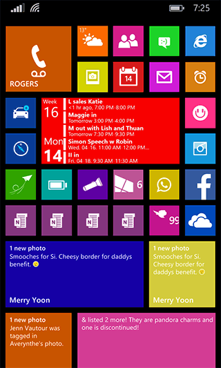
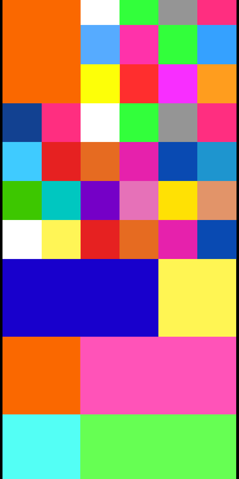
One thing I DID want was a really colourful array of tiles. So I thought, why not colour each tile but still use a totally flat approach?
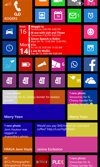
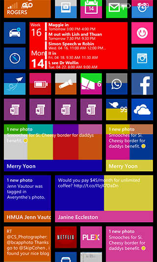
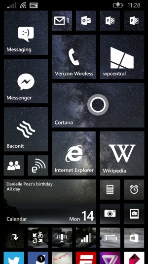
Then it gets a litte trippy when you start scrolling through:. It's kinda neat to see the tiles changing colour.
And then when you stop in between tile colours, it looks like a patchwork quilt. Surprisingly, I actually don't hate it. I might keep it around.
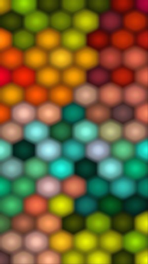
If anyone wants to use the flat approach, you can use the background I created as a template to create your own individual custom tiles and colours.
Keep in mind this image is made to fit a 768x1280 screen, so I don't know if it will line up properly with other screen resolutions.
