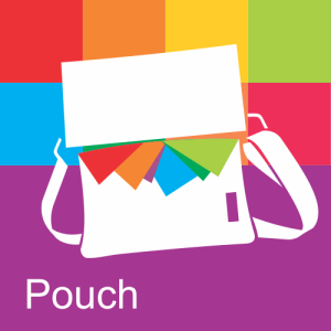
Redesign the Pouch logo

Status
Not open for further replies.
Thought I was being all original w/ the zipper thing, and came back here a half hour later to see a few others went down that path. Oh well - here's mine anyway.

pouch_zipper_v01.png
 
Saw many designs which will be similar to mine. But either ways I would like to submit my entry. On other note though, I do not have Adobe Illustrator, nor am I familier with the tool, so my submission is just a logo designed on plain old power point. I hope you guys like it.

 

Attachments

  • Pouch_Logo_Submission_Yellow.jpg
    Pouch_Logo_Submission_Yellow.jpg
    28.4 KB · Views: 159
  • Pouch_Logo_Submission_Red.jpg
    Pouch_Logo_Submission_Red.jpg
    33.9 KB · Views: 160
  • Pouch_Logo_Submission_Green.jpg
    Pouch_Logo_Submission_Green.jpg
    29.8 KB · Views: 159
  • Pouch_Logo_Submission_Blue.jpg
    Pouch_Logo_Submission_Blue.jpg
    28.3 KB · Views: 160
Here's another quick one, also Metro-compliant. Color should be a warm brown. It would help differentiate your app because the rest of them are just too intense, in my opinion. I think one day, when WindowsPhone will mature, the violent colors of its present UI will get tempered or themed. You should start now.
See Homegraphics by Claudiu Popa for more works of mine.

pouch2.png

Vector file here
https://skydrive.live.com/pagenotfounderror
 
Here are a few rough ideas, which I can work on some more if you like any of them.

I have designed a few Windows Phone apps and logos, MetroTime, TouchTimer are two of them.


Vector files and or XAML available on request!
 
Last edited:
Wow! I'm quite impressed with the talent here on the WPC forum. Some of these are great!
 
Here is my first go at the logo, using elements from the pocket logo to form a pouch shape.
I don't have illustrator so all I have are the separate layers in png format.

pouchv1.png
 
Step aside and let me introduce you to this charming, functional design.
dDh3Pns.png
The new Pouch App icon. A pouch with a pouch on it! It sort of looks like a smile because people react well to faces. The strokes are strong and very scalable so it can be noticed at even small sizes. The high contrast sunny orange ties well to the Pocket branding. The knot at the top produces a contrasting shape that also relates with Pocket's branding. Stroke sizes are set to multiples of 12, which is recommended for Windows Phone apps.

The empty space in the middle is a perfect spot for your live tile count. Observe these 2 suggestions.
V13y5cSs.jpg Rd0zm6ss.jpg

This design is very flexible and has much potential.
Download source files.
 
Status
Not open for further replies.

Members online

Forum statistics

Threads
331,823
Messages
2,254,796
Members
428,693
Latest member
Akki