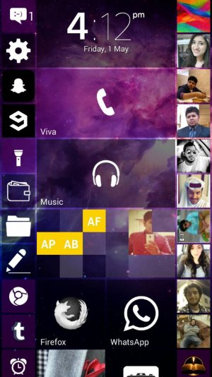
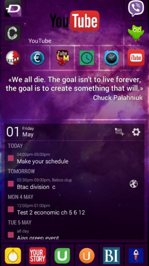
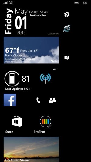
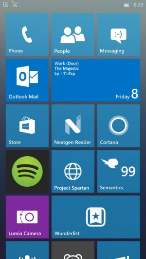
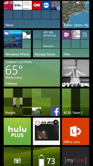
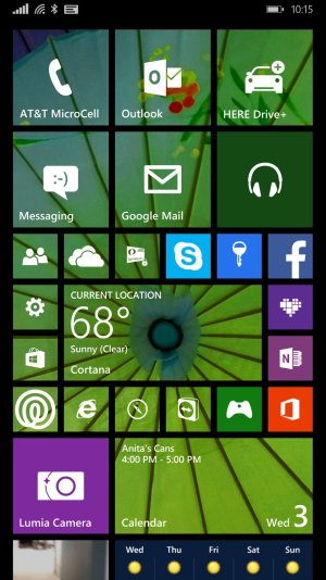
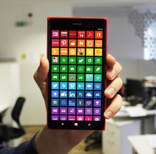
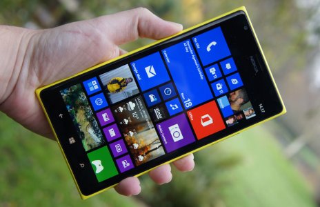
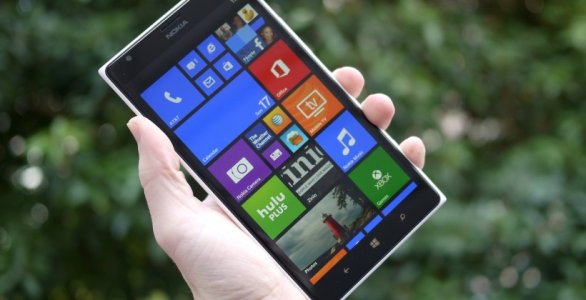
[Showing Off] My Lumia 1520 Start & Lock Screens
- Thread starter Wilguens Joachin
- Start date
You are using an out of date browser. It may not display this or other websites correctly.
You should upgrade or use an alternative browser.
You should upgrade or use an alternative browser.
Duy Nguyen 8s
New member
- Apr 29, 2015
- 14
- 0
- 0
Tom Snyder
New member
- Apr 16, 2013
- 311
- 0
- 0
greedo_greedy
New member
- Jun 11, 2013
- 911
- 0
- 0
re: [Showing Off] My Lumia 1520 Start & Lock Screens
Your effort is commendable. Nice work :amaze:
Your effort is commendable. Nice work :amaze:
Madam ImAdam
New member
- Jan 1, 2014
- 486
- 0
- 0
canhosaigon
New member
- May 21, 2015
- 10
- 0
- 0
RJ Priest
New member
- Feb 13, 2013
- 364
- 0
- 0
re: [Showing Off] My Lumia 1520 Start & Lock Screens
New 1520 owner in Canada. I think that I prefer the look of 2 columns of medium tiles rather than the 3 on the 1520, but I am extremely happy with the 1520 and my new start screen.
Even though I loved the look of wp8.0 and metro design, I think that if Windows Phone had offered the transparent tile option from the beginning, it would have really helped sell the OS to average joe consumer who hated the look of solid colour live tiles.
Attachments
TheHouseBunny
New member
- Feb 24, 2014
- 22
- 0
- 0
Tom Snyder
New member
- Apr 16, 2013
- 311
- 0
- 0
steven2211
New member
- Nov 18, 2013
- 12
- 0
- 0
re: [Showing Off] My Lumia 1520 Start & Lock Screens
This one is really cool
This one is really cool
tiimothydadams
New member
- Jul 28, 2015
- 12
- 0
- 0
tiimothydadams
New member
- Jul 28, 2015
- 12
- 0
- 0
Marko Marjanovic
New member
- Feb 12, 2015
- 264
- 0
- 0
re: [Showing Off] My Lumia 1520 Start & Lock Screens
Got tile? Name pls
Really digging the Discovery News app tiles...
//images.tapatalk-cdn.com/15/05/22/dc7e84437748d6770bb70775a2a075d8.png
Got tile? Name pls
Dietrich Cleijne
New member
- Oct 9, 2013
- 278
- 0
- 0
re: [Showing Off] My Lumia 1520 Start & Lock Screens
I guess they're all just small tiles arranged by colour.
I guess they're all just small tiles arranged by colour.
jmerrey
New member
- Dec 9, 2010
- 1,790
- 2
- 0
re: [Showing Off] My Lumia 1520 Start & Lock Screens
Which app/tile are you asking about?
Got tile? Name pls
Which app/tile are you asking about?
Similar threads
- Replies
- 2
- Views
- 8K
- Replies
- 11
- Views
- 11K
- Replies
- 3
- Views
- 5K
- Replies
- 1
- Views
- 2K
Trending Posts
-
-
-
Windows 10 Themes no longer working...
- Started by DocCovington
- Replies: 6
-
I'm looking for a CalDAV, CardDAV client for Windows
- Started by xandros9
- Replies: 1
Forum statistics

Space.com is part of Future plc, an international media group and leading digital publisher. Visit our corporate site.
© Future Publishing Limited Quay House, The Ambury, Bath BA1 1UA. All rights reserved. England and Wales company registration number 2008885.


